9 Colourful ways to stand out on social media
Grab eyeballs scrolling through social media feeds by covering content in colour. From bold branding to subtle statements, selecting key shades can help your brand stand out and be easily recognisable in a sea of social media sharing. There’s an entire rainbow to choose from and multiple ways to paint your online presence, so we’ve come up with 9 examples to dip your favourite brush into.
1. Select a signature shade
Arguably the simplest way to add colour to branding is to pick a singular signature shade and wash your business’ entire social media experience in it. With one key colour and perhaps a secondary contrasting colour for text overlays, you can build recognisable colour branding in no time.
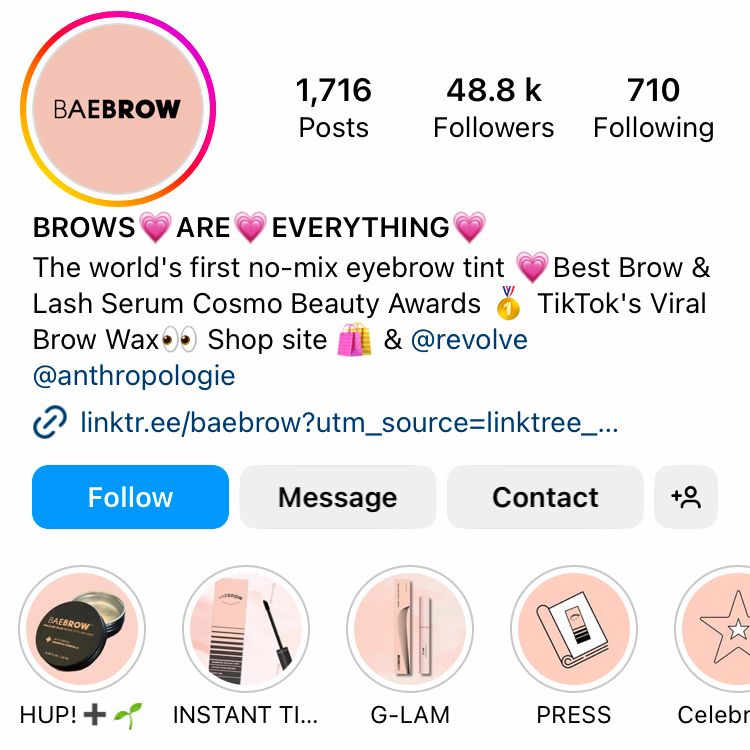

A signature colour with contrasting text overlay by @baebrow on Instagram
2. Hone in on a handful of colours
When your creativity can’t be contained by a singular colour, perhaps a palette would be more suitable. Choose a handful of shades to show off your unique style. Bare in mind, being bold doesn’t have to burn retinas. By incorporating brighter shades and muted hues, you can make a cocktails of colours all complementing each other in harmony.

Wine brand @goodpairdays is a master of collective colour cohesion. From Instagram stories highlight covers to Facebook feed posts, the colour palette paves the way. In fact, @goodpairdays is doing so many things right, we dedicated an entire article to its Instagram profile, so you can get inspired by the best bits.
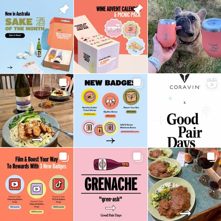
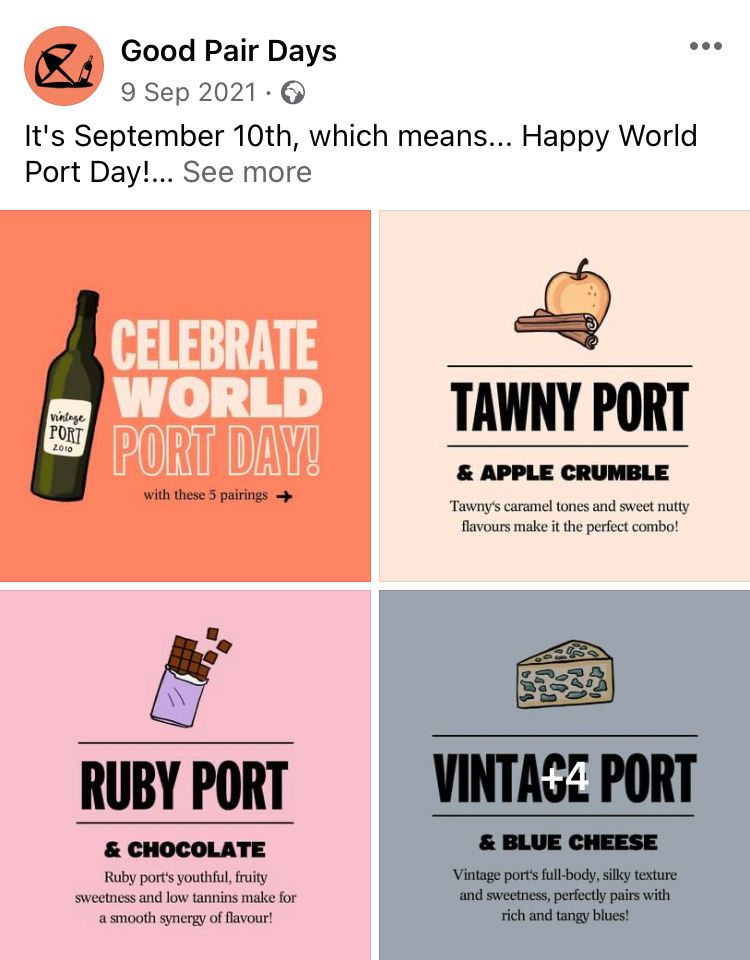
Instagram grid (left) and Facebook post (right) by brand @goodpairdays
While Instagram is an obvious choice for visual content, it’s not the only place to paint with a palette. Even job ads on LinkedIn by @goodpairdays incorporate high-quality branding adorned in the chosen colour scheme.


LinkedIn ads by brand @goodpairdays
3. Wash out to win
Catching attention doesn’t have to be overcomplicated. There’s a subtle sophistication to simplicity and sometimes that’s all that’s needed to stand out for all the right reasons. If you’re moved by muted tones, creating a menagerie of monochrome might be the move for you.
From Instagram stories highlight covers to Facebook posts and TikTok videos, shower care brand @helloklean covers its content from head to toe in washed out tones.
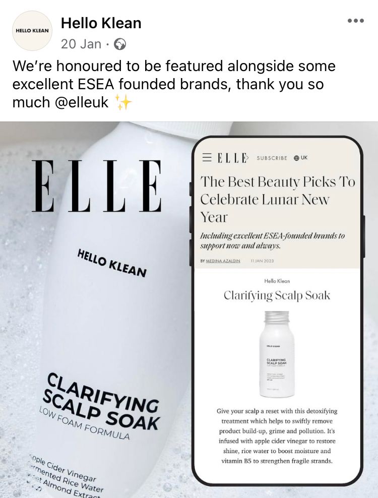
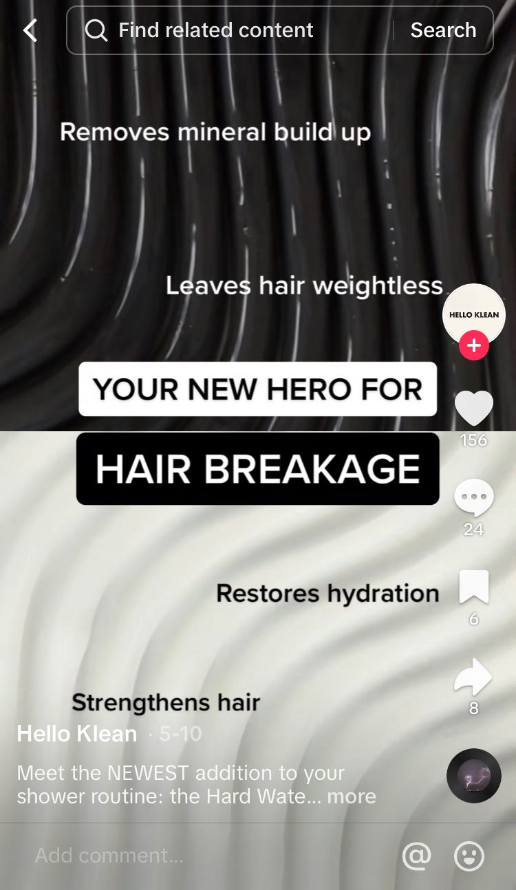
Facebook post (left) and TikTok video (right) by brand @helloklean
4. Grab a gradient
When a solid hue isn’t for you, blend together your favourite shades for a sliding show of style. Choose from 2 or more shades to break out beyond being basic. From a subtle shade switch to an entirely different colour, big brands all over social media have embraced this multicoloured technique.
Take your glowing gradient beyond your logo by infusing it into every part of your social media presence. Check out this incredibly vibrant Facebook banner by @tinder which pulls from the beautifully blended gradient to unleash a powerful first impression.

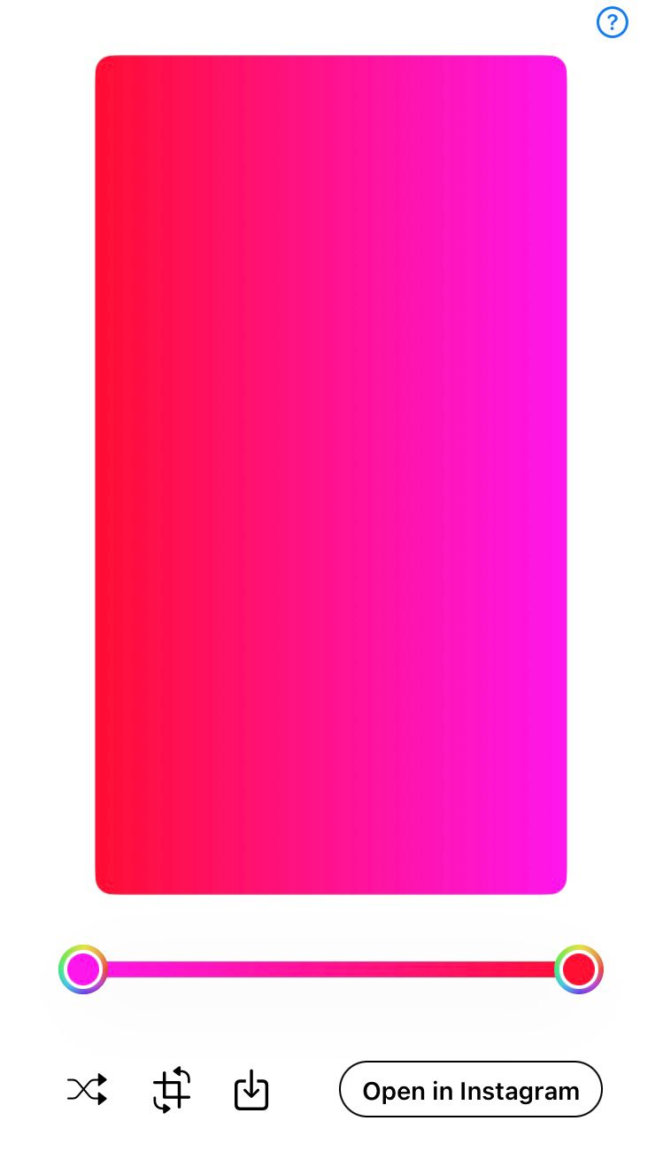
Design your own gradients using Mixter. This colourful app gives you full control to manipulate the rainbow into your own ideal brand colours. Change the colours, amount of each colour and the rotation of the gradient. Get inspiration from the random generator or meticulously meddle with the colour grid, spectrum or sliders to achieve your ideal look. Export to Instagram stories to insert as a background at the touch of a button. Find out more here.


5. Curate colour through content
Take a moment to think beyond logos, backgrounds and overlays. Your colour concept could emerge through the media itself. If your products and/or services lend themselves to a specific look, a unique mood or a repetitive theme, this could be the perfect opportunity to make the colours in your content the star of the show.
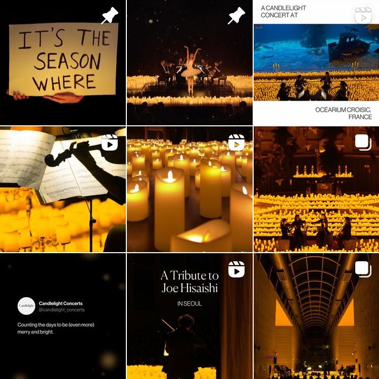

Instagram profile (left) and Facebook post (right) by brand Candlelight Concerts by Fever
6. Claim a filter
Whether you use filters for aesthetics or just a bit of fun, the power of a well-picked filter should not be overlooked. Filters can be used for mood design through the manipulation of colours on media. Deep, warm colours can make content look cosy while crisp, cooler tones can feel refreshing. Picking out a particular filter for your brand, or creating your own overlays, can give your content a signature look, making it recognisable to your audience in the middle of busy feeds. Check out the yellow, orange and blue tones pulled out by the repeated filter in the examples below.

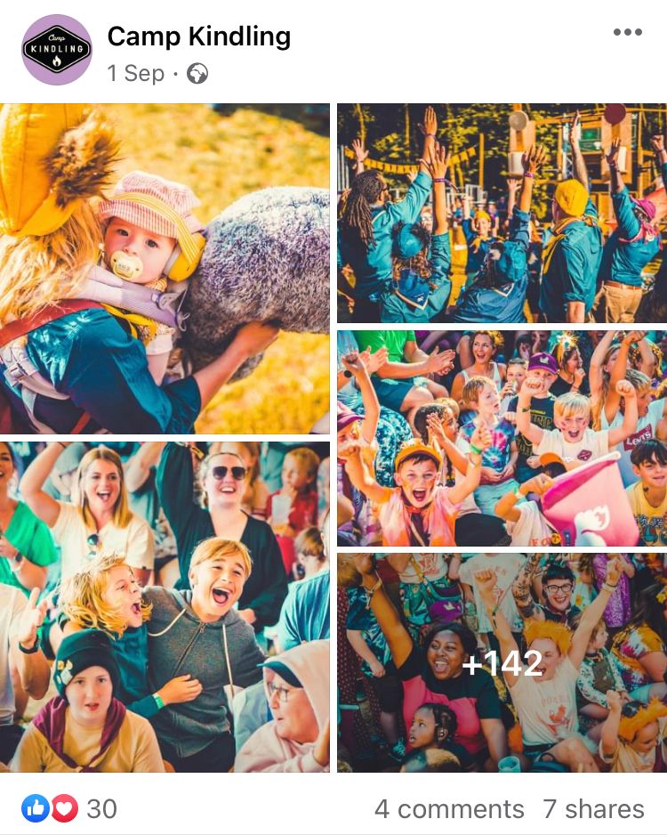
Instagram profile (left) and Facebook post (right) by brand @campkindling
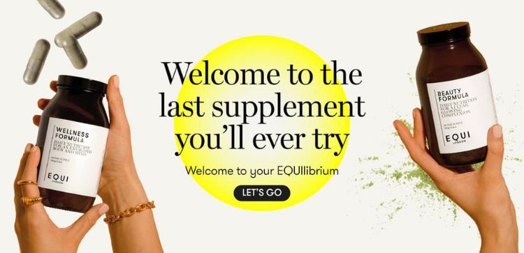
7. Pitch a powerful pop
A little pop of colour can be all that’s need to make a big statement. In the example below, a signature shade steals the spotlight, even though it’s used sparingly. The bright yellow colour waves to the eyeballs while the rest of the profile picture, stories highlight covers and posts remain muted, giving the punch of colour its own individual style.


Instagram profile (left) and Instagram post (right) by brand @equilondon
It’s not just about the colour either, but the repeated shape the colour is continually contorted into. The circular form speaks rather than shouts in a dance of elements to truly set this branding apart.
8. Change it up
Looking for an even more inventive use of colour? Deodorant company @wildrefill has a fresh take for you to dive into. New release? New colours! With a new major product release comes a total change in colour palette to build excitement and boost sales. With a significant shift in shades, it’s impossible to miss that something exciting is on the horizon.
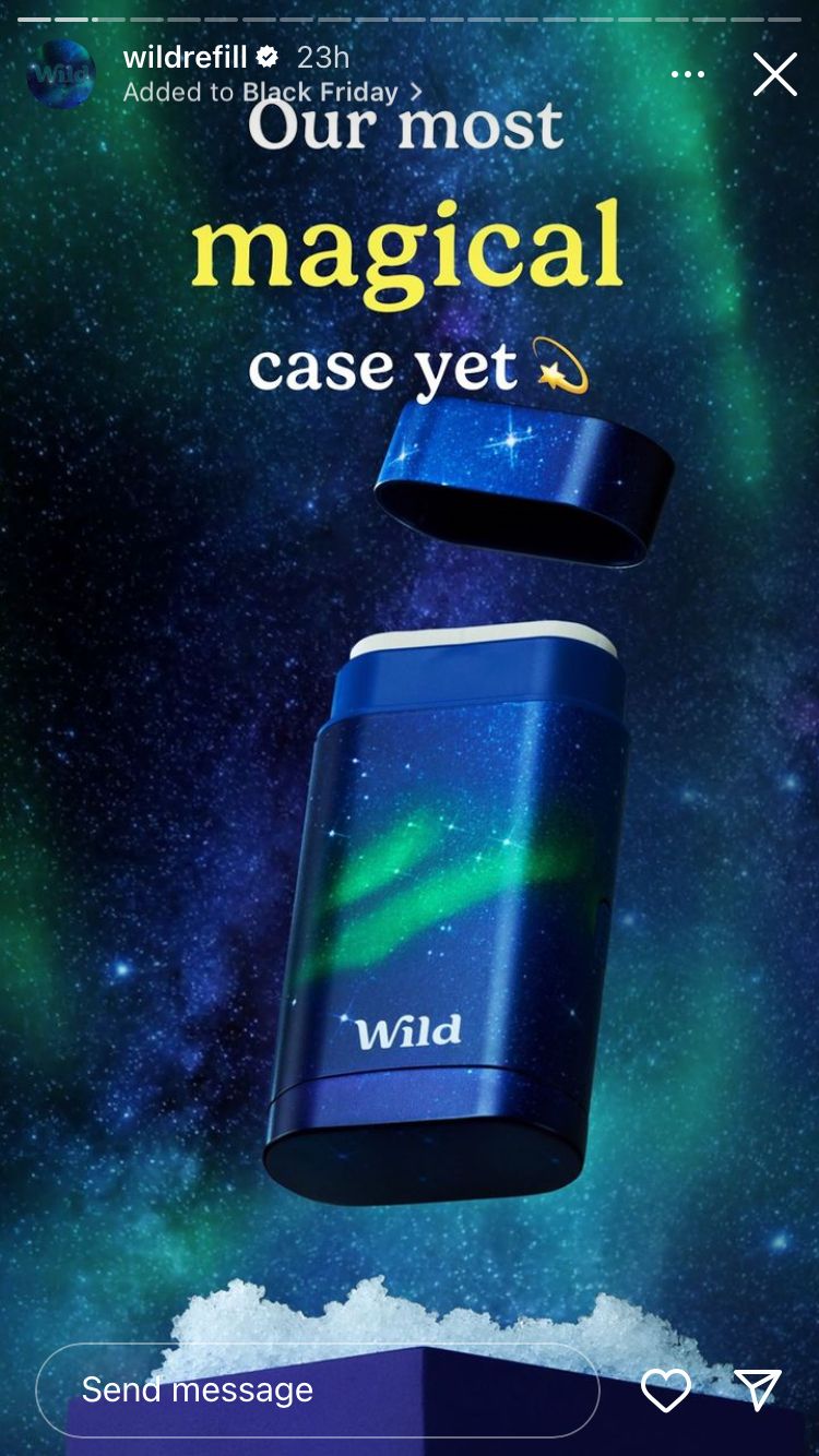
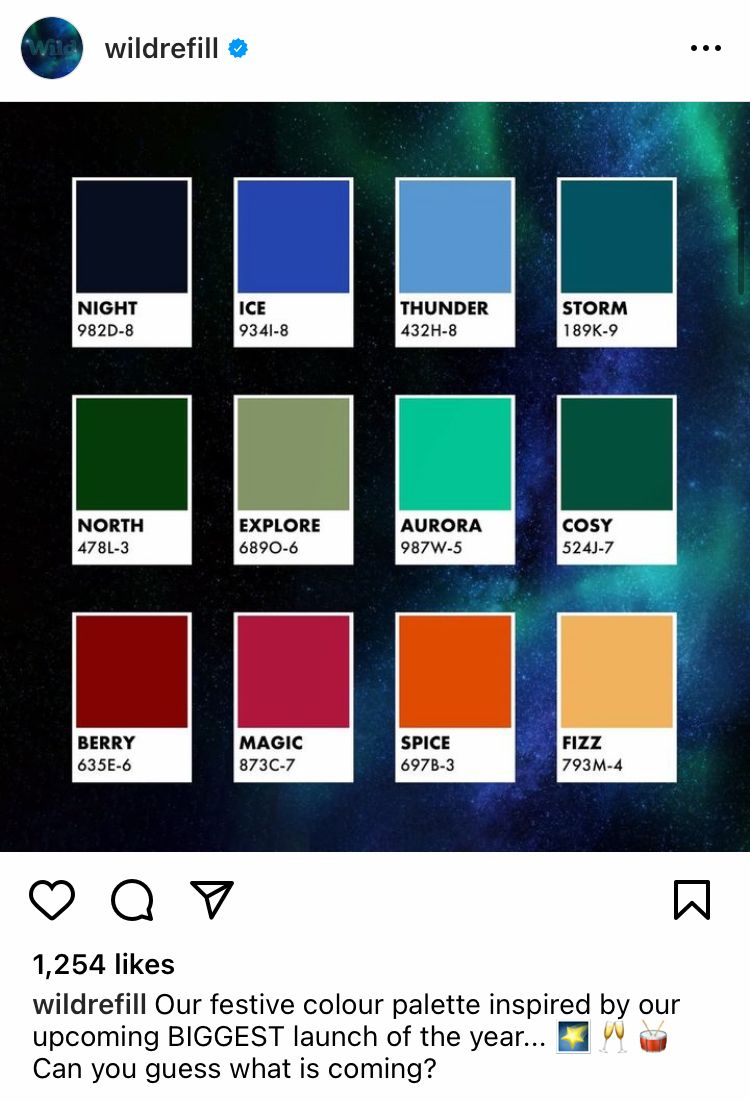
Instagram stories post (left) and grid post (right) by brand @wildrefill
The profile picture was also temporarily changed to match the aesthetic for this major colour change.


Instagram profile pictures by brand @wildrefill
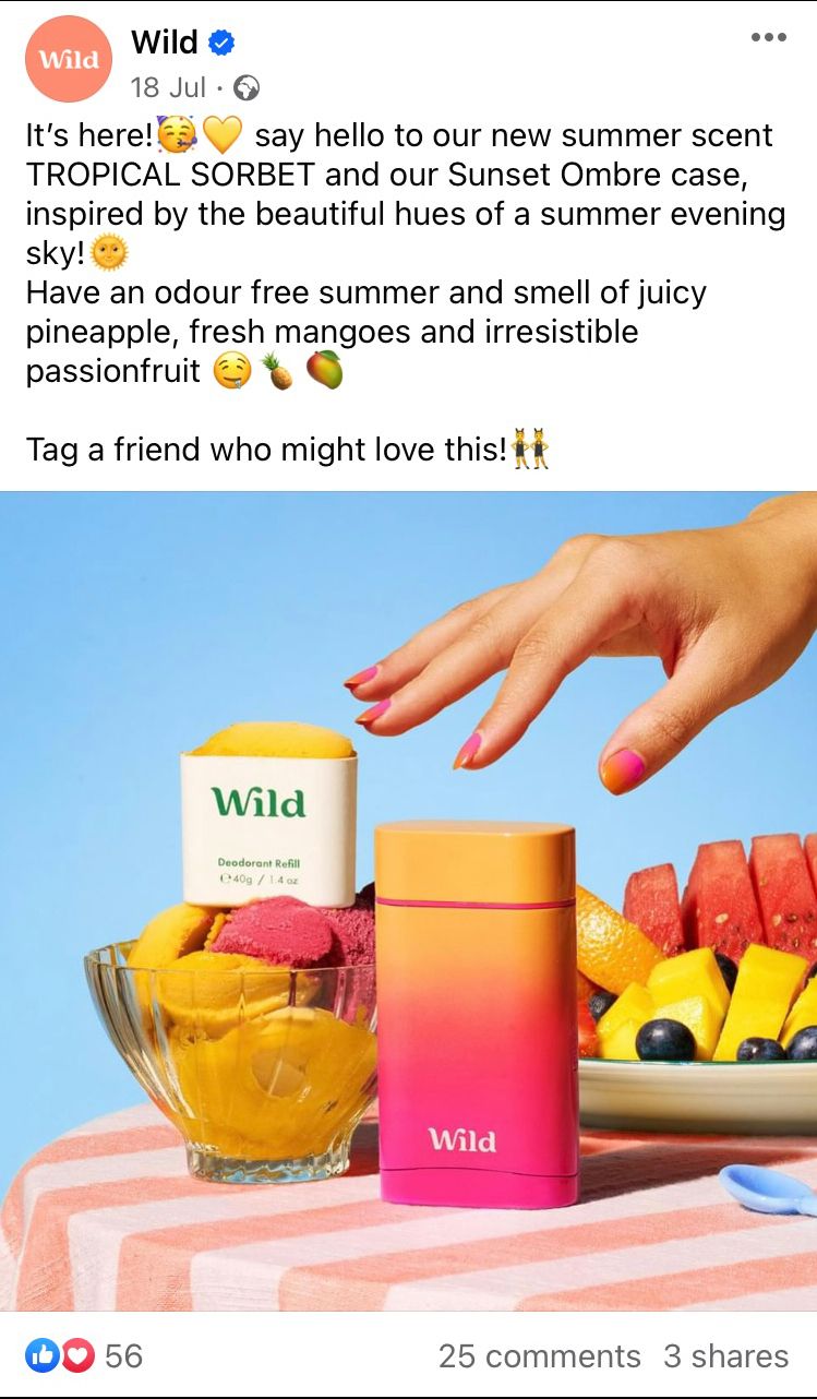
Something @wildrefill does really well is it captures a feeling through colour use. Compare the above example with the total contrast of the summer release. You can almost smell the season. Look at how different the shades are to the winter release. Notice how the colours conveyed on social media match the colours in the product design.


Instagram posts by brand @wildrefill
The twist in tones is eye-catching and contrasting enough that it’s difficult to ignore. Fans of the brand can now associate a colour palette update with the anticipation of a new product. Of course these colour schemes are carried across other social media platforms too, such as Facebook, to make as big an impact as possible.

Facebook posts by brand @wildrefill
9. Carry colours across platforms and beyond
In many of the previous examples, you will have noticed that colour schemes are carried across different platforms, leaking into product imagery, logos, website design and more. This is important for branding as it helps guide the customer through the business’ world. Keep your colours cohesive for maximum recognisability. Think about how you use colours across social media platforms.


Branding on Facebook (left) and LinkedIn (right) by @rhealsuperfoods
Think about the colours you use in content. Check out how the people featured in TikTok content by brand @rhealsuperfoods regularly wear green clothing to continue the cohesive colour choice.

Beyond social media, your chosen colour(s) can be carried on throughout your link in bio service, website and into the real world to make your brand unmistakable.


Link in bio service (left) and website (right) by brand @rhealsuperfoods
Branding is a huge part of making your business stand out on social media and it can evolve and grow with the business and its products. However, branding will only get you so far. For real knowledge about what is working well for your brand and content on social media, head over to Minter.io - the social media analytics tool for all the metrics you need to grow your business online. Check it out here.
Try it today! →