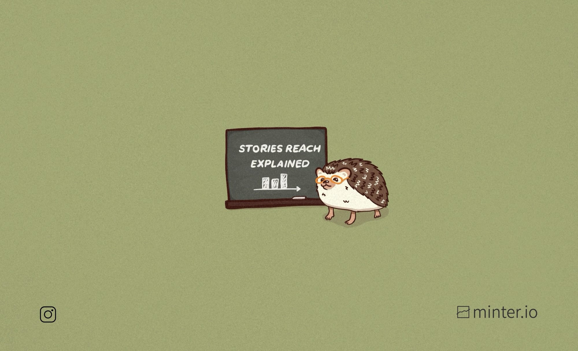
Instagram Stories reach metrics explained
Are your Instagram stories an afterthought? Stories aren’t only for your most loyal followers. In fact, there are many innovative stickers available to add to your Instagram stories, which enable you to potentially reach significantly more people that your immediate audience.
Reach is a crucial metric to track for success on Instagram and in this article we’re going to look at 6 of the most beneficial reach metrics to track which are specifically designed for tracking the reach of your Instagram stories. Discover Minter.io to get all the data you need to make informed decisions about your content on social media.
Stories section on Minter.io
The reach graphs in the stories section of your Minter.io account all relate solely to stories posted by your profile. This separates stories data from your regular profile posts, making it easy to see exactly what is working for your stories content. By tracking and understanding the graphs related to reach in your stories section, you can determine specific days when reach peaked and dipped and whether your reach has come from people who follow or don’t follow your profile.
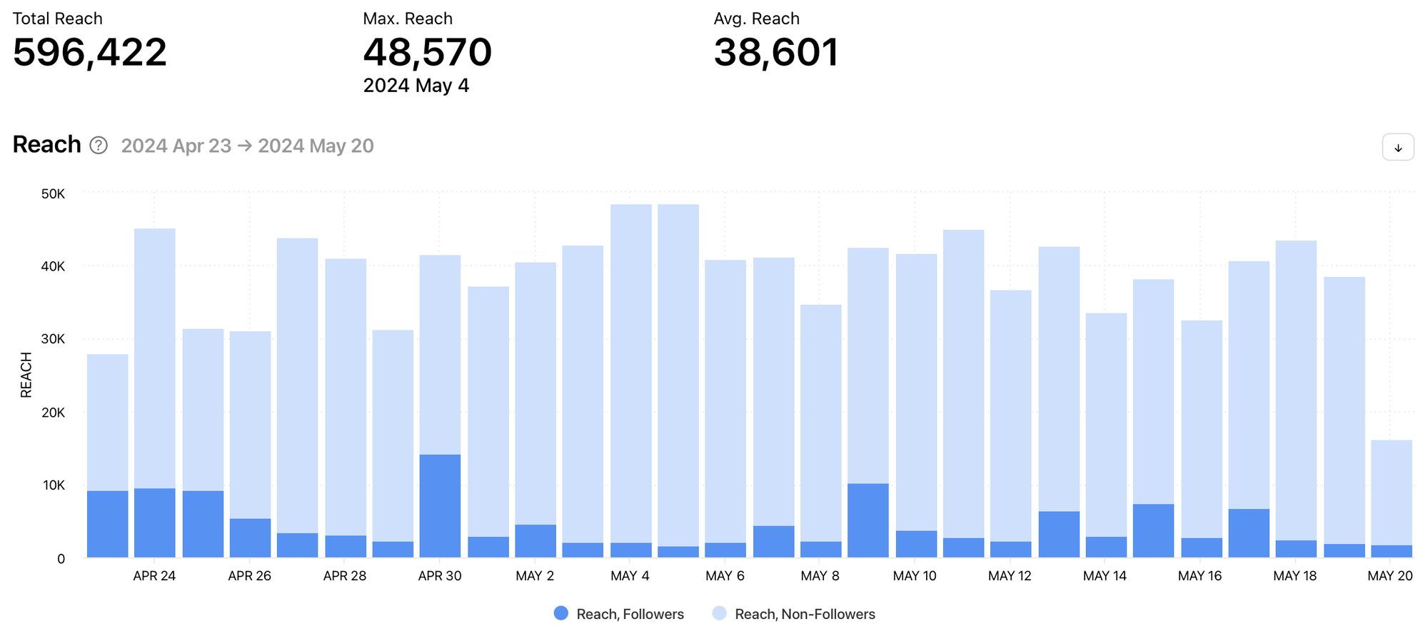
Reach
The reach graph shows the number of times stories were viewed by unique accounts during the selected date range. Reach data is split into followers and non-followers. Above the graph shows the maximum reach with the date this reach was achieved, alongside the average reach.
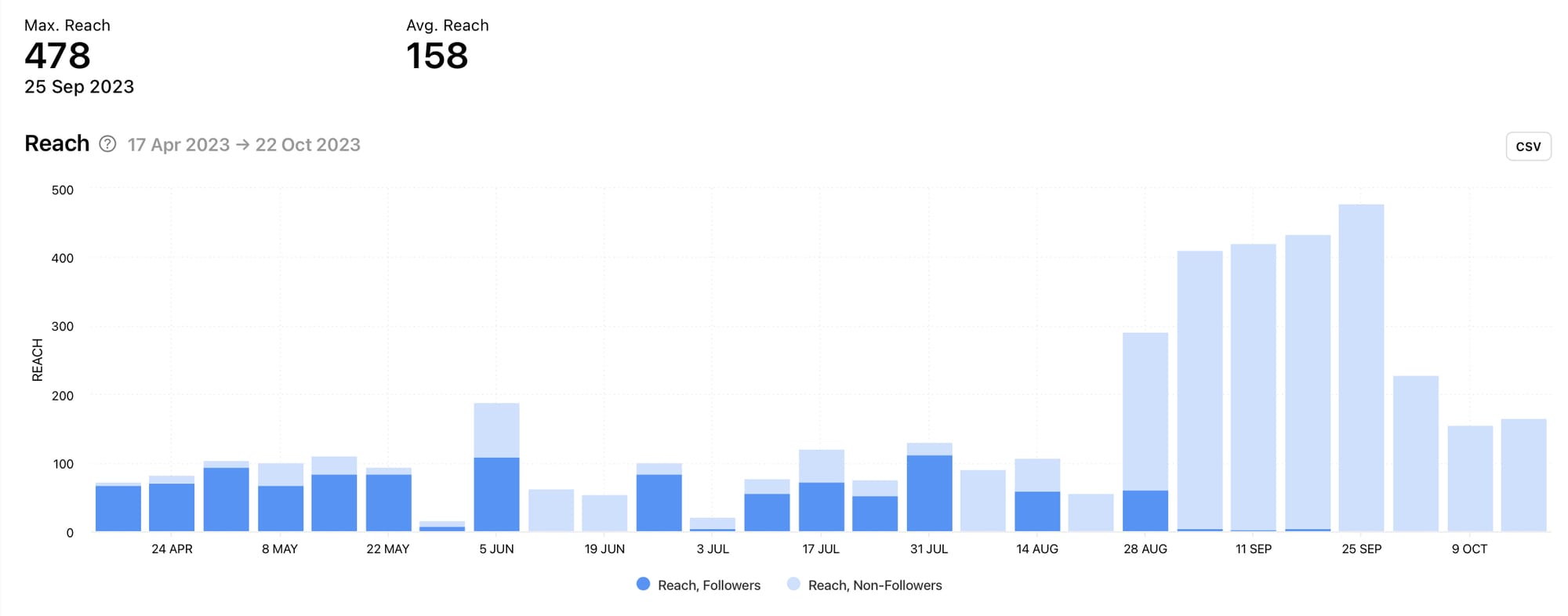
Determine which days gained the highest amount of reach for your stories so you can replicate stories that performed particularly well. Stories reach data is split into followers and non-followers, making it easy to see where your reach has come from.
In the graph above, notice the spikes in non-follower reach. On these days, it would be a good idea to determine whether there was anything different in the content which could have triggered this change. Perhaps particular stickers, hashtags, locations or other connectivity functions were used. Maybe another account mentioned or tagged the account, resulting in a surge of additional reach. This is the kind of thing that’s useful to pay attention to so you can replicate elevated reach to non-followers in the future.
Reach Rate
The reach rate graph shows the average reach rate of stories posted on the given day during the selected date range. This is the percentage of followers who saw your stories. Above the graph shows the average reach rate percentage and the maximum reach rate percentage with the date this reach rate was achieved.
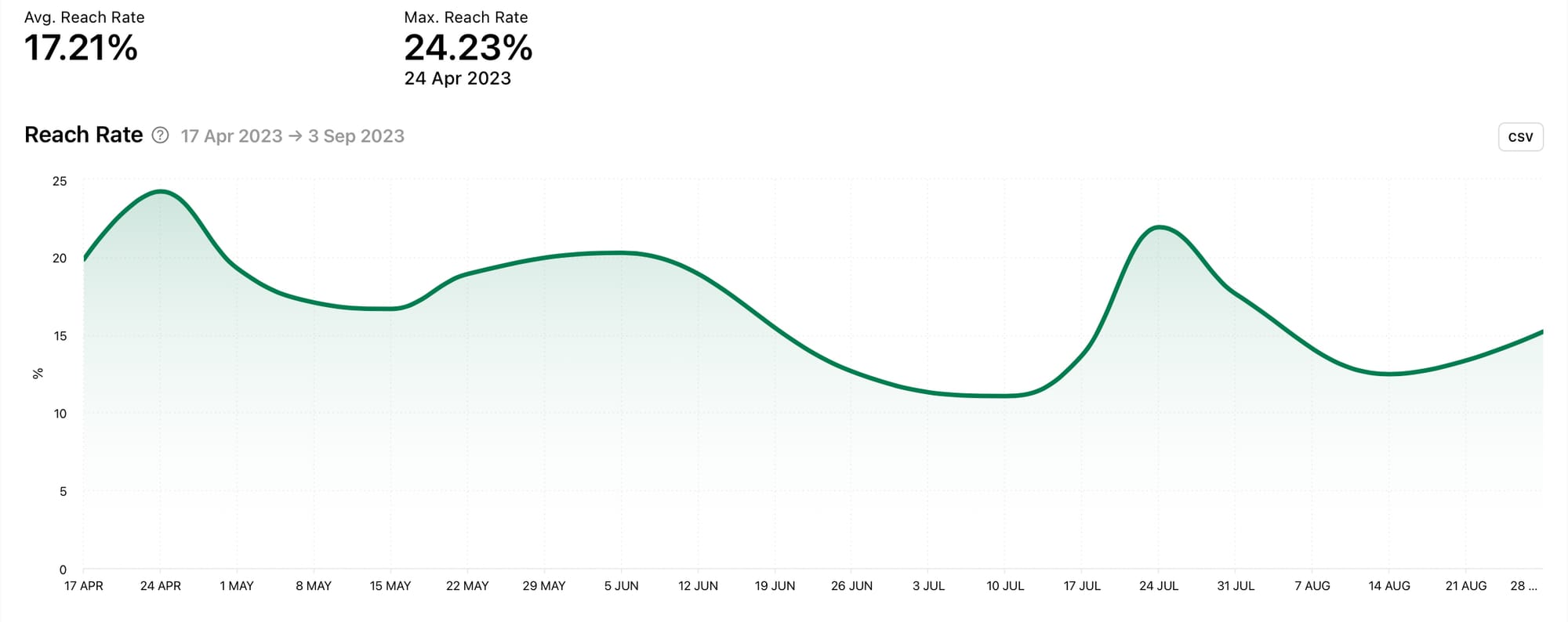
Take note of the percentage of followers who viewed your stories and what actions triggered a higher percentage. Posting more or fewer stories, sharing certain types of information, using specific stickers or nudging followers towards your stories in profile posts could all have an impact.
Individual Stories on Minter.io
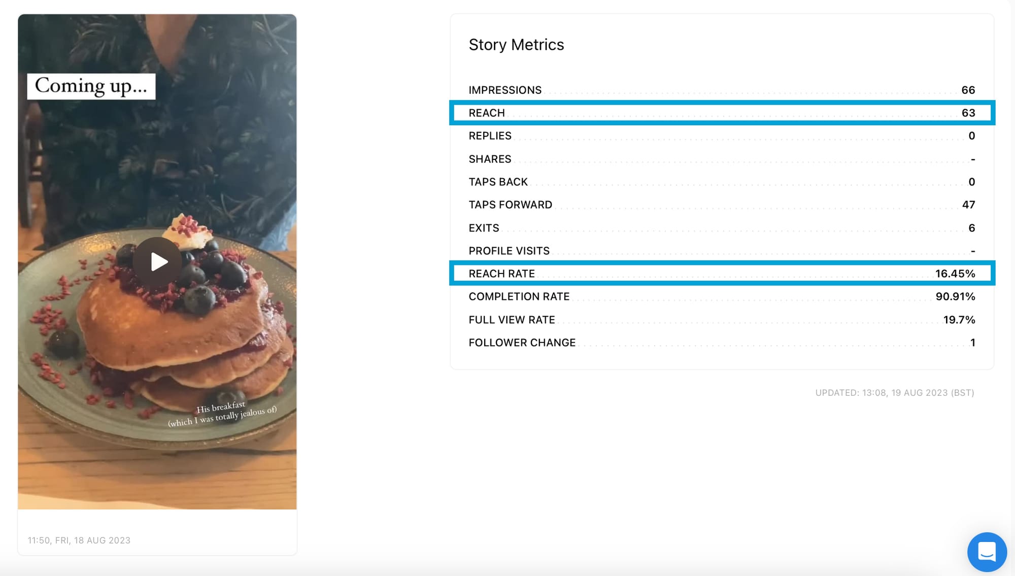
You can hone in on individual stories to get a really good look at the content that is performing best. By finding your content with the highest amounts of reach and reach rate, you can replicate and rinse for elevated reach on repeat.
All Stories
Sort all stories by reach or reach rate. Each individual story also has reach metrics displayed.
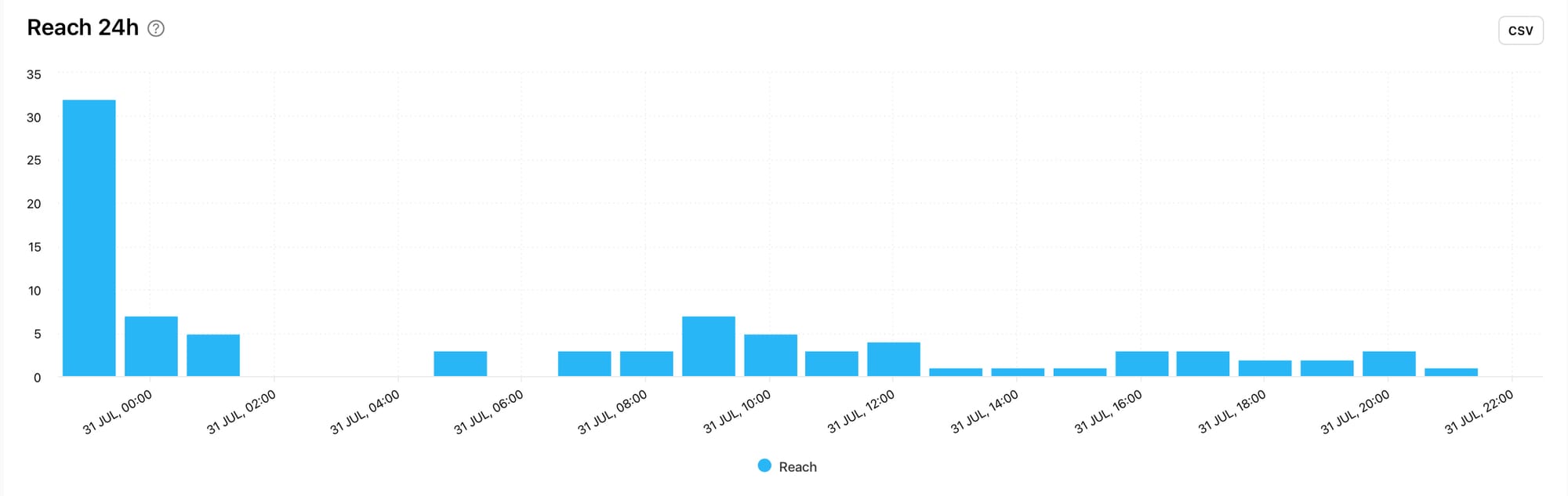
24 Hour Data
Select a specific piece of content to view reach 24 hour data which shows the amount of reach the content gained each hour from the time of publication. 24 hour data gives you insight into how well your content performed within the first day of publishing, helping you to understand how the algorithm responded to your content.
Profile section on Minter.io
The profile section of your Instagram data on Minter.io combines your post, stories and ad data to get an overview of how well your reach is performing overall. By tracking and understanding the graphs related to reach in your profile section, you can determine how much reach your content gained as a whole, on specific days and whether your reach has come from people who follow or don’t follow your profile.
Reach
The reach graph shows the number of unique accounts that viewed posts, stories and ads during the selected date range. Reach data is split into followers and non-followers. Above the graph shows the total amount of reach up to the last 30 days, the maximum reach with the date this reach was achieved and the average reach.
Reach Distribution
The reach distribution graph shows the percentage of followers and non-followers that viewed your posts, stories and ads during the selected date range, up to the last 30 days.
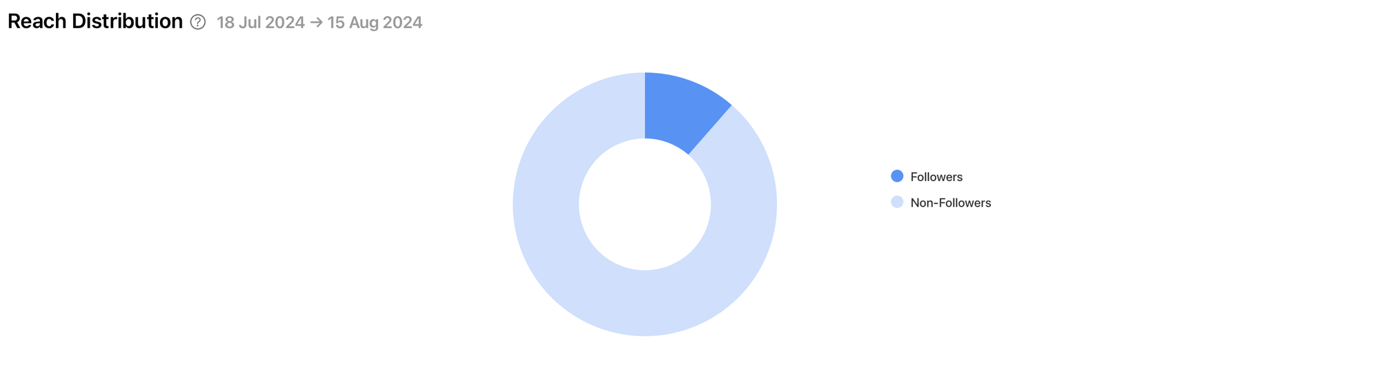
Learning about where your reach is coming from can give you a clear indicator of how Instagram’s algorithm and connectivity functions are working in regard to your profile as a whole. It can also show whether your current audience is being served up your content. If your content is reaching non-followers regularly but your following isn’t increasing, it’s probably time to look at how you can turn casual viewers into loyal brand enthusiasts.
Benchmarks section on Minter.io
Benchmarks provide you with a clear guide as to the areas that might require your attention by providing a simple comparison with accounts of a similar size. This is a useful tool for determining whether your content is underperforming, is about average or is excelling in regard to reach. In the benchmarks section of your Minter.io account, you can see whether your reach levels are in the lower, median or upper sections of your cohort.
Reach Rate per Story
The reach rate per story graph shows the average reach rate per story compared with other Instagram accounts in the same cohort.
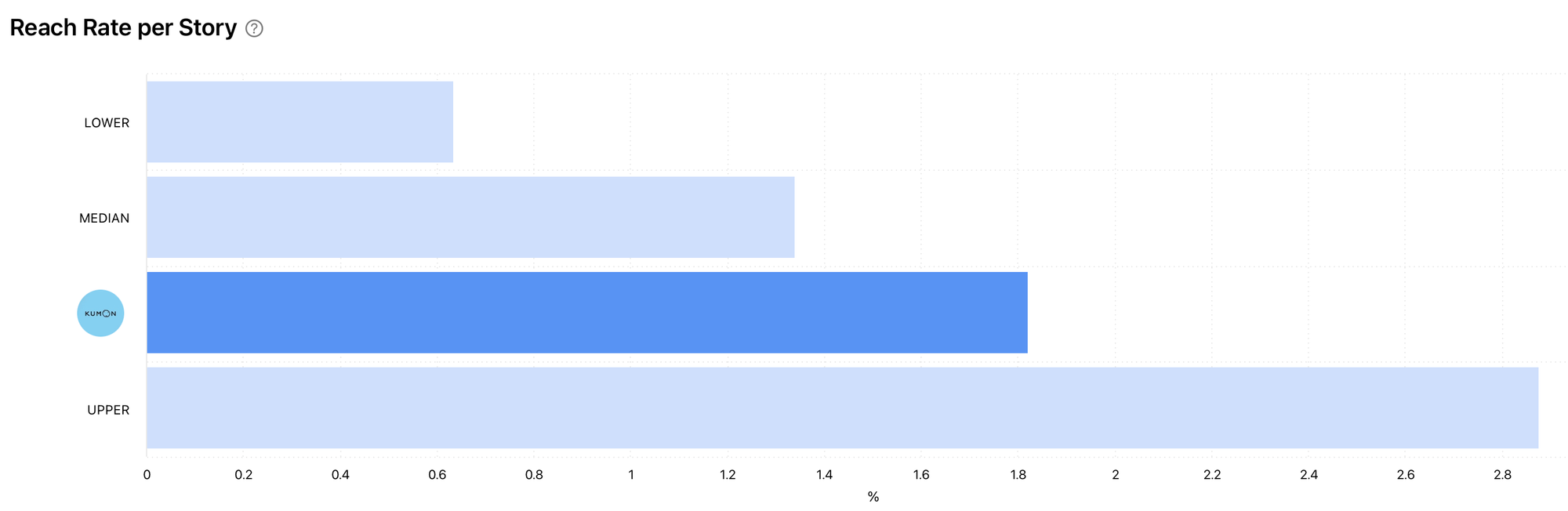
Is your profile landing in the lower, median or upper area of the reach rate per stories graph? If your content is near the lower bar, consider focusing on improving your reach rate per story. This could involve using stickers such as the hashtags, locations or mention stickers. You might also consider joining a current, popular ‘Add yours’ sticker run. Additionally, focus on increasing the quality and consistency of your stories and aim to boost engagement in order to boost reach, perhaps through polls, questions or quiz stickers.
Unlock all the graphs in this post and a significant amount more by discovering Minter.io - the social media analytics tool for businesses online. Explore more here!
Try Minter.io→