How to track analytics from your Facebook competitors

Have you ever wanted a sneaky peak at the secret sauce that makes your competitors’ social media content soar on Facebook? Minter.io recently released the keys to the treasure trove with its brand new Facebook Competitor Pages feature. Alongside the option to track the analytics of your competitors on Instagram and X, you can now track the performance of your competitors' Facebook pages too! Let’s have a look at all the juicy details.
Don’t forget, Minter.io has a fully customisable date picker so you can choose whether to view data from all time, recent data or data from a specific time period. Choose to view your competitor’s graphs by day, month or week for information organised in a way that makes sense for your needs.
Here are all the graphs currently available to unlock with Minter.io Facebook Competitor Pages…
Audience
Audience insights let you see whether your Facebook competitor’s following is growing or shrinking, which is important info to know before you take inspiration from their content. With the graphs below, you’ll be able to make informed decisions about which content strategies might work for you.
Fans
Follow the rise and fall of your competitor’s Facebook fanbase with the Fans graph. This graph shows the number of times the page was liked during the selected date range. Hover over specific parts of the line graph to see the exact amount of fans on a specific date. For key info at a glance, check out the number of fans, fan change, maximum fan change and average fan change above the graph.
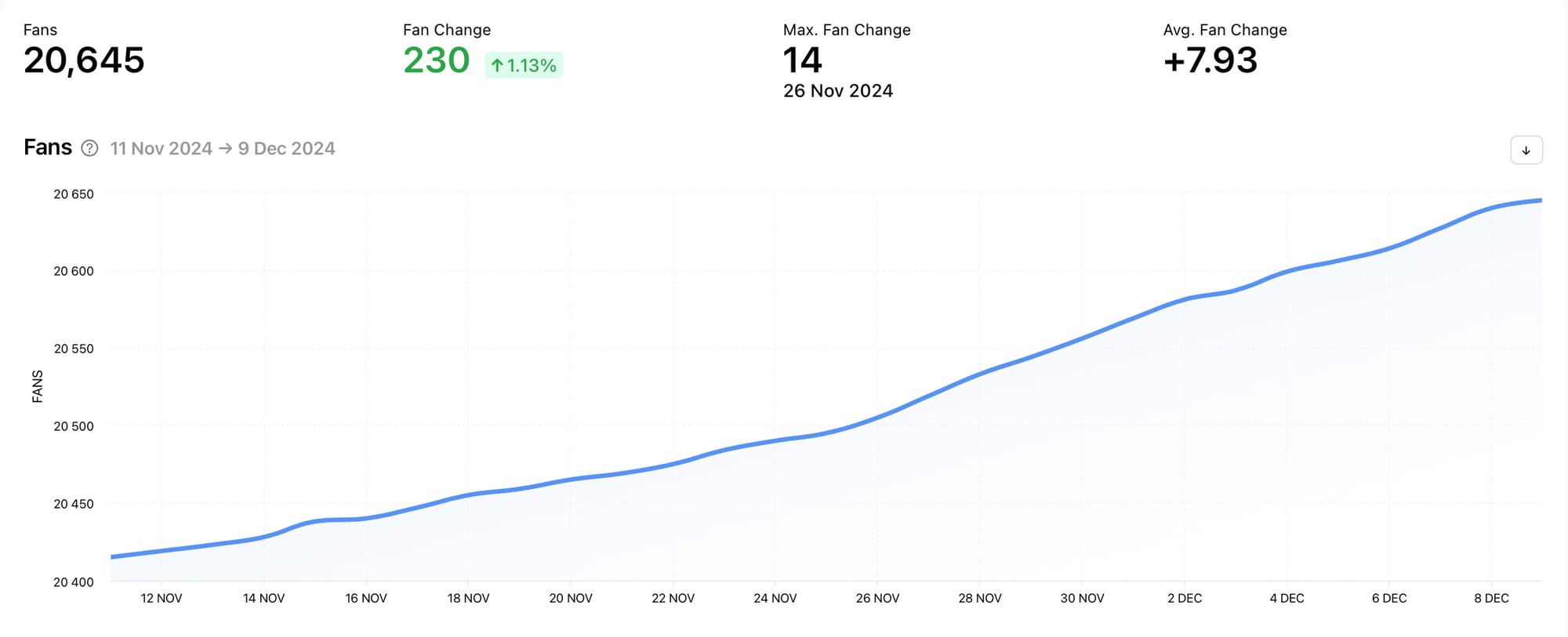
This is the perfect graph for seeing the change in the amount of Facebook fans your competitor has over time, especially as historical data is available from the day the page is connected. With this graph you can pick out periods where your competitor’s Facebook strategy was going strong, as well as times of trial and error that you can learn from without even publishing a post. The Fans graph is also ideal for picking out key information such as the average amount of fan change, helping you benchmark your performance against theirs with ease.
Fan Change
If you’re looking to pinpoint the exact days that made the biggest difference to your competitor’s Facebook fanbase, the Fan Change graph is the place to go. This graph shows the absolute increase or decrease in fans during the selected date range i.e. the total amount of fans gained or lost. Hover over the bars within the graph to see the exact fan change on a specific date.
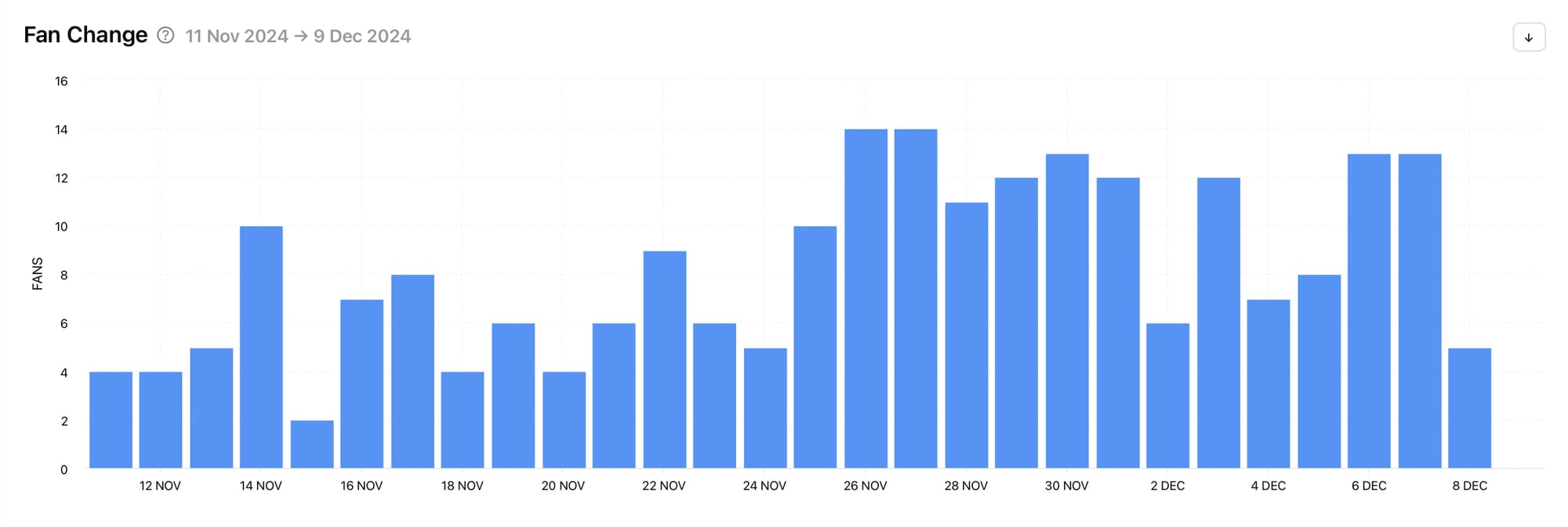
Easily pick out the days that gained the most amount of fans for your competitor to identify strategies and content worth exploring. Equally, notice days that lost your competitor fans. This will help you avoid potential pitfalls. With historical data available from the day the page is connected, you can rifle through a backlog of spikes and dips in fans.
Posts
Content is king in the world of social media, so understanding what your competitor is publishing and how their content is received by an audience is extremely valuable data to possess. The Posts section sheds light on post information such as the number of posts, likes, comments, shares and engagement rate as well as insights for individual posts.
Number of Posts
Have you ever wondered how often you should be posting on Facebook? Check out what is working for your competitor with the Number of Posts graph. This graph shows the number of posts published during the selected date range. Hover over the bars within the graph to see the exact number of posts published on a specific date. Above the graph, easily pick out the total amount of posts, the maximum number of posts and the average number of posts published within the date range.
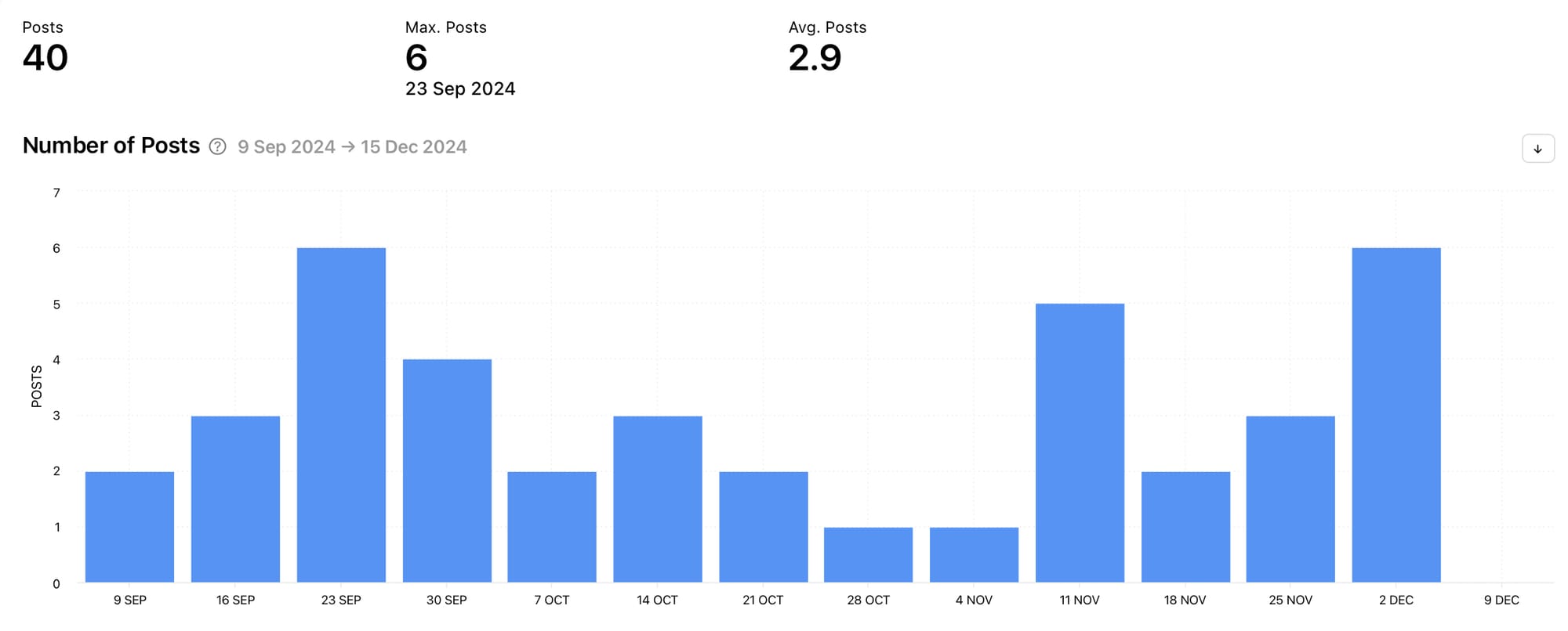
Use the Number of Posts graph to determine whether your posting schedule is on par with your competitors. This is also a handy graph to add context to other upcoming graphs. It can help you determine whether your competitor got more engagement on posts purely because they were posting more often or because their content was performing well.
Number of Likes
If you’re looking for days, weeks or months that gained particularly high levels of likes for your competitor, look no further than the Number of Likes graph which shows the number of likes on posts published during the selected date range. Hover over the bars within the graph to see the exact number of likes on posts published on a specific date. Above the graph, easily pick out the total amount of likes, the maximum number of likes and the average number of likes within the date range.
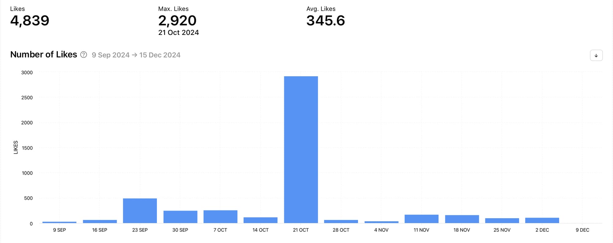
Tracking the number of likes your competitor gained can help you understand how well your content is performing in relation with theirs. It can also help you pinpoint content and strategies that worked particularly well for your competitor, which you can take inspiration from to create quality content for your own brand. In the example above, the week starting October 21st is begging for attention. If this was your competitor, you’d be wise to explore what was published during that week and how it differed from the competitor’s other content to gain a huge spike in likes.
Number of Comments
If you’re looking for further engagement information, the next stop is The Number of Comments graph which shows the number of comments on posts published during the selected date range. Hover over the bars within the graph to see the exact number of comments on posts published on a specific date. Above the graph, easily pick out the total amount of comments, the maximum number of comments and the average number of comments within the date range.
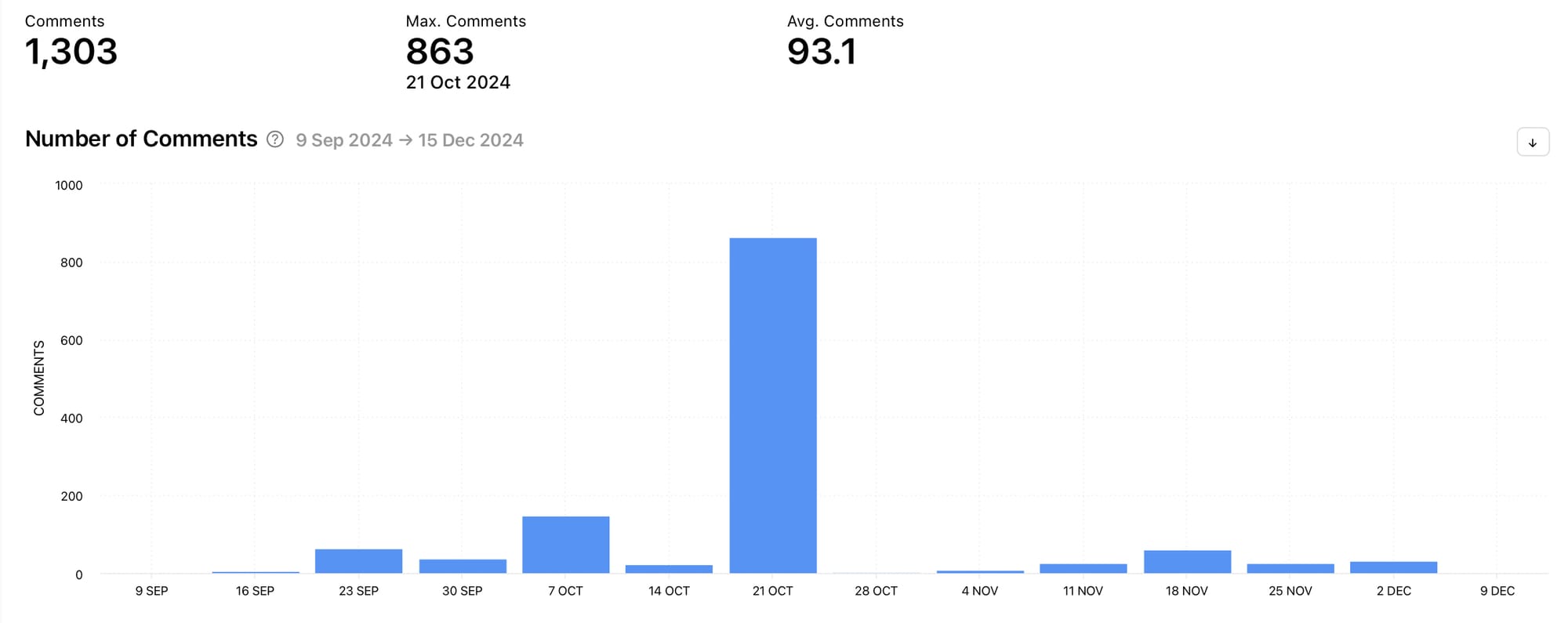
Tracking the number of comments can be very useful but remember that comments are not guaranteed to be positive. Divisive, controversial or shocking content can all spark a serious amount of comments, which may look impressive on a graph but could have negative repercussions for a brand. For this reason, always look at the Number of Comments graph in conjunction with other graphs such as the Fan Change graph and the Number of Likes graph.
Number of Shares
Head to the Number of Shares graph to see the number of shares of posts published during the selected date range. Hover over the bars within the graph to see the exact number of shares of posts published on a specific date. Above the graph, easily pick out the total amount of shares, the maximum number of shares and the average number of shares within the date range.
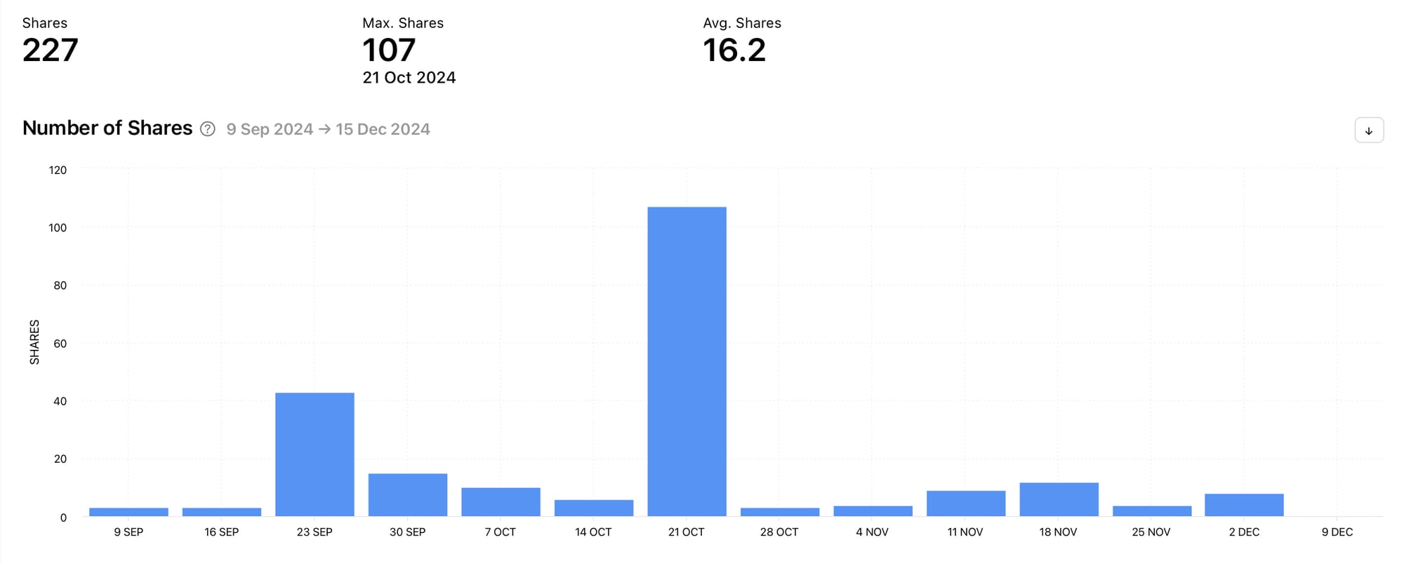
Similarly to comments, the Number of Shares graph indicates whether posts were interesting enough to share. However, it doesn’t provide any further context such as whether people shared posts for positive or negative reasons. For this reason, this graph is best used in conjunction with the Number of Likes graph.
Post Engagement Rate
Wanting to see what your competitor’s overall engagement rate was for their posts? The Post Engagement Rate graph shows the percentage of fans that interacted with posts. This is calculated as the sum of all likes, comments and shares divided by the number of posts and by the number of fans on a given day during the selected date range. Hover over a part of the line graph to see the exact post engagement rate percentage on a specific date. Above the graph, easily pick out the average post engagement rate and the maximum post engagement rate.
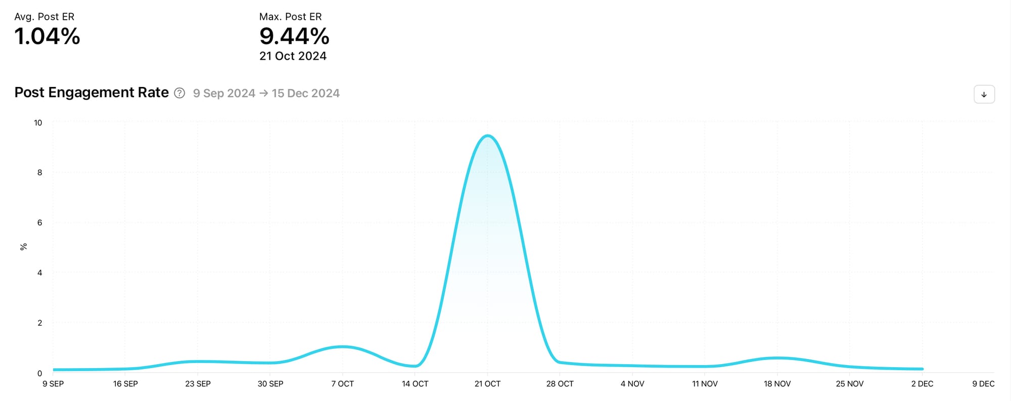
The Post Engagement Rate graph is a must-track if you’re interested in knowing the amount of engagement your competitor is gathering on posts. It includes key interactions viewers can make on posts so you can get a good view of the amount of engagement your competitor regularly brings in, as well as spikes and dips in engagement to pay attention to.
Page Engagement Rate
The Page Engagement Rate graph shows the sum of all likes, comments and shares divided by the number of fans on a given day during the selected date range. This is the percentage of fans that interacted with any posts. Hover over a part of the line graph to see the exact page engagement rate percentage on a specific date. Above the graph, easily pick out the average profile engagement rate and the maximum profile engagement rate.
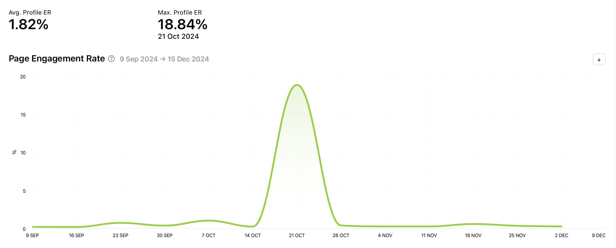
Pay attention to spikes and dips in this graph as well as the status quo.
Individual Posts
Now that you’ve had a good look at the post graphs, dive into your competitor’s individual posts. This information is located at the bottom of the Posts section of your Facebook competitor data or you can jump to this section by selecting ‘All Posts’ from the panel on the left-hand side of the screen when viewing competitor data.
Posts sorted by metrics
Select a post type or view all posts sorted by a specific metric. Choose to view posts by engagement rate, likes, comments, shares, fan change or date.
Each post has several metrics displayed alongside it including the engagement rate and the number of likes, comments and shares for the individual post. This gives you a better overview of how the post performed in other areas as well as your chosen metric.

24 hour data
Select ‘View Post’ on any post to view 24 hour data which shows how the post performed within the first day of posting, broken down by the hour. How a post performed soon after publishing can indicate other things such as how well a post was received by its immediate fanbase and whether the algorithm pushed the post to more people. View 24 hour data for likes, comments, shares and fan change.
Optimization
The Optimization section shows you how your competitor can make choices for their content to boost its performance. This is gold dust when researching what works well for similar brands, as you can snap up this information for your own content.
Best Time to post, Engagement
The Best Time to post, Engagement graph shows the best time to post to get interactions from viewers. This is worked out using the average engagement rate of posts published at specific times of the day and days of the week during the selected date range. Each tile shows the engagement rate by percentage for the specific time of the day and day of the week. Hover over a tile to see the time and day more easily. The darker the colour, the better the time to post for your competitor. The best time to post is also plucked out and displayed above the graph for easy detection.
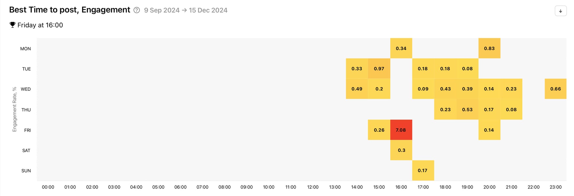
You might want to experiment with posting at times that work well for your competitor.
Post Types
Facebook has a significant amount of post types available to use. With the Post Types graph you can see which post types your competitor favours. View the distribution of post types during the selected date range. Hover over a section to see the percentage and number of posts within a type. Is your competitor posting text posts, links, photos, videos, albums, notes, music, events or reels? Which post type do they use the most? Are you using similar post types to your competitor? Find this info out here.
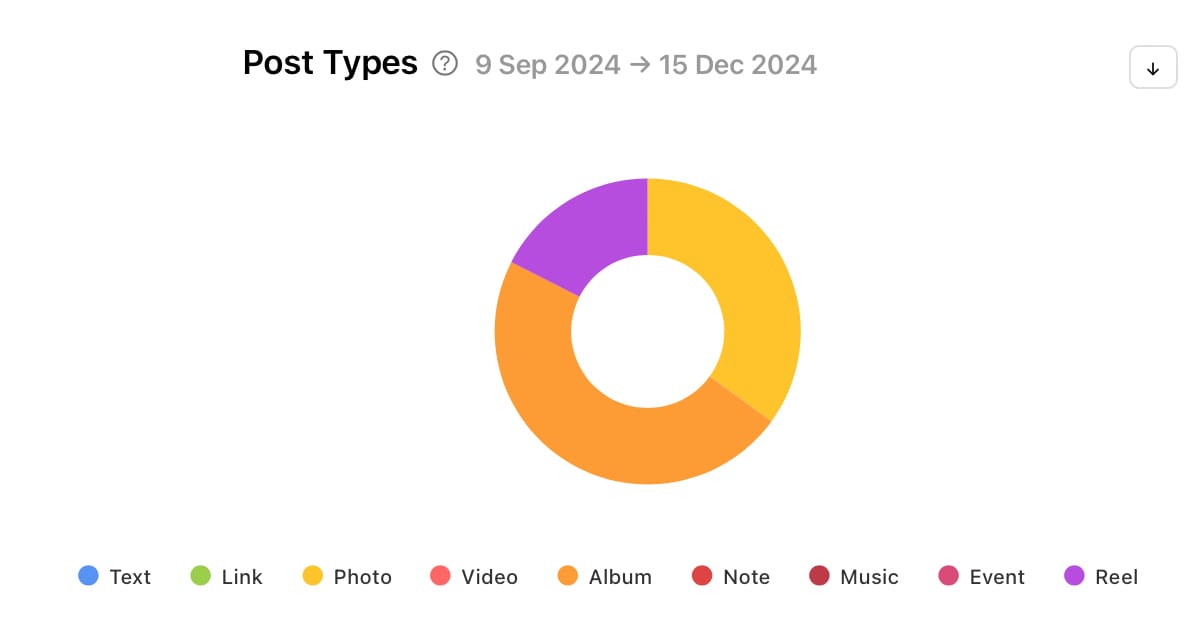
Knowing the types of posts your competitor creates could influence you to follow suit depending on their post performance. If you’ve been neglecting post types your competitor favours, now might be the ideal opportunity to explore them. Use this graph in conjunction with viewing your competitor’s individual posts to get inspiration for content you might want to create for your brand.
Most Engaging Post Types
Now that you know the types of posts your competitor is creating, it’s time to find out what is working best for them. The Most Engaging Post Types graph shows the distribution of post types used during the selected date range by the number of interactions. Hover over a section to see the percentage of that post type and the number of interactions. Which post types were engaged with the most? Find this information out with this graph.
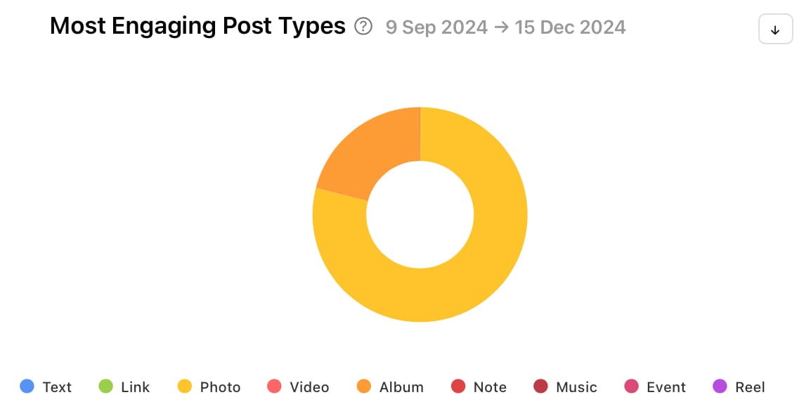
This crucial information can help shape your own content strategy as you explore post types that your audience is likely to engage with too. Using the example above, you might want to take a closer look at your competitor’s photo posts and see if using similar techniques in your photo posts can gain you more engagement.
Top Hashtags by Interactions
When you think of hashtags you might immediately think of Instagram and X, but hashtags are alive and well on Facebook too. Check out the Top Hashtags by Interactions graph to find hashtags that work well for your competitor. This information shows the top hashtags used on posts by the total number of interactions during the selected date range. Interactions include likes, comments and shares. Hover over a bar to see the number of interactions a hashtag gained.

If your competitor is in the same field as your brand, you’re likely to find relevant hashtags here that might also work well for your audience. Even branded hashtags that won’t be applicable to your company can give you an idea of the kinds of branded hashtags you might want to create for your brand on Facebook or across your social media presence as a whole.
Most Effective Hashtags
Similarly to the graph above, the Most Effective Hashtags graph can give you an idea of the kinds of hashtags to add to your own Facebook content. The Most Effective Hashtags graph is worked out as the top hashtags used during the selected date range by the average number of interactions. Hover over a bar to see the number of interactions per post a hashtag gained.

Number of Hashtags
Get an idea of how many hashtags your competitor regularly puts on their posts. This can give you a clue as to what has been working well for them so you can toy with a similar setup. The Number of Hashtags graph shows the number of posts published during the selected date range grouped by the number of hashtags used. Hover over a bar to see the exact number of posts that were published with a specific number of hashtags.

Track your competitors on Facebook, Instagram and X today with Minter.io - the social media analytics tool for businesses online. Unlock the graphs in this article in an instant. Try it now!
Try Minter.io now→
