How to use competitor data to grow on Twitter
Imagine how strong your social media strategy would be if you could grow from your competitor’s wins and learn from their mishaps without the trial and error. With competitor data, you can spy on your rivals from the comfort of an internet connection, so put the magnifying glass down and let’s get ogling.
We’ve given you the run down of your Instagram competitor’s data in a previous article and today we’re diving in deep with competitor analytics on Twitter. With a few button clicks, you can get an avalanche of info at your finger tips. This truly is the secret you’ll wish you’d have known about sooner…
Grow with Twitter competitor analytics
Competitor analytics unlock extremely valuable information that can be transferred easily to other brands in the same area of business. Whether you’re just starting out, attempting to rise out of a slump or striving for a period of growth, information on competitor Twitter accounts could help you reach your goals. You can get limited insights directly within Twitter, however with Minter.io you can get so much more. Access insights on the audience, content, optimisation and engagement of your competitors for a true all-round approach.
Let’s go through the competitor data you can track with Minter.io for Twitter accounts…
Audience
As your competitors are likely to be selling similar products and services to your business, it’s also likely they’ll be targeting a similar audience. Therefore, having information about the audience of your competitors can be helpful in illuminating who you could be targeting while shedding light on gaps in your strategy or the market at large.
Followers
Before we dive into the details of your rival’s audience, let’s first look at the trajectory of that following. View at a glance the total number of followers and follower change metrics within the selected time frame. Is the following increasing or decreasing over time? How can this inform your content decisions on Twitter?
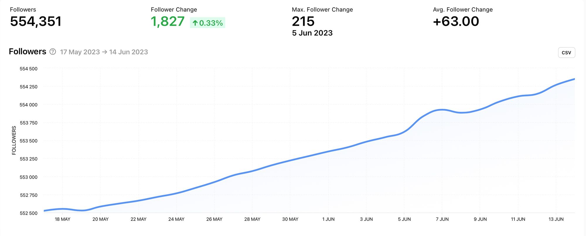
Notice that in this example, the total following is increasing at a steady rate over time. This is a good indicator that the social media strategy in place for this brand is working. If the overall trajectory was negative, the information could still be valuable - you might just want to take notes on what not to do instead.
Follower Change
The follower change graph shows the total amount of followers lost or gained on a daily, weekly or monthly basis. This makes it really easy to pick out specific time periods where the follower count rose or dropped.
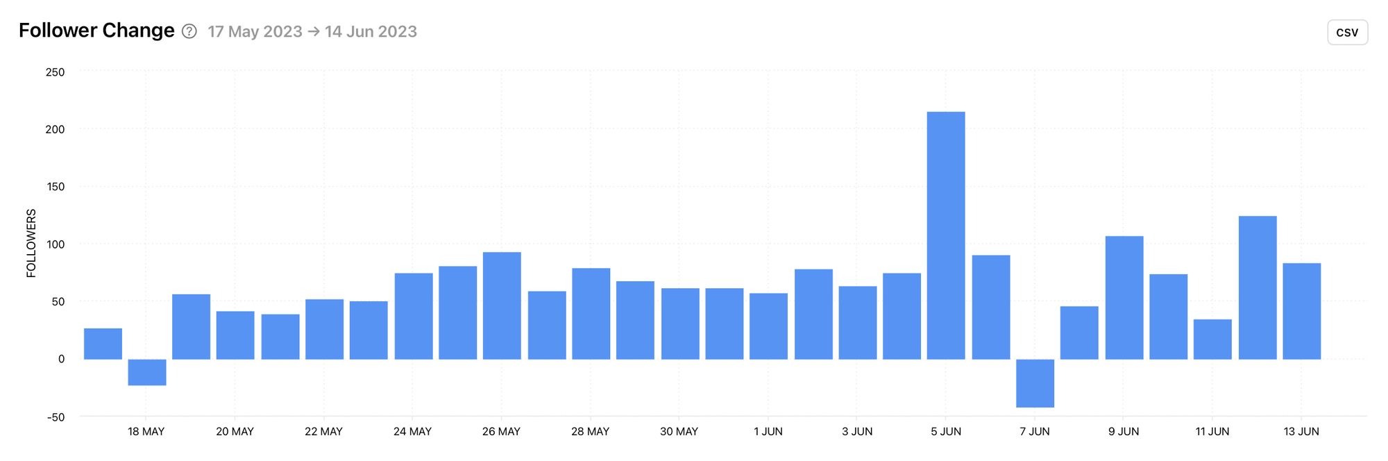
In this example, you can see a date where the follower change spiked as well as a date where the follower change dipped. Using this data, you can pinpoint content that might have caused these anomalies and learn why certain posts resulted in specific reactions. From there you can replicate content that gained positive audience growth and avoid content that resulted in follower loss.
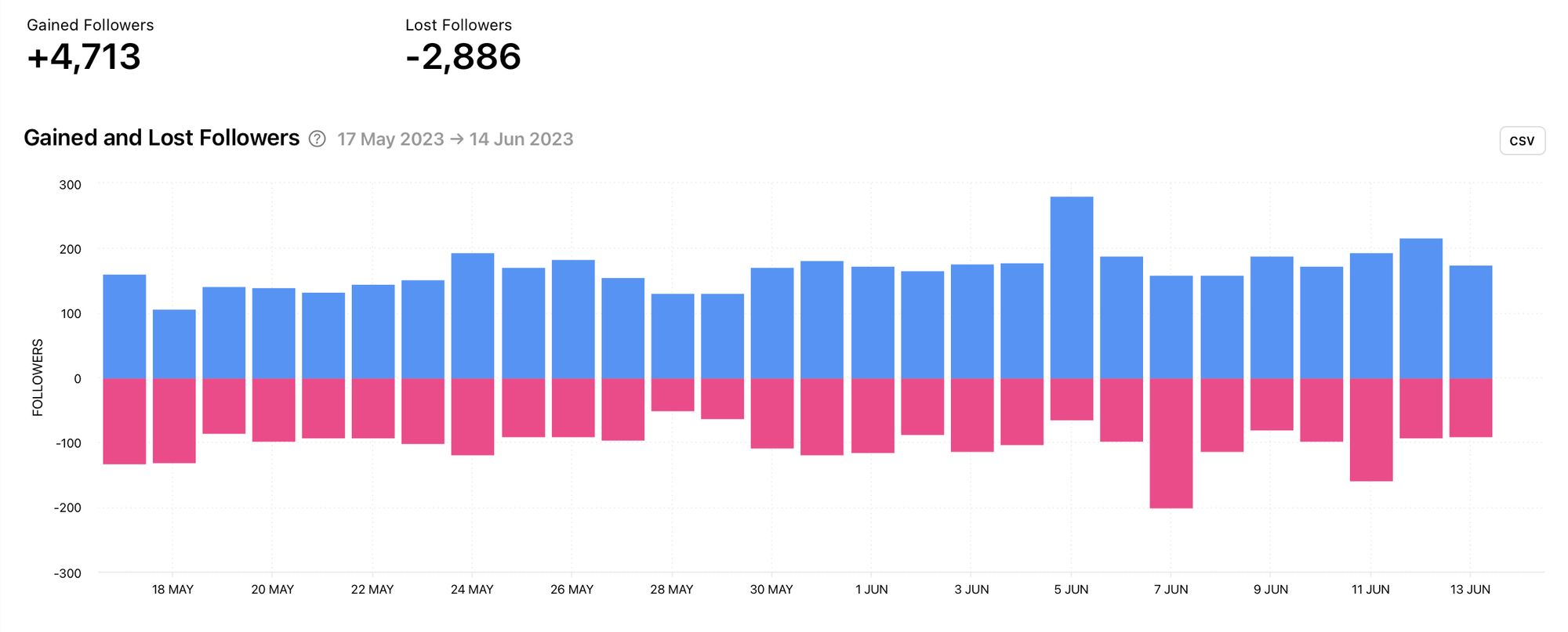
Gained and Lost Followers
An even more detailed breakdown of follower change is displayed in the gained and lost followers graph. Instead of taking into account the total amount of follower change as a whole, this breakdown clearly shows exactly how many followers were gained and lost on a day-to-day basis. The blue bars show the number of followers gained while the pink bars show the number of followers lost. Use this for a more precise look at the follower change of your competitor.
Follows
The follows graph shows the amount of Twitter accounts your competitor follows. A steady follows graph is fairly normal, while a rapidly increasing follows graph could show malpractice in the form of follow-for-follow which could skew other data. A follows graph that has peaks and valleys could show another malpractice in the form of follow/unfollow. Being aware of this could have a ripple effect in how you interpret other data from this competitor.
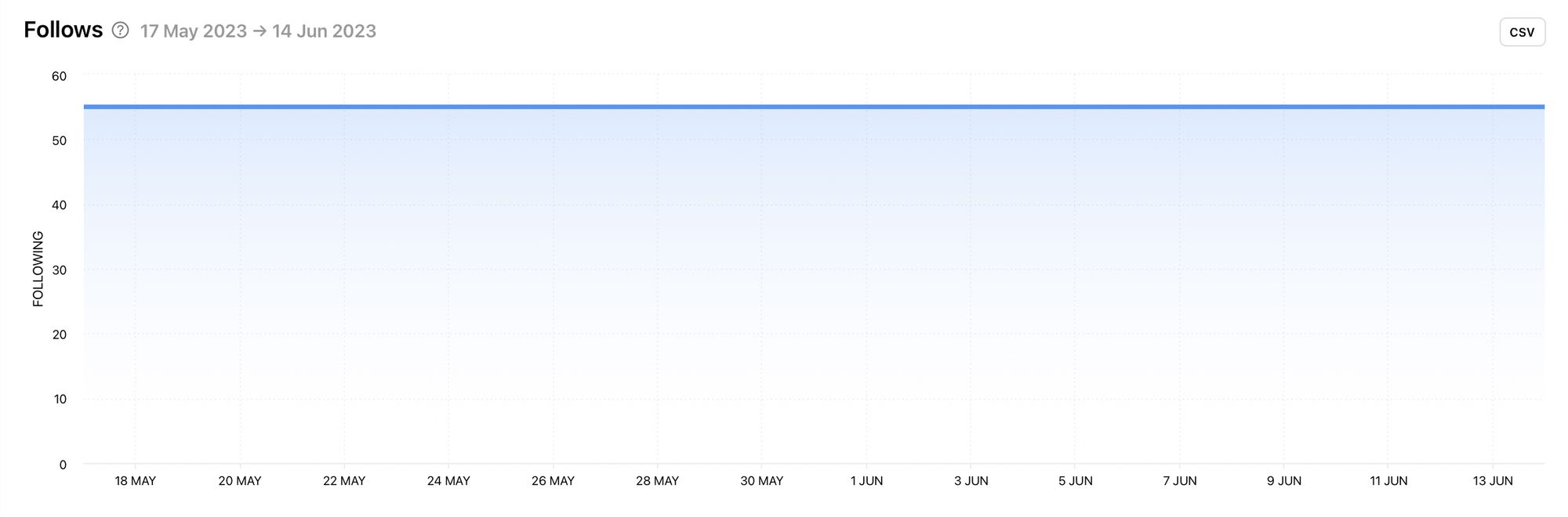
This graph is a good example of what you would expect to see from a large brand online. Giant brands are likely to follow even fewer accounts. Smaller brands or local brands might follow more accounts as they seek to embed themselves into a community. If the competitor you’re viewing has a single addition to the number of accounts they’re following, look into it. This could signify a collaboration worth noting.
Gender of Followers
While knowing the numbers behind your competitor’s audience is useful, learning details about the make-up of the audience is even better because it makes targeting, content crafting and strategy easier. Is your competitor’s audience mostly male or female? How large is the majority or is there an even split? Is it similar to your current audience?
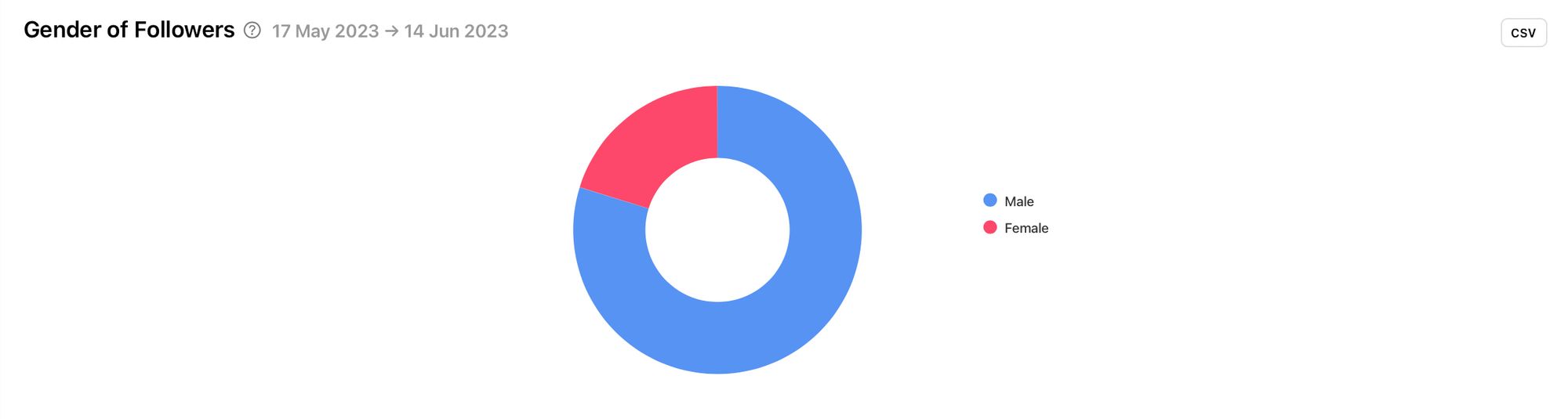
Knowing this information about your competitors could inform the content you choose to create. Are you targeting a similar group of people? If so, it could be a good idea to see how this influences the tweets your competitor publishes. If your audience is the total opposite, why might this be the case? Do you need to course-correct or are you serving a different demographic within the same space? How can you use this knowledge to your advantage?
Countries of Followers (map)
It’s valuable to know where your competitor’s followers are located, especially when comparing this data with your own audience. Viewing locations using a map makes it clear to see whether the competitor’s followers are located in a specific pocket of the world or if they are spread out worldwide. The darker the blue, the higher the amount of followers.
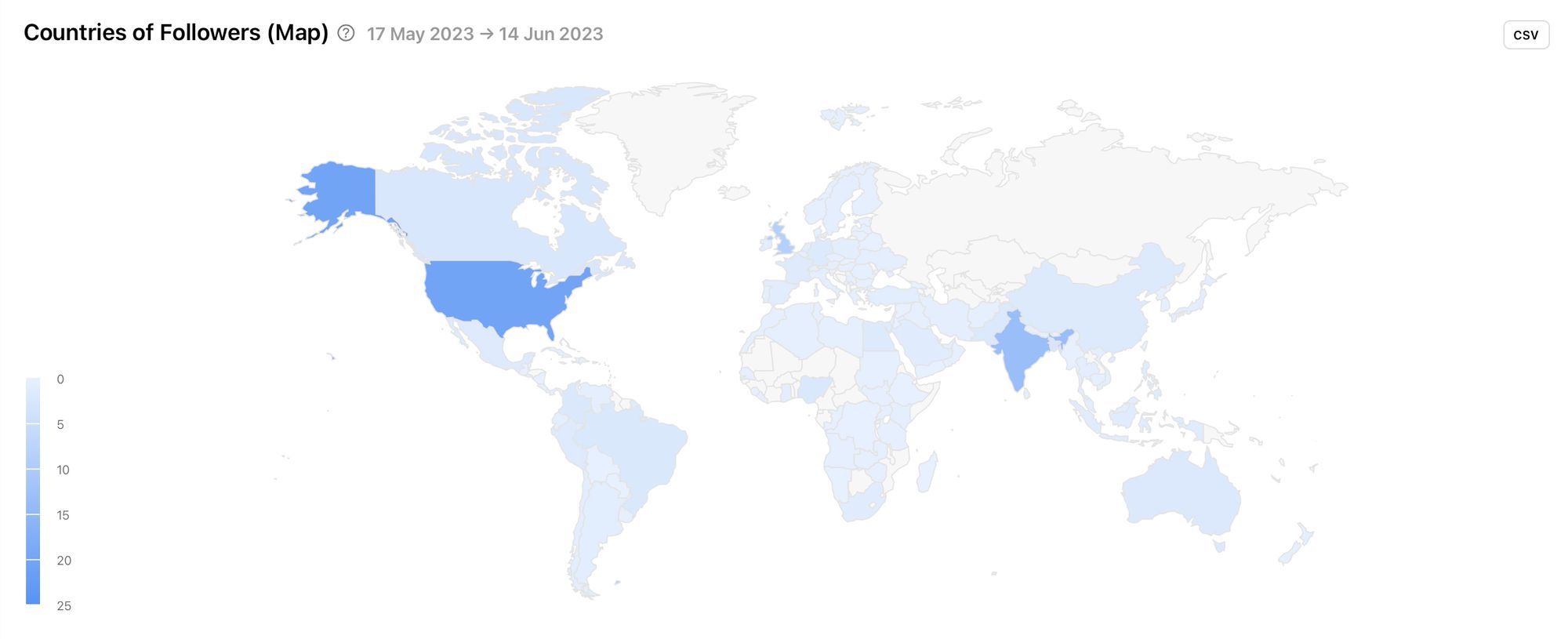
The size and location of your competitor, as well as the way their socials are set up, could influence this data. Does your competitor have multiple Twitter accounts set up for targeting different countries or do they use one Twitter account as a central hub? Are your followers in similar locations or are they completely different? How could this influence your strategy? Are there more places you could branch out to which are working for similar brands?
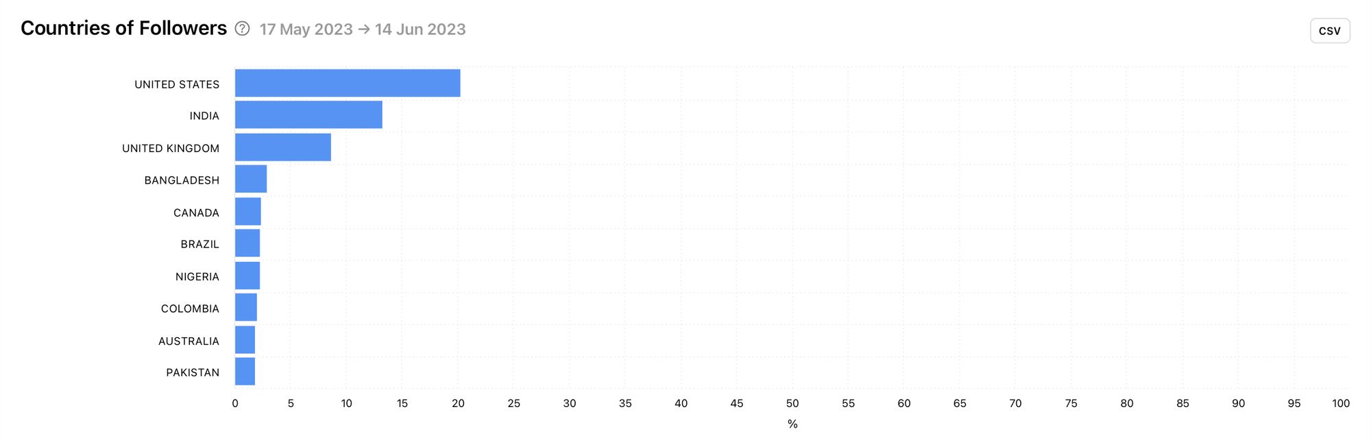
Countries of Followers
Another way to view the countries of your competitor’s followers is through a bar graph. This makes it very easy to see which countries make up the highest amount of the competitor’s audience.
Cities of Followers
Minter.io analytics breaks down the locations of the competitor’s Twitter followers even further. Within a specific country, there can be many cultural differences, events, traditions, important dates, monuments and information worth knowing about that is relevant to specific cities. This is really important to know when growing your audience and targeting people from a specific place. For example, different content is likely to appeal to people in New York when compared with people in Austin, Texas - even though they’re in the same country.
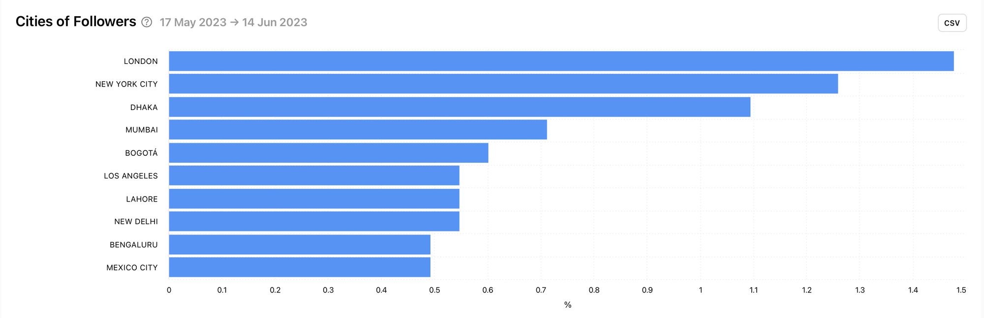
You can use this competitor data and compare it with the cities of your followers. If you want to grow in the same spaces as your competitor, use this graph to take into consideration the best cities to target. From here you can create content that could be relevant and relatable to that audience.
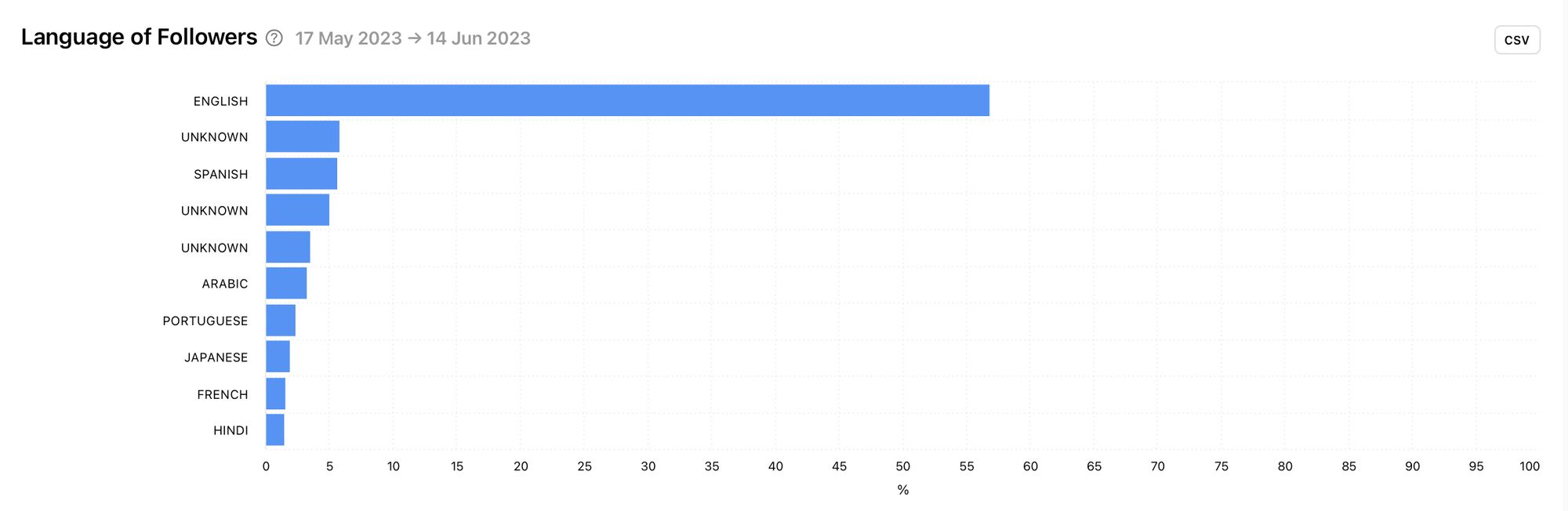
Language of Followers
The language of your competitor’s followers can shed light on how they communicate on Twitter. The example below clearly shows that the main language of this competitor’s followers is English. Therefore, it makes sense that the brand would publish tweets written in English. Are you composing tweets in the same language as your competitor’s followers? If not, why not?
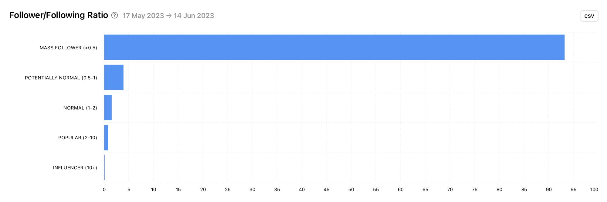
Follower/Following Ratio
Another neat little metric worth taking a look at is the follower/following ratio. This graph provides insight into the quality of the audience as it shows the follower to following ratio of the competitor’s followers.
Tweets
Unlock tweet insights to view the content strategy of your competitor. See what they tweet, how often they tweet and how effective their tweets are. With data on individual tweets in addition to metrics over a selected time frame, Minter.io enables you to draw inspiration from what works while sidestepping potential pitfalls.
Number of Tweets
View how much your competitor tweets and how often. How many tweets does your competitor usually publish? Is their tweeting schedule consistent or sporadic? Are there certain days of the week when they tweet more?
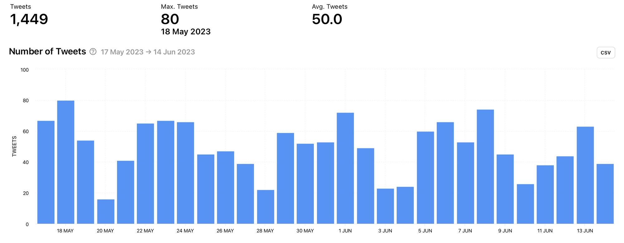
Notice that in this example, there are dips in the amount of tweets published on the weekends. Is this something your brand could benefit from or is it revealing a gap that your brand could fill?
Number of Retweets
Retweeting is a great way to interact with other content and connect with other accounts on Twitter. Check out the amount of times your competitor got retweets on content they published within a specific time frame.
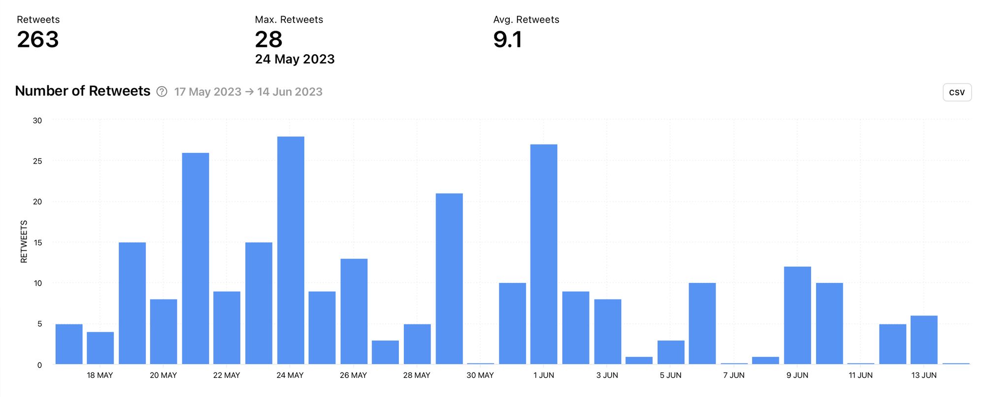
Notice the number of spikes in this example. You can use this information in conjunction with other graphs to determine why there were so many more retweets on these dates. You can also determine whether these spikes were positive engagement and see if you could use this knowledge to gain more positive interaction with your tweets too.
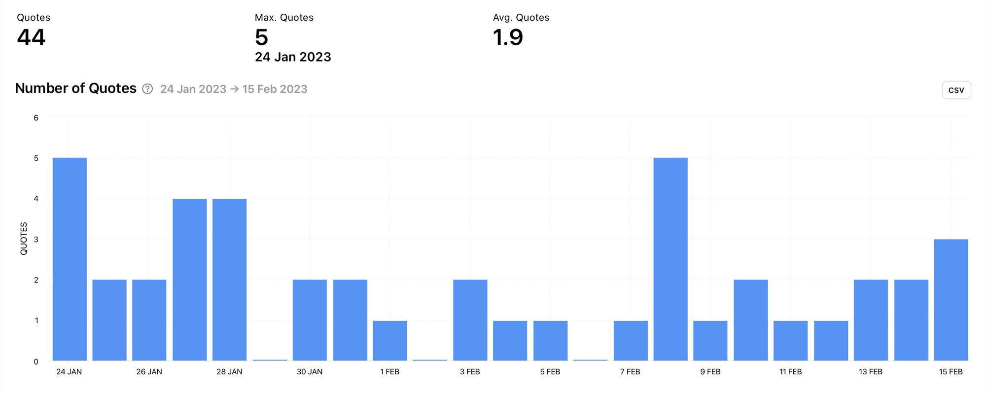
Number of Quotes
View the number of times your competitor’s tweets were shared as quotes. If the number is significant, you may want to steal the strategy used to spark this kind of interaction with your tweets. Pinpoint days where the number of quotes was highest to find the most effective strategies.
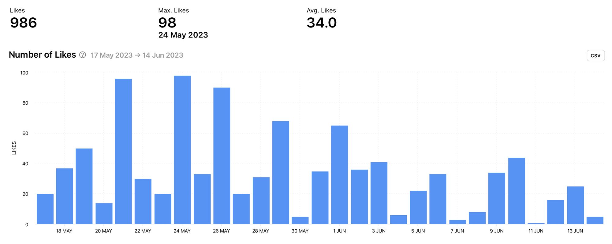
Number of Likes
The number of likes is a positive engagement metric, so when your competitors are getting lots of likes, it’s worth taking note. Check out the number of likes graph to find days that produced a large amount of likes and use this knowledge to find the content that sparked those likes. Effective inspiration gets so much easier when you have the data to back it up.
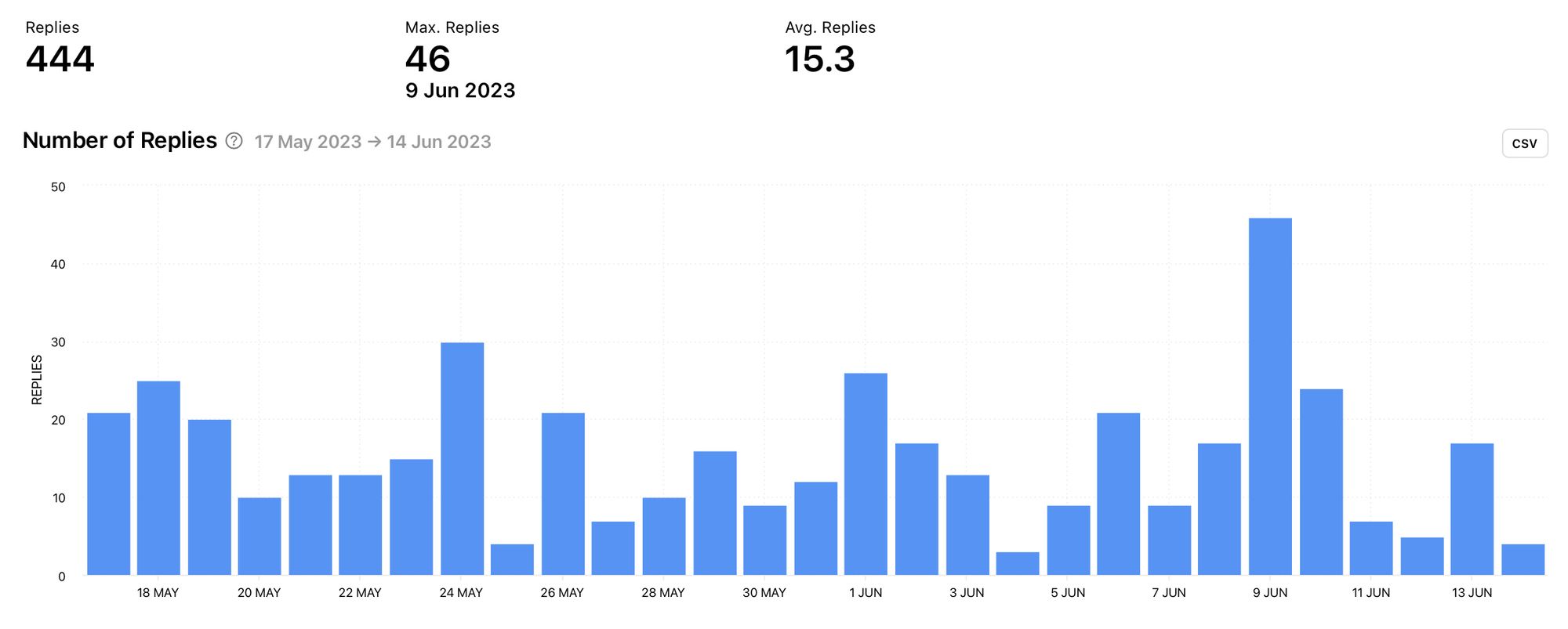
Number of Replies
Use the number of replies graph to pinpoint days, and in turn content, that gained high levels of replies for your Twitter competitor. When looking at the number of replies, be aware that even though this is an engagement metric, that doesn’t automatically mean the responses were positive. However, getting your community talking is a good way to kick the algorithm into showing your content to more people, so take note of the content that works for your competitors.
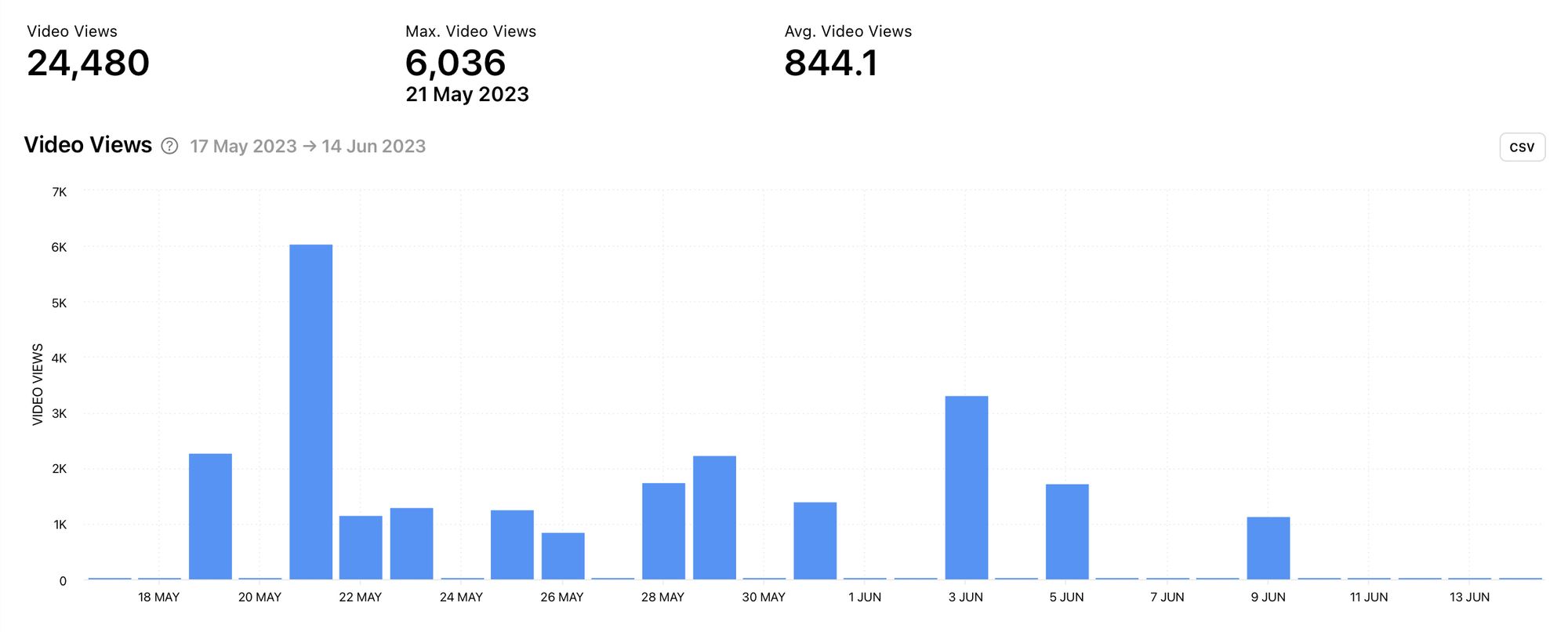
Video Views
When your competitor publishes video content to Twitter, Minter.io tracks the amount of times these videos are viewed. Does video content work well for your competitor? If so, when did these videos gain the highest amount of views? You can use this information to inspire your video creation and to post videos on days that worked well for your competitor.
Tweet Type
There are a lot of ways to communicate on Twitter. Knowing the types of tweets your competitor publishes is useful because it shows you how they typically interact with their following.
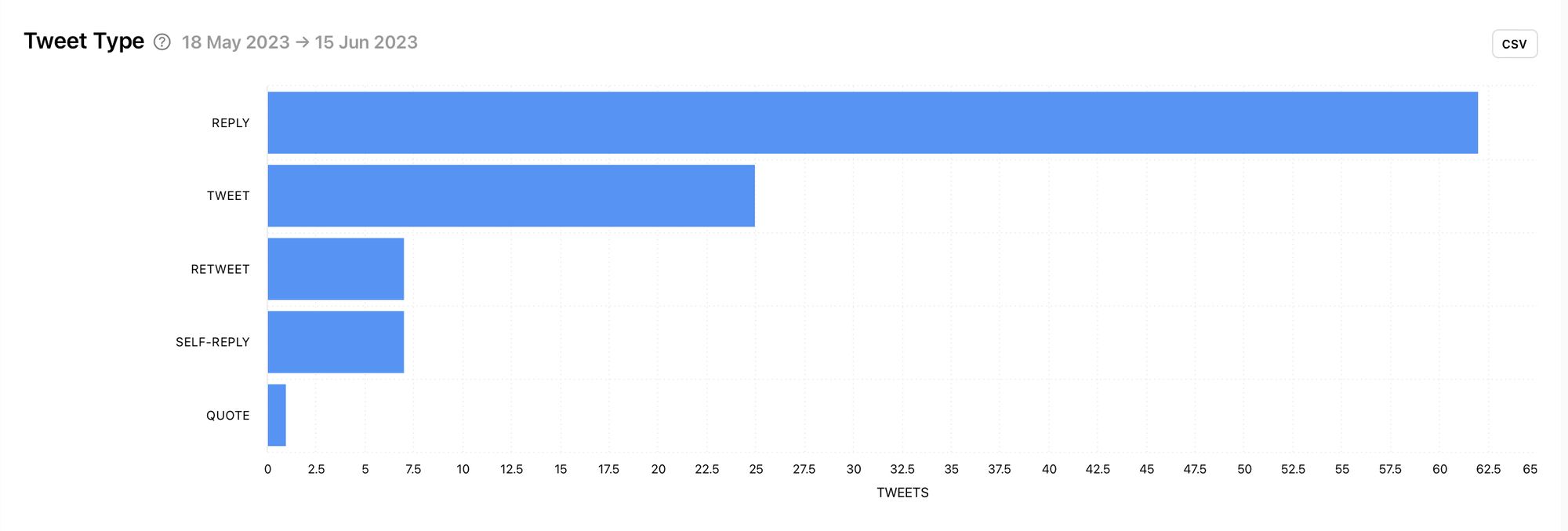
In this example, the top tweet type for this competitor is reply. This indicates that while the number of tweets is high, a large proportion of those tweets were probably responding to other people. This could influence how you tweet. Do you communicate with your audience in a similar way to your competitor?
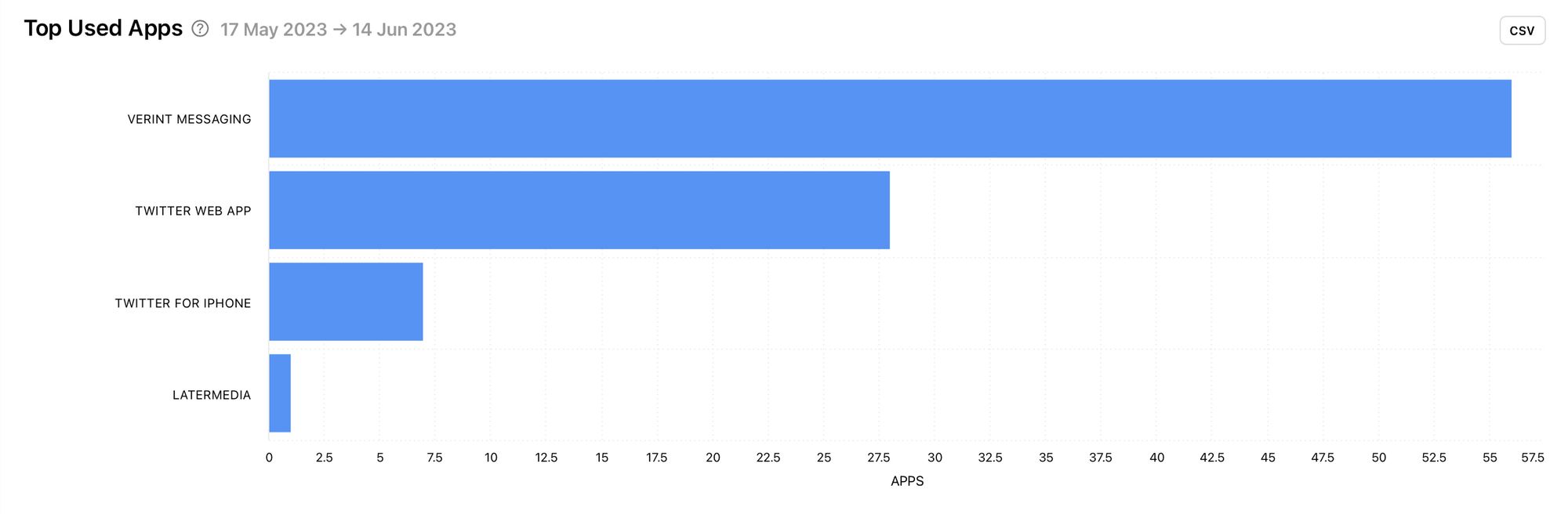
Top Used Apps
There are a number of tools on the market that can help you publish and schedule tweets for your business. Discover apps a competitor uses to publish tweets and get great ideas for tools worth utilising.
Tweet Engagement Rate
Engagement is a metric every business should be tracking as it drives the algorithm to push content to more people. When looking at competitor data, the tweet engagement rate graph clearly shows peaks and dips in engagement.
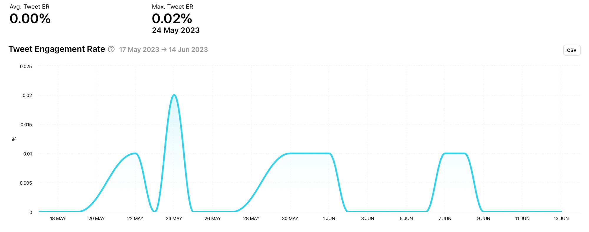
Look at the major peak in this competitor’s graph. You can pinpoint the exact date to find the content that led to this result. Remember, not all engagement is guaranteed to be positive for a brand, but getting insight into content that drives engagement is vital in helping you build an effective content strategy.
Profile Engagement Rate
The profile engagement rate takes into account the sum of all retweets, quotes, likes and replies divided by the number of followers. It is the percentage of the follower count that reacted to tweets.
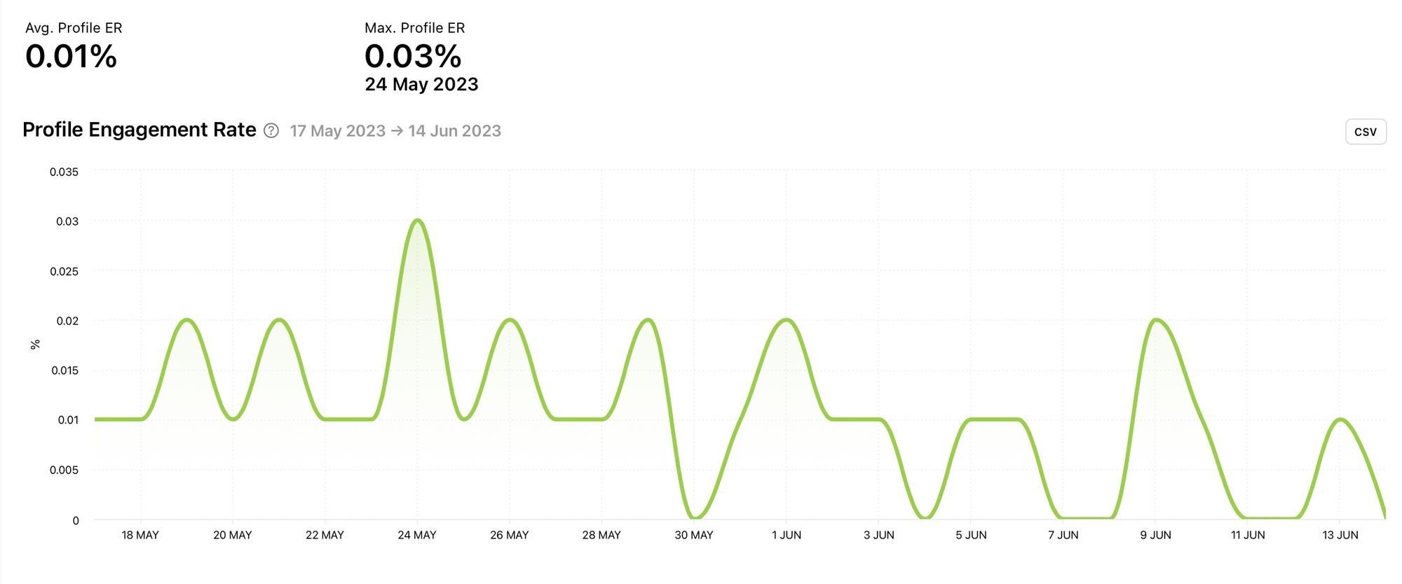
In this example, there are many peaks and dips. You could use the dips to determine the types of tweets to avoid while leaning into content that encouraged the peaks.
Tweets by Metric
Check out tweets created by your competitor and view them by engagement rate, retweets, quotes, likes, replies, video views, follower change or date. Here you can get inspiration based on the best performing content for your competitor, sorted by the metric that means the most to you.
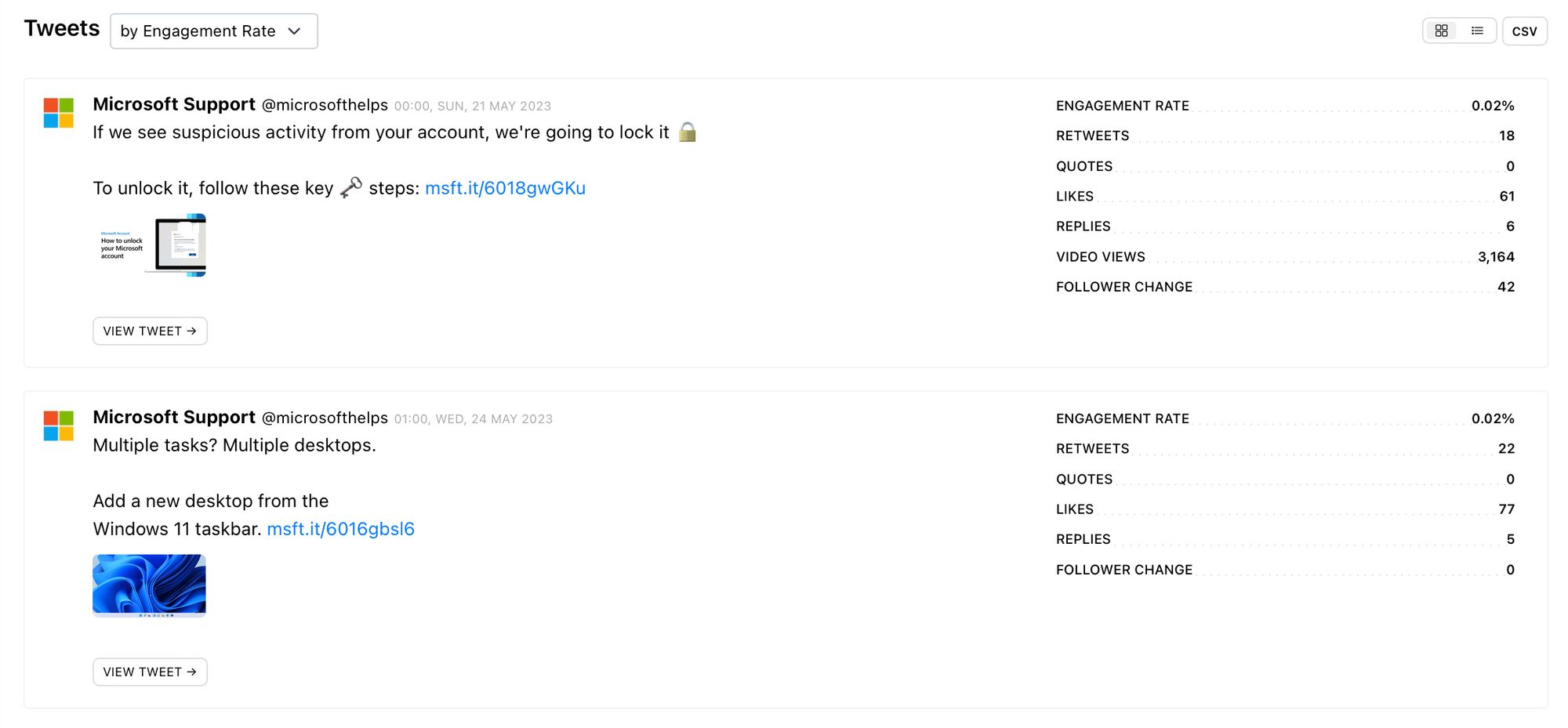
See the engagement rate, retweets, quotes, likes, replies, video views and follower change for a tweet while viewing the copy and any other media associated with those metrics. Why do you think the top posts have performed well for your competitor and how could this information shape your content strategy?
Select ‘View all’ at the bottom of the screen to view more posts from this competitor or jump to the ‘All Tweets’ section using the panel on the left-hand side of the screen.
24hr data
Click the ‘View Tweet’ button to view a specific tweet in more detail. From here you can also choose to view the tweet on Twitter at the click of a button.
Scroll down to see data from the first 24 hours of the tweet’s publication. This includes retweets, quotes, likes, replies, video views and follower change. Recently published content on Twitter is favoured by the algorithm, meaning your content is most likely to be pushed to your audience (as well as new viewers) within the first 24 hours of publication. Therefore, data gathered within this time frame is particularly important to take into consideration.
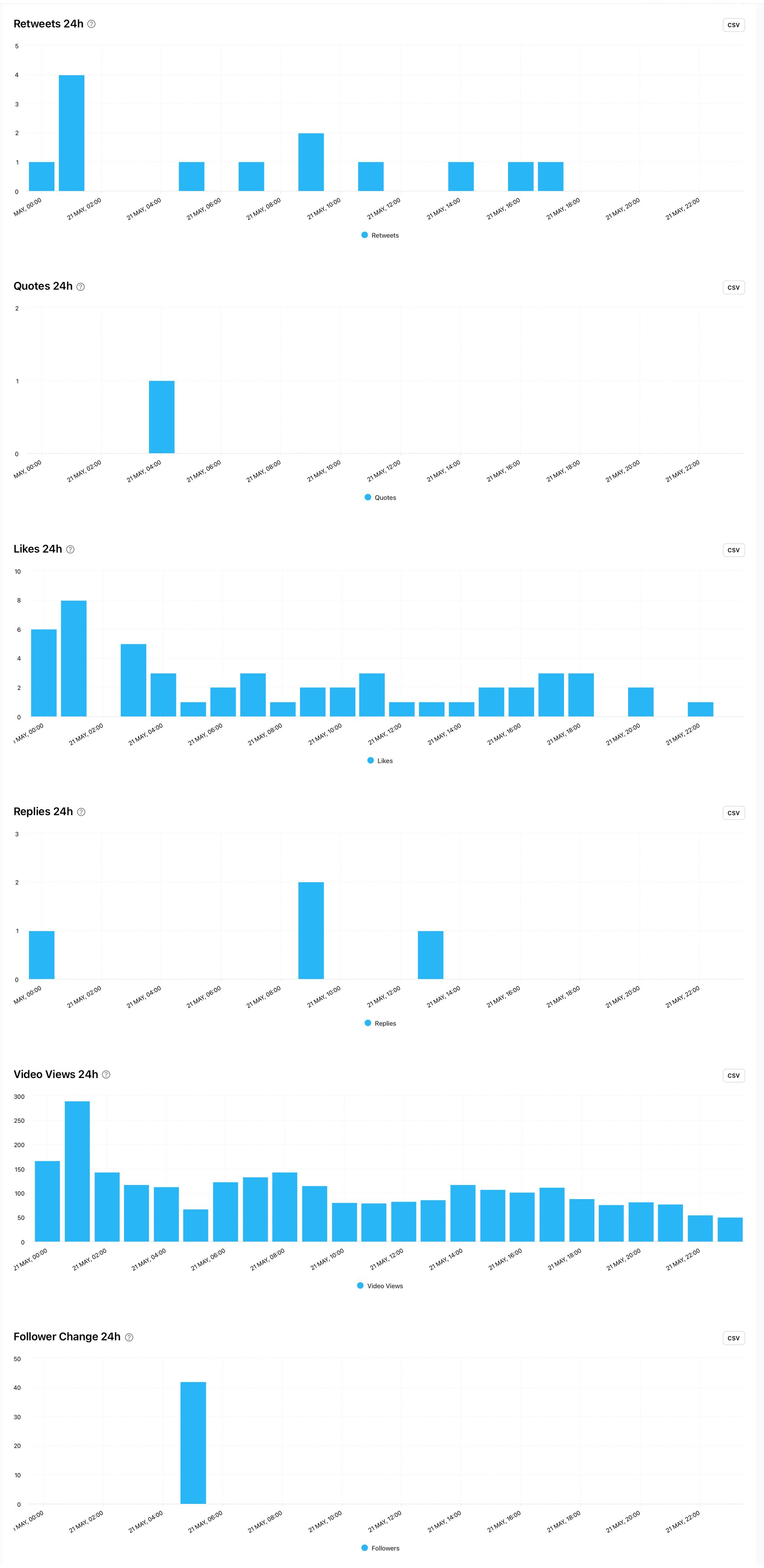
Notice how gradual or dramatic the decline is for each metric. In the above example, you can see that after an initial spike, the video views graph has a very gradual decline. This could indicate that this video is worth taking note of as the viewership was fairly consistent over the 24 hour time period. Do your 24 hour graphs look similar to your competitor’s or is there something you could learn and apply to your content to boost views and interaction in the early stages after publication?
Optimization
Looking at how your competitors could optimise their Twitter presences for social media success could provide valuable insight into optimising your own tweets. If you’re targeting a similar audience with similar products and services, it makes sense that optimisation pointers that work for your competitors might be worth trying out yourself.
Best Time to post
The best time to post graph tracks the average engagement rate on tweets published at specific times of the day and on different days of the week. The darker the colour, the better the result.
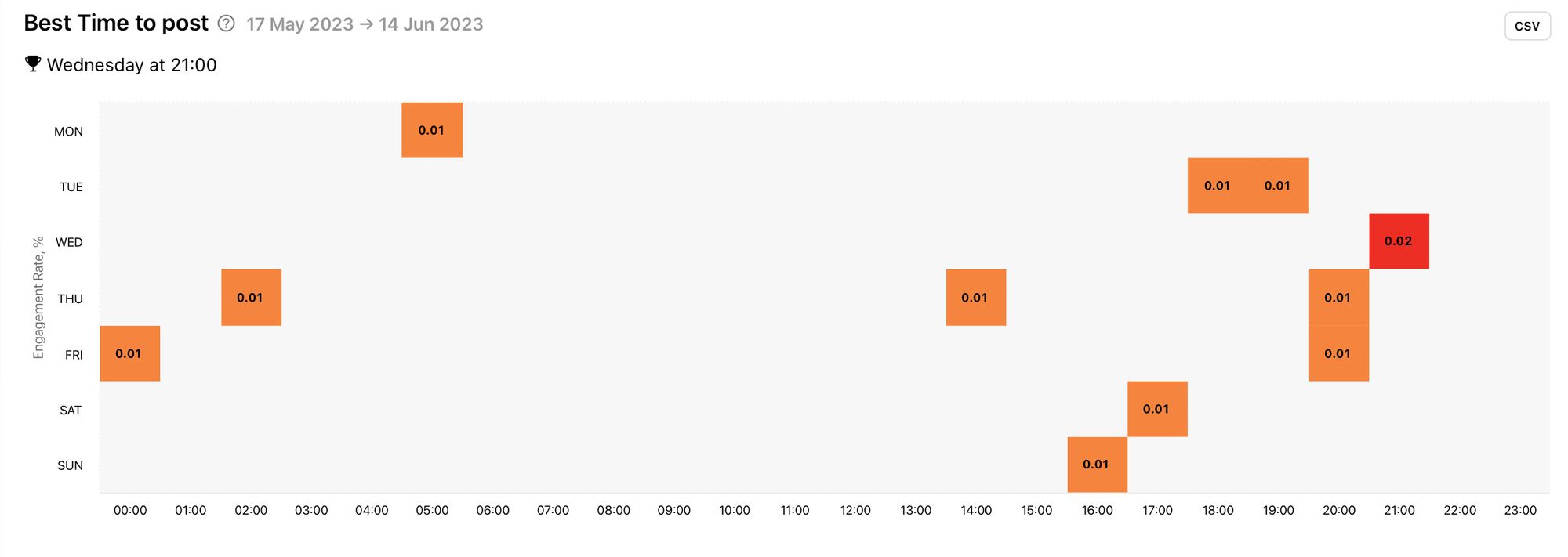
In this example, you can see that the best time to post for this competitor is Wednesday at 9pm. It may be worth testing times that work well for your competitor to see if changing this unlocks more engagement on your tweets.
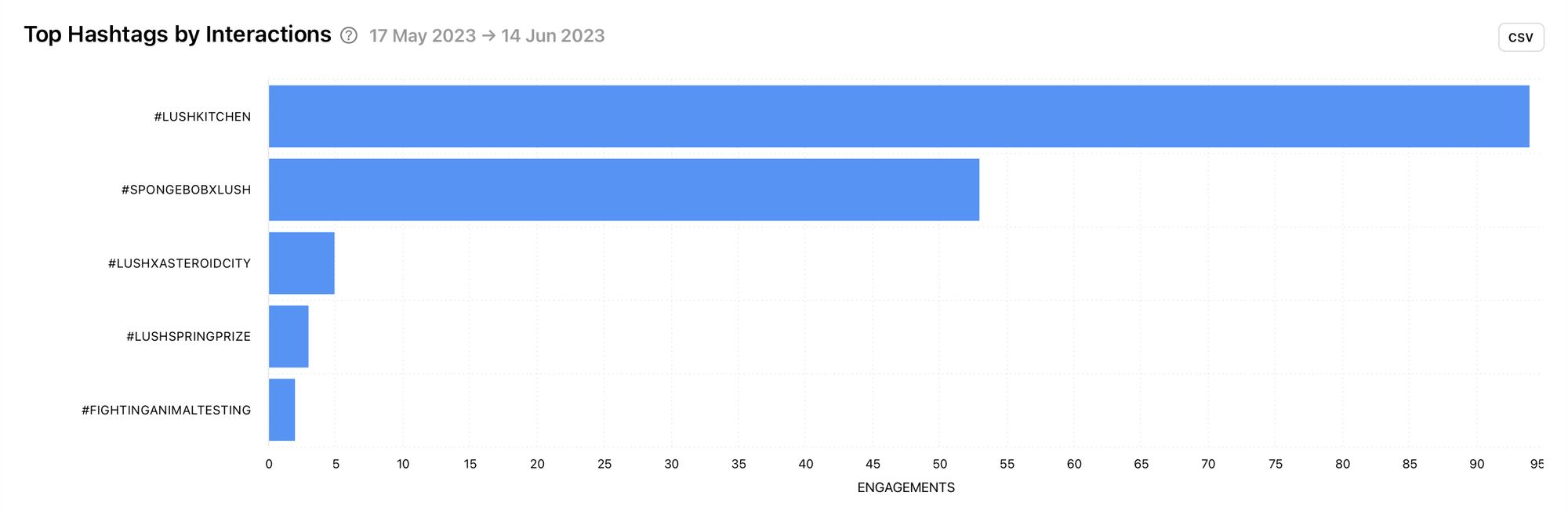
Top Hashtags by Interactions
Find a flurry of effective hashtags relevant to your target audience with the top hashtags by interactions graph of your competitor. This graph shows the hashtags on tweets that got the highest total amount of interactions on them, giving you an instant inspiration boost with hashtag examples that actually work.
Most Effective Hashtags
If you’re after the most effective hashtags your competitor used within a selected time frame, the most effective hashtags graph is for you. This shows the top hashtags by the average amount of interactions.
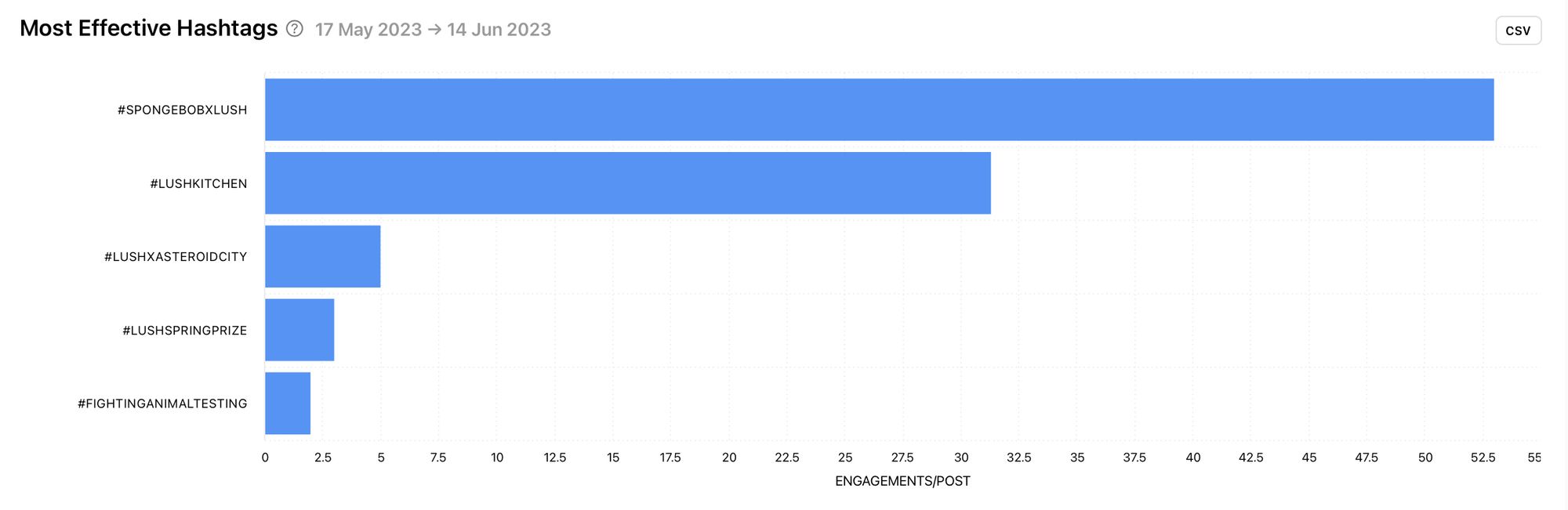
In this example, the vast majority of hashtags are brand-specific hashtags. While these hashtags won’t be applicable to your brand as they are unique to your competitor, notice how well these brand-specific hashtags are performing. Check out how this competitor uses their brand name in hashtags to determine how you could craft your own.
Number of Hashtags
For further insight into how your competitor uses hashtags, view the number of hashtags graph. This displays the number of tweets grouped by the number of hashtags used. Does your competitor always use hashtags or do they save them for something specific such as a hashtag campaign?
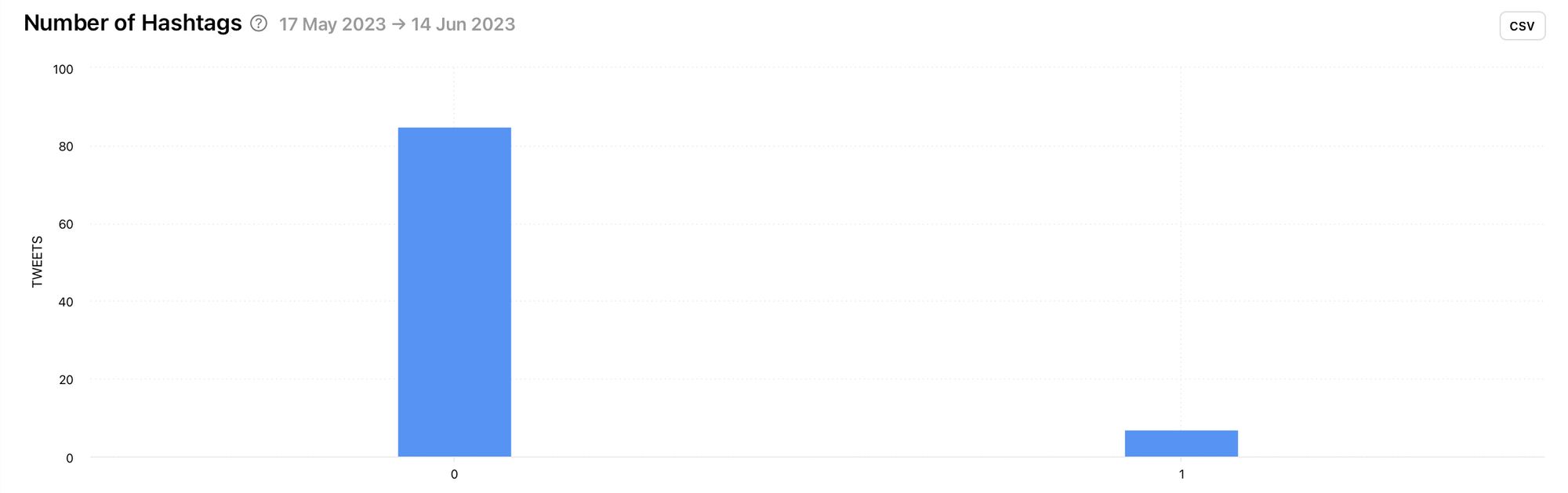
With Minter.io you can track specific hashtags. You can use this feature to gain insight into competitor hashtag campaigns or group together information on your own hashtags.
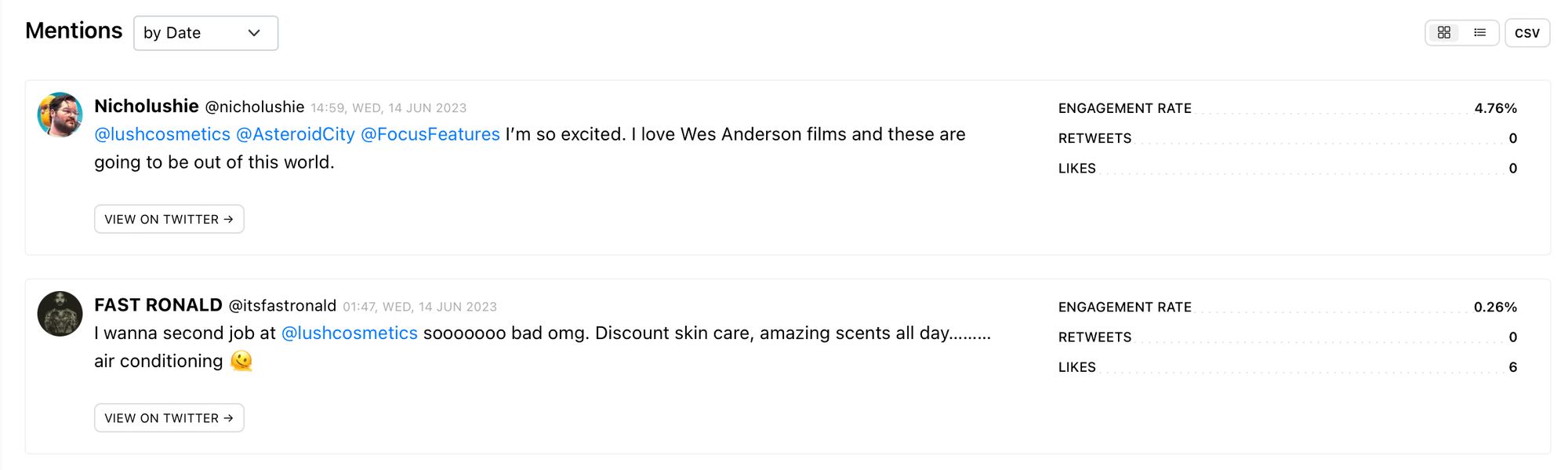
Mentions
Listening in on conversations about your competitor on Twitter can give you a lot of insight into the customer experience. By tracking competitor mentions, you can be the proverbial fly on the wall. Mentions are all about how other people are talking about the brand. Find out how people really feel, what they love and what they don't love, and watch your competitor respond to tweets they’re mentioned in. Can you boost your game and plug in gaps by taking notes on the mentions of your rivals?
Number of Mentions
The total amount of times your competitor is mentioned is tracked with the number of mentions graph. This can help you view how often your competitor is tagged in tweets and enable you to identify time periods where mentions skyrocketed.
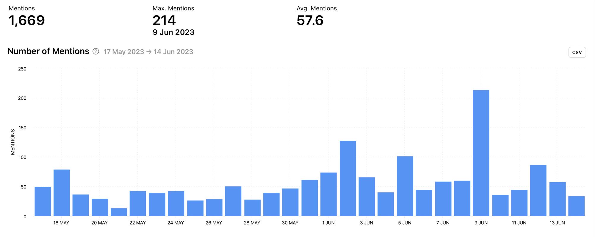
In this example, you can see that the competitor mentions peaked on June the 9th. With this knowledge, you can find the mentions published on this day and determine whether mentions peaked for positive or negative reasons. Get inspired by the positive and learn from the negative.
Likes (Mentions)
Check out the number of likes on mentions within the selected time frame. Remember that likes on mentions don’t necessarily mean that the mention was positive for the brand. It could merely mean that a lot of people agreed with the mention. Take this into consideration when using this graph.
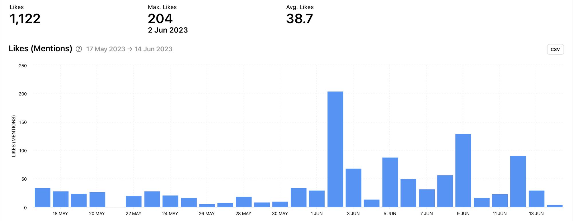
In this example, likes on mentions peaked on June the 2nd. What sparked this surge of interaction and how can you use this information to encourage positive mentions and avoid negative ones?
Retweets (Mentions)
View the number of retweets on mentions for even more data about interaction with mentions. What is causing people to retweet a mention? Is it good news for your competitor and how can you spark positive retweets for your brand?
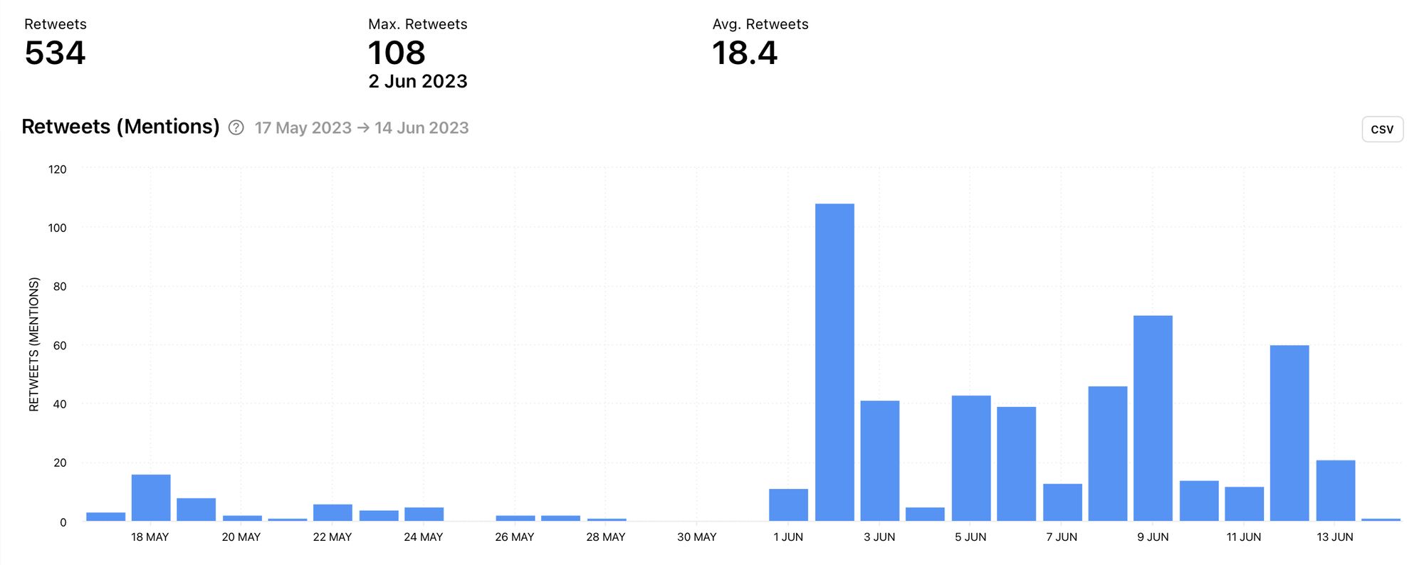
When looking at this graph in conjunction with the previous graph, there is a clear correlation. When data like this lines up, it’s worth taking a deeper look into the content that drove the high level of interaction.
Unique Users (Mentions)
Check out the amount of unique accounts that mentioned your competitor within the selected time period. Are there a few superfans driving the mentions or is there a significant amount of the competitor’s customer base chiming in?
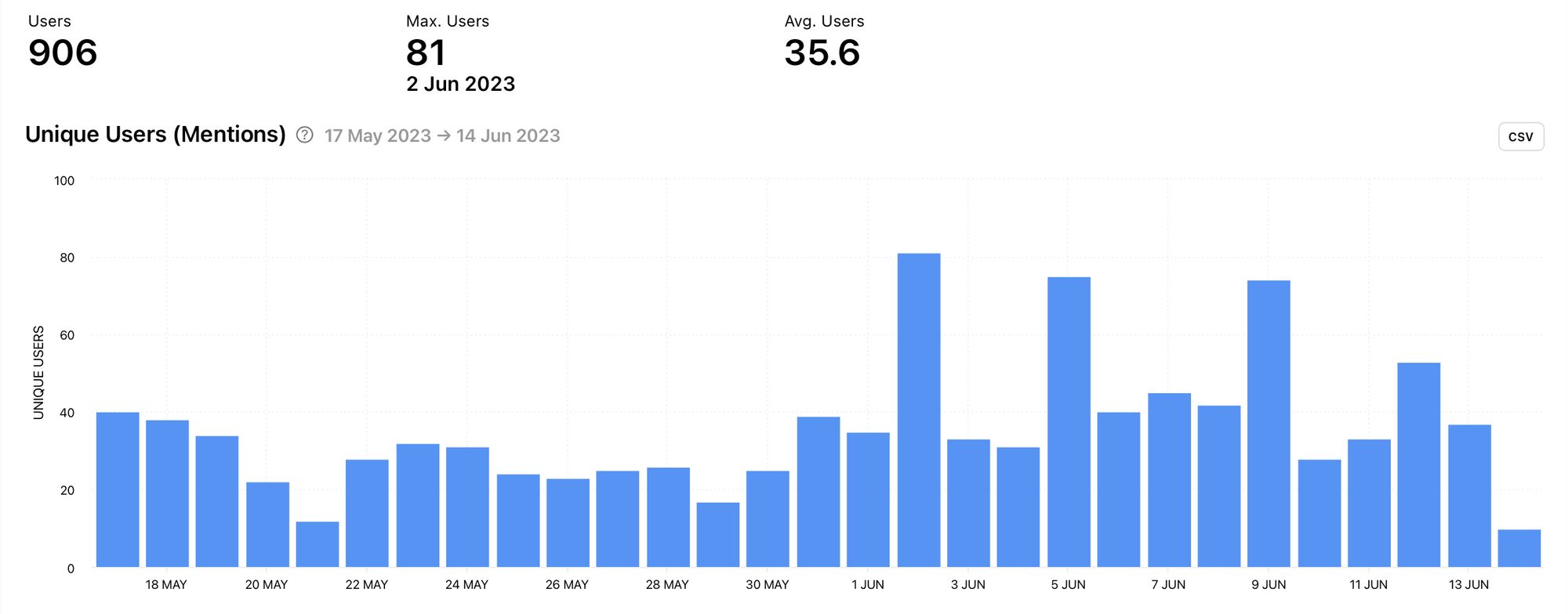
This information can help you analyse whether days that peaked in mentions originated from a small group of people or not. If there weren't a significant amount of unique users on the days with peaks, this could indicate that one person mentioned your competitor repeatedly.
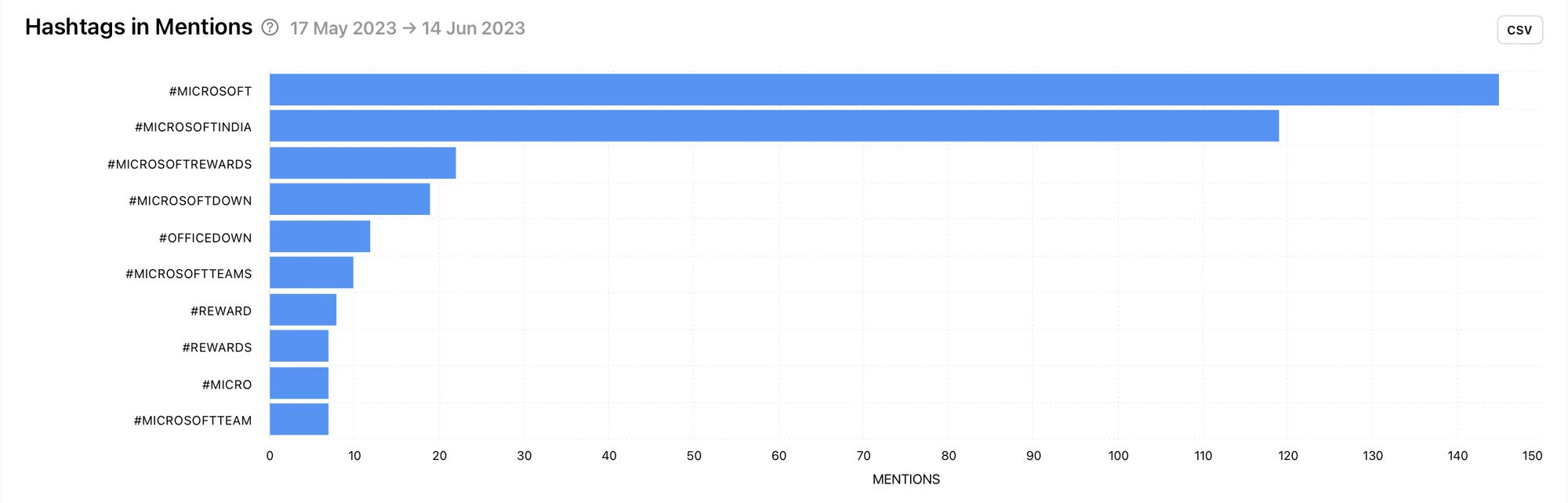
Hashtags in Mentions
Get a clearer view of the tweets which mentioned your competitor by looking at the hashtags attached to the same tweets as the mentions. These hashtags can show you how other people interact with a brand similar to yours. Sometimes these hashtags could even give great insight into events, tools and trends relevant to your business.
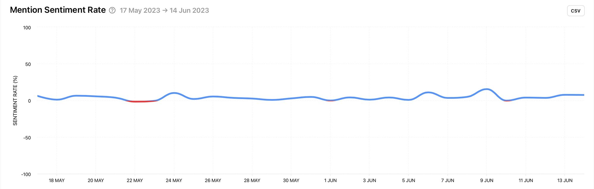
Mention Sentiment Rate
For a quick snapshot of the tone of your competitor’s mentions, look at the mention sentiment rate. This graph clearly shows whether mentions are positive, negative or neutral. This can help you find mentions of note and help you learn quickly from conversations surrounding your competitor.
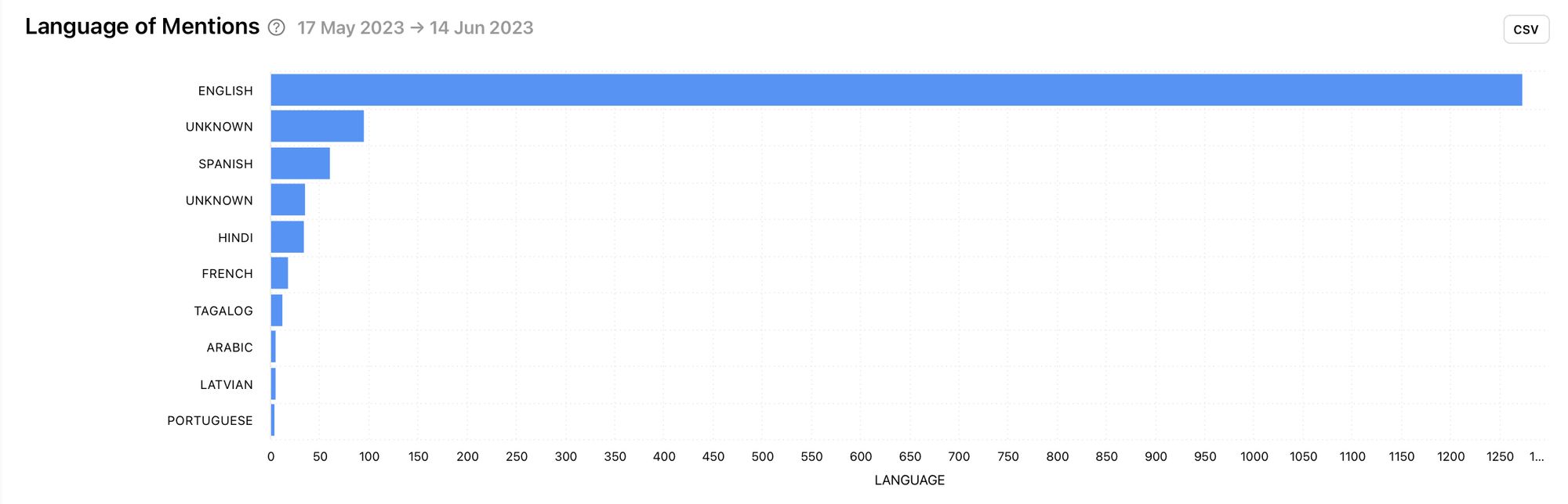
Language of Mentions
The language of mentions graph provides insight into the people talking about the brand and how those people communicate on Twitter.
Mentions by Metric
View all your competitor’s mentions by date, retweets or likes. This helps you build a clearer picture as you can view tweets that mention your competitor alongside key engagement metrics.
Unlock competitor insights for Twitter
Accessing competitor accounts with Minter.io is simple.
Here’s how:
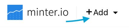
- Go to the top left-hand corner of your Minter.io account and select the ‘+Add’ button.
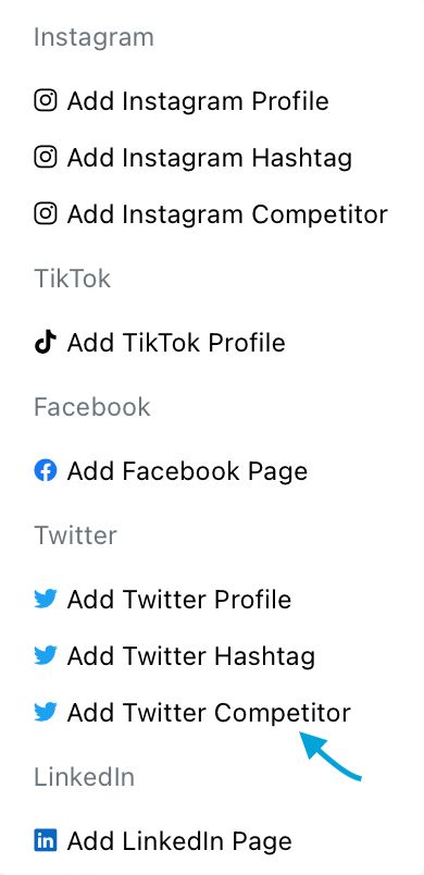
2. Click on ‘Add Twitter Competitor’.
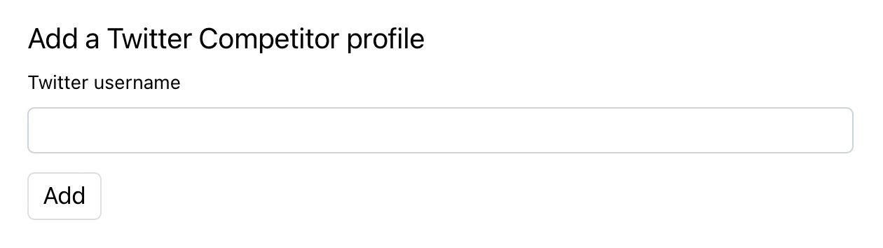
3. Insert the username of the Twitter account.
4. Click ‘Add’.
Competitor analytics are available on Platinum and Agency plans. Get access to competitor insights from the day you sign up to Minter.io while historical data is available for the last 3,200 tweets and up to 7 days for mentions. Learn more here.
Try Minter.io!