How to get more comments on Instagram using Minter.io

Is your content good enough to get people talking? The amount of comments on your content is more than a vanity metric. Get comments rolling in thick and fast and you could find the algorithm pushing your content to more people. This could mean more brand awareness, social proof and further engagement for your social media presence.
Boosting your comments is a key stepping stone towards success on social media and in business at large. In this article, we’re looking at how you can use the features and graphs on Minter.io to get more comments than ever.
Comments graphs and features
Minter.io is flush with graphs to help you grow an audience and connect with that audience in a meaningful way. This means there are several graphs relating to comments to get stuck into. In this section, we’re breaking down the best graphs to get started with, so you can understand the data and use it to your advantage.
Post Comments
In the Posts section of your Minter.io Instagram data, you’ll find the Comments graph. This shows the number of comments by post type within the selected date range. The colour-coded bar chart makes it easy to pick out the content types that gained the most comments. Use this to determine whether to focus on photos, carousels or reels when aiming to get more comments on upcoming content. Look at the peaks in the graph to find days, weeks and months that gained more comments than others. This can help you investigate the content that was published during these high-performing time periods as well as consider whether anything else played a factor e.g. a collaboration, mentions, a marketing campaign, seasonal changes etc.
Note that above the graph is the total amount of comments as well as the average amount of comments. By having the average number of comments per post to hand, you can assess whether content performed well, averagely or poorly.
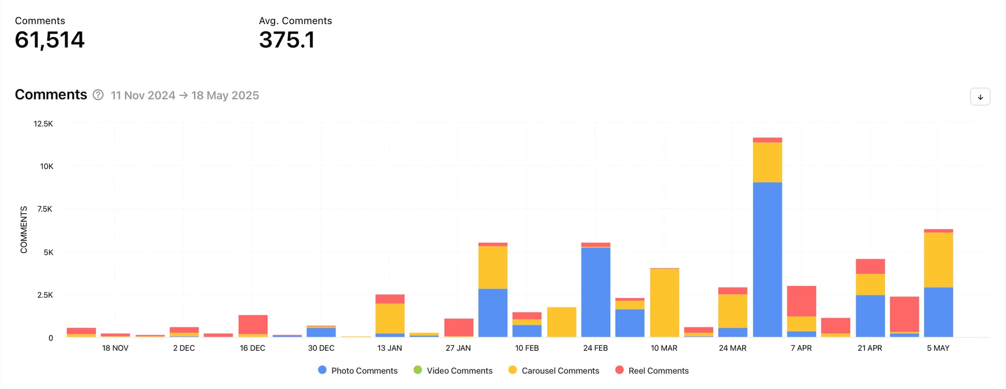
In the example above, the amount of comments generally increases towards the end of the selected time frame, with comments peaking between the 24th of March and the 7th of April. This is a good sign as it shows progression. The block with the most amount of comments gained them on photo posts, however there are a fair amount of comments on all the post types shown. This profile owner should use this graph in conjunction with the Number of Posts graph to determine whether photo posts gained more comments simply because more photo posts were shared or because they genuinely performed better than other post types.
All Posts (sorted by comments)
Scroll down to the bottom of the Posts section of your Minter.io Instagram data, or choose ‘All Posts’ from the navigation bar on the left-hand side of the screen, to find all the posts published within the selected date range. Choose to view your posts by comments and your content will be sorted showing the content with the highest amount of comments first. You can see the amount of comments displayed underneath each piece of content.
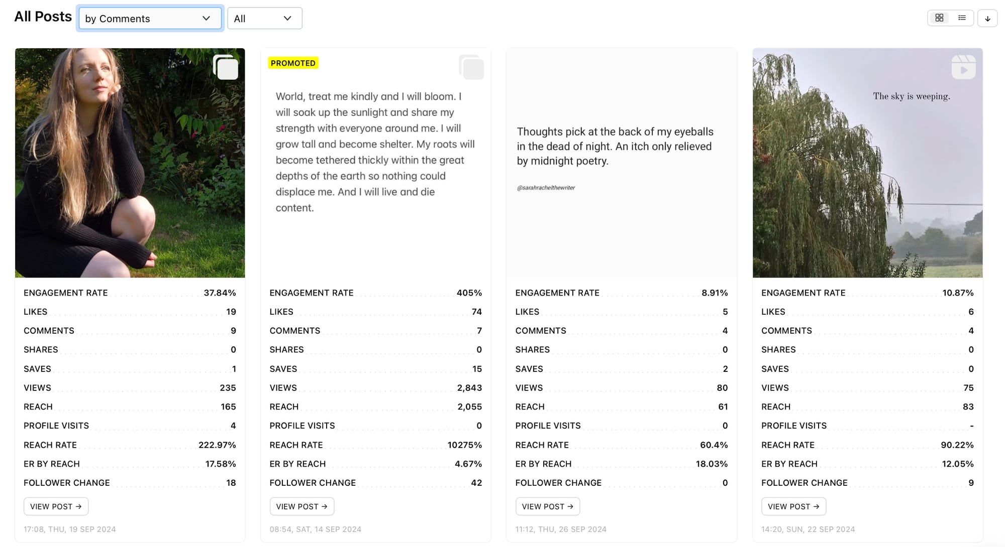
Take inspiration from the pieces of content you published with the highest amount of comments. What content types are at the top of the list? What are the themes, topics and content styles? What copy accompanies the top posts? Are there repeated visual elements, colours, branding or editing? Use this section to gain insight into what has already worked well in terms of bringing in comments so you can replicate techniques that are likely to gain more comments on future content.
Comments 72h graph
Click on an individual post to view 72 hour data and scroll down to find the Comments 72h graph. This shows the distribution of comments the post received in the first 72 hours from publishing, broken down into hours. This is useful because it shows how quickly the content received comments and when they petered out. This gives insight into how your audience and the algorithm responded to the piece of content being published.
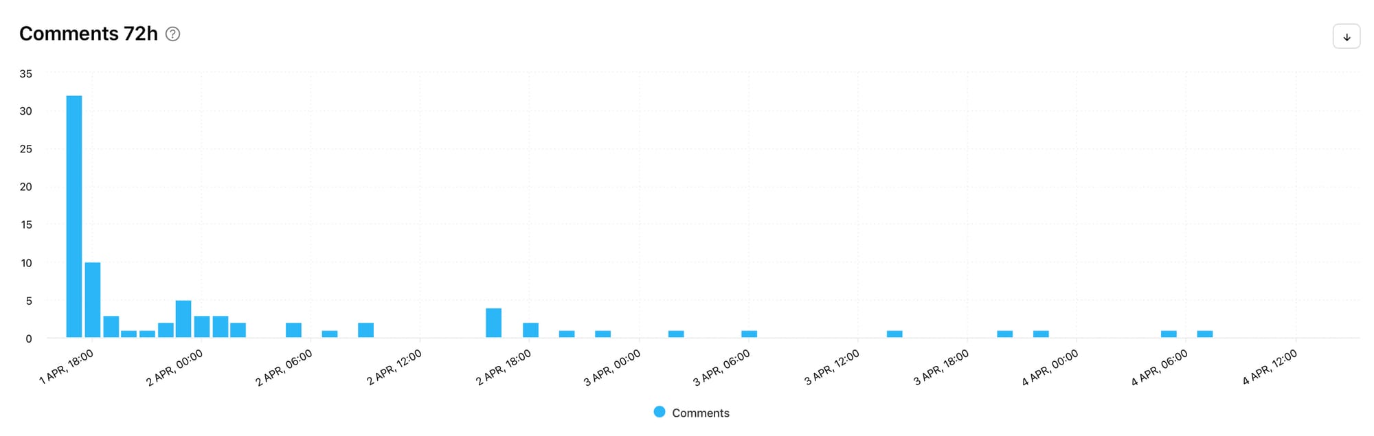
Check out the 72 hour data for your top-performing posts. Did they rake in comments fast or were they fairly consistent? Were there moments when comments spiked and can you find out what caused those?
Ad Comments
If advertising is part of your social media marketing strategy, it may be interesting to see how many comments your ads gained. Go to the Ads section of your Minter.io Instagram data to find the Ad Comments graph. This shows the number of comments by post type during the selected date range.
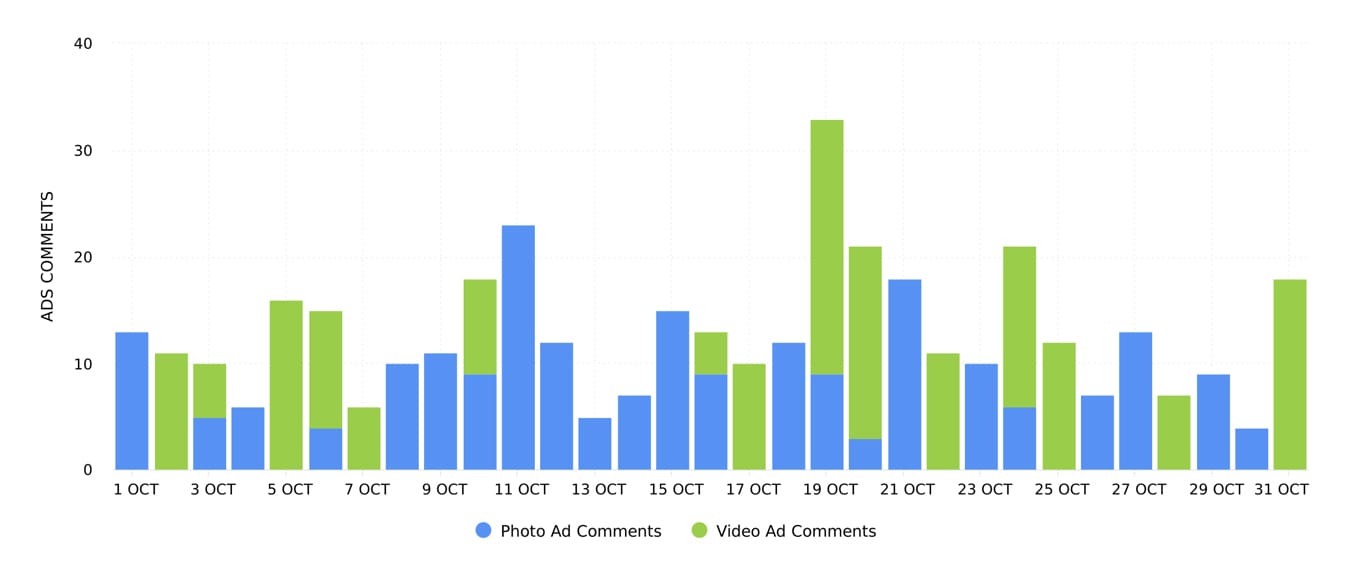
Use this graph to determine whether photos or videos gained the most amount of comments on your ads. Pinpoint days that gained the highest amount of comments to determine which ads triggered them. This can help you craft engaging ads to bring in even more comments.
Additional data to consider
Now we’ve explored the best graphs to pinpoint exactly what is going on with your comments, it’s time to consider some less obvious graphs to assist you. In this section, we’re going to explain why you might want to look at your comment sentiment rate, benchmarks and optimisation graphs to develop an even better understanding around your comments.
Comment Sentiment Rate graph
While the general aim may be to get more comments on your content, it’s worth remembering that not all comments are positive. Unlike likes, the amount of comments a piece of content gets can have multiple interpretations. For example, controversial content may gain additional comments for a profile, but that might not always be such a good thing.
To see whether the comments on your content are positive, negative or neutral, head to the Posts section of your Minter.io Instagram data and scroll down to the Comments Sentiment Rate graph. If your business thrives off controversy, this may not be an important step for you. However, if not, it’s very important to act if the comments are mainly negative.
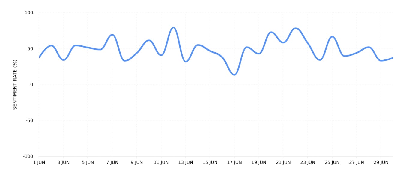
Responding to concerns, answering questions and pivoting your content to produce fewer negative responses could help you gain more comments in the long run. This is because positive responses can be a sign of building a loyal fanbase of people who will repeatedly comment on your content. However, negative responses may boost the amount of comments but it won’t boost your business, and at the end of the day, that's what cultivating a social media presence is all about.
Comments per Post graph
Head to the Benchmarks section of your Minter.io Instagram data to find the Comments per Post graph. Benchmark data shows how your profile is performing compared with other accounts in a cohort of similar follower sizes. This is particularly useful for understanding whether the amount of comments on your content is within the lower, median or upper amounts when compared with similar accounts.
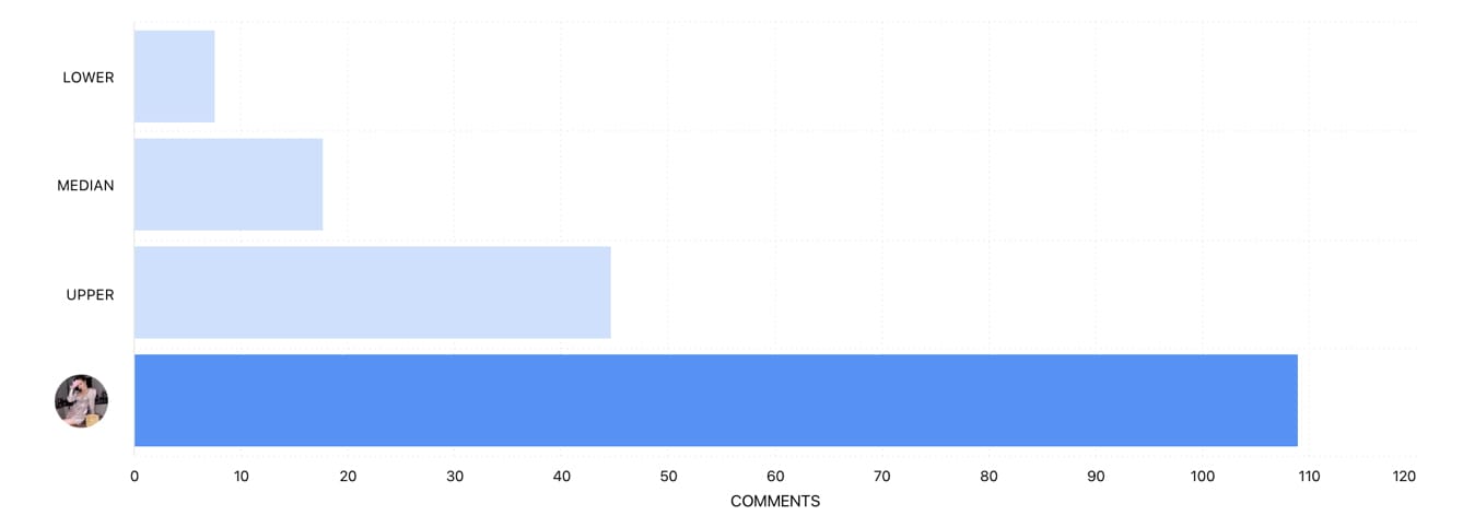
In the example above, the account is exceeding the upper amount of comments within its cohort. Therefore, this graph should be used to set realistic expectations in this instance. Perhaps there are other metrics that should be dived into before making a big push for more comments?
If your profile is coming in at the lower or median levels, this can confirm that focusing on increasing the amount of comments is a valuable use of your time. Keep checking on the benchmark graphs to see your progress over time.
Optimisation graphs
Comments (and other kinds of engagement) can be boosted with some simple optimisation techniques. Head to the Optimization section of your Minter.io account to find the Best Time to post, Engagement graph, Most Engaging Post Types graph and Top Hashtags by Interactions graph. While these graphs are aimed at increasing the total amount of engagement on your posts and are not specific to comments, utilising them will give you a good chance of boosting your comments.
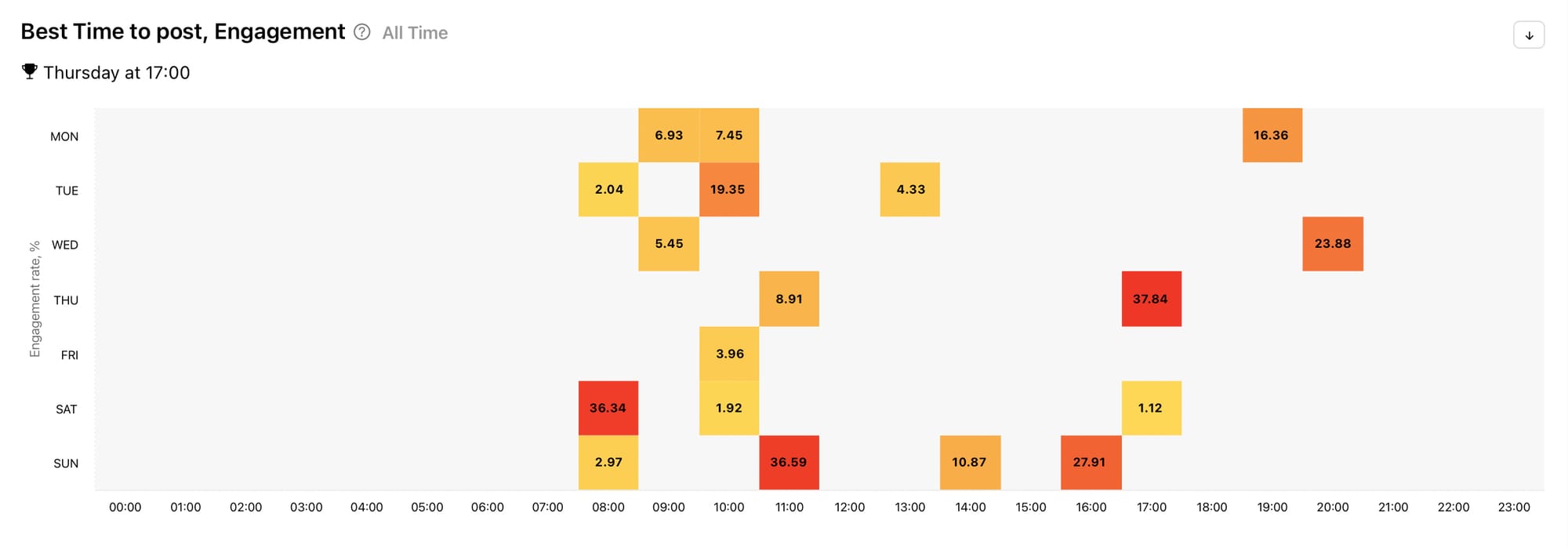
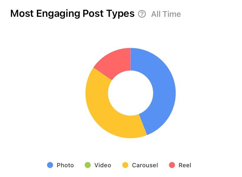
Best Time to post, Engagement (left) and Most Engaging Post Types (right) graphs by Minter.io
Track the chatter that’s pouring in by using Minter.io - the social media analytics tool for businesses. Get access to every graph in this article and so many more across multiple social media platforms, competitor accounts and hashtag tracking. Try it today!
Try Minter.io now→