Get more shares on TikTok with Minter.io

Sharing has always been good for business. Whether you’re aiming for an increase in word-of-mouth marketing, user-generated content or shares in direct messages, sharing builds trust and trust builds strong brands and business growth.
Minter.io is a social media analytics company that platforms several TikTok shares graphs that businesses and brands can wield to increase their knowledge around the behaviour of their audience. Learn how your content viewers are interacting with your content, how often your content gets shared, when your content is likely to gain shares and which content is raking in the majority of shares.
In this article you’ll discover many of the shares graphs Minter.io unlocks for you. Explore the differences between them and how to use this information to accelerate your way to more shares across your TikTok content.
Content Shares
Head to the Content section of your TikTok data on Minter.io to find the Content Shares graph. This graph shows the number of shares of videos published during the selected date range.
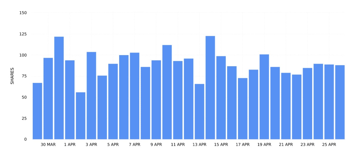
Using the date picker, compare information across specific time periods, seasons and marketing campaigns. Note spikes and peaks in data. What influenced the rise and fall in the shares of content published within the date range? Understanding the actions you take (such as the number or times you publish posts or the types of content published) as well as outside forces (such as events, seasons, holidays etc.) can help you make strategic decisions to supercharge surges in shares when you publish content.
Ad Shares
Head to the Ads section of your TikTok data on Minter.io to find the Ad Shares graph. This graph shows the number of times ads posted during the selected date range were shared.
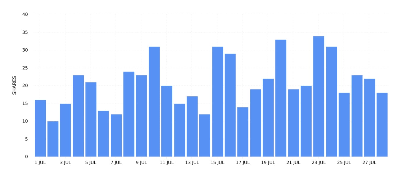
If advertising is a part of your TikTok content strategy, the Ad Shares graph can help you understand when your adverts gained shares. Notice spikes and peaks in data. Were specific ads run at specific times and did this influence the amount of shares your ads gained? Recognising the kinds of ads your audience responds positively to, alongside when those ads are being pushed, can help you strategise to put more money behind high-performing ads on days when your content is likely to be shared more.
Profile Shares
Head to the Profile section of your TikTok data on Minter.io to find the Profile Shares graph. This graph shows the number of shares received during the selected date range across all videos.
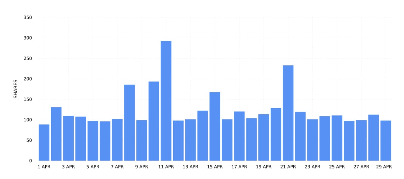
As this graph shows the amount of shares across all videos, not just the videos published during the selected date range, use this graph to pinpoint patterns in shares overall. Note spikes and peaks. Does publishing new content influence this graph or is the data fairly steady? Analysing this graph can help you take steps to get more shares across all your content. Which actions are you taking that are influencing this graph and what proportion of shares are coming from content previously published? Are external events, such as holidays, events and different seasons, influencing this graph dramatically?
Sort All Videos or All Ads by Shares
Head to the All Videos or All Ads section of your TikTok data on Minter.io to find all your content or ads published within the selected date range in one place. From here you can sort your posts by a number of metrics. Choose to sort your content by shares to order your content from the most amount of shares gained to the least.
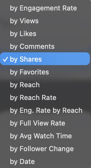
This feature fast-tracks you to the content published within the selected date range that has gained the highest amount of shares. Choose ‘All Time’ from the date picker to see the content that has gained the most shares overall. Use these findings to shape future content in an effort to encourage more shares on new content.
72 Hour Shares
Select a piece of content from the All Videos or All Ads section of your TikTok data on Minter.io and scroll down to find the 72 Hour Shares graph. This graph shows the distribution of shares the content received in the first 72 hours by hour.
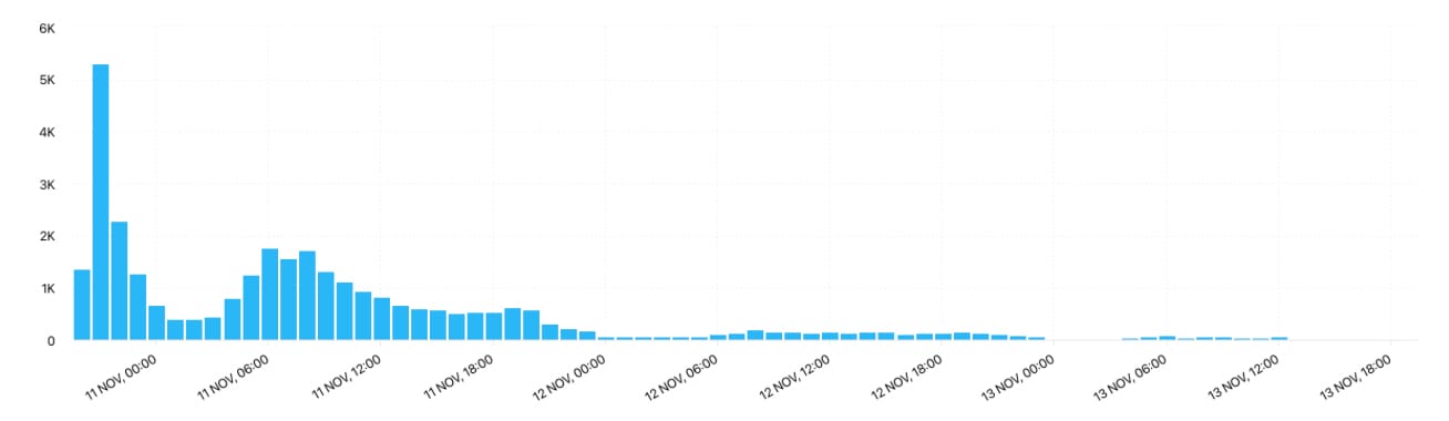
Use this data to understand the early performance of a piece of content. Did shares explode instantly or was it a slow burner? Did shares consistently roll in or did they taper off? 72 hour data can help you understand how your content was served up by the algorithm and how the early audience interacted with it. Spikes and steep inclines in shares can indicate an activation in the algorithm, whereas dips and declines can signal interest dropping off. Understanding the amount of shares your top-performing content gained early after publication can provide clues as to which new content is likely to pop off.
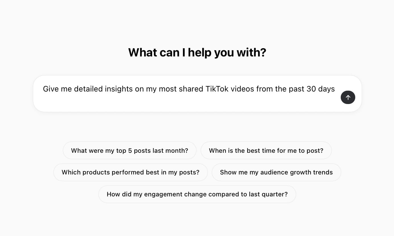
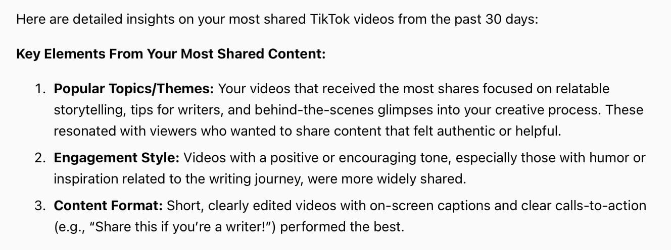
AI Analyst
Rocket your way to more shares by utilising the Minter.io AI Analyst. This innovative tool provides clarity, data and strategic recommendations in seconds, tailored around your analytics and built to help you succeed with ease. Simply start with a question, query or prompt and let the AI Analyst provide the rest.
AI Analyst by Minter.io
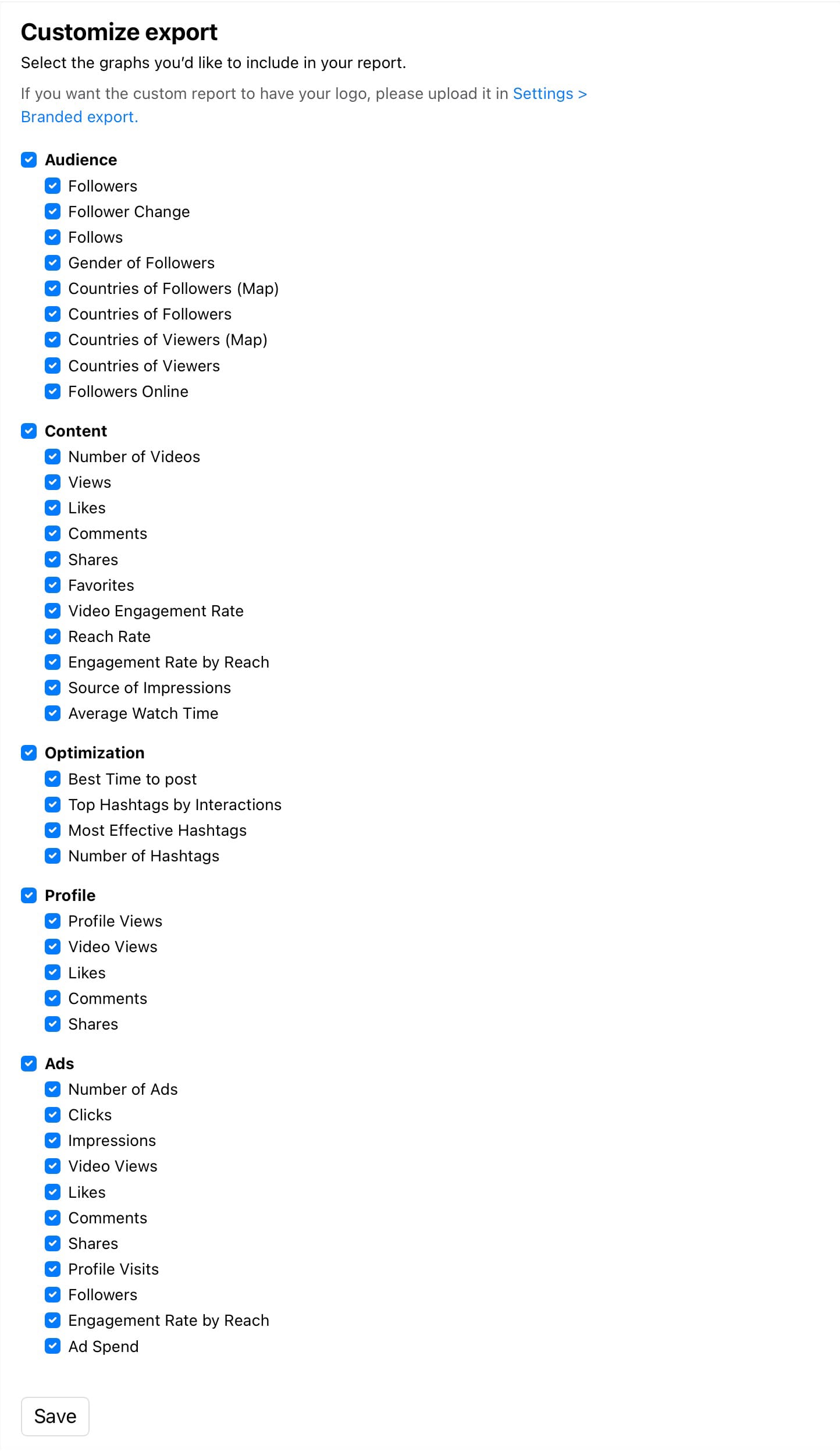
Export Shares Data
Export your TikTok analytics data to XLS, CSV or as a presentation-ready PDF or PPTX report. You can also schedule reports to be automatically emailed to you when you need them. Customise your report to include content, profile and ad shares.
So, what are you waiting for? Explore your shares graphs with Minter.io today! While you’re there, unlock analytical data for your Instagram, Facebook, X, Threads and LinkedIn accounts too…
Turn data into your best content ever.