
How to measure Instagram Collab posts

Collabs are a top way to get your brand in front of newer, bigger relevant audiences, but how can you measure the success of an Instagram Collab? It turns out it isn’t exactly simple… Instagram Collab posts allow a piece of content to be shared simultaneously across two or more profiles. With multiple co-authors, a single piece of content can be seen by more than one audience at the same time, which is great for reach, brand awareness and growth. Tracking and measuring collab posts is vital for understanding their full benefit to your brand and allowing you to strategise their use effectively, but Instagram’s native insights don’t make this very easy.
With Instagram’s in-app insights:
- Instagram Collabs are bundled together with regular posts so there’s no way to view data only about collab posts
- There’s no way to compare collabs against other collab posts to analyse their performance
- There’s no way to compare how collabs perform vs non-collab posts
- Historical data is limited to 90 days making it impossible to view performance over a significant period of time
- There’s no way to compare two different date ranges
With these limitations, it is incredibly difficult to determine the success of collaborations, analyse their performance and strategise effectively. That’s why Minter.io created the Collabs tab, where you can track, measure and analyse the performance of Instagram Collabs, including your own and guest posts, in a dedicated space that’s separate from your regular posts. Your own collab posts are posts that are published from your account, while guest collab posts are posts which include your profile as a collaborator but are published by another profile. With advanced graphs to track the performance of all and only collab posts in one place, rank the effectiveness of your collaborative partnerships, view the impact of collabs on your follower count, explore the engagement on collab posts and compare the engagement rate of collab posts against non-collab posts, Minter.io is the tool that gives you tailored, targeted data for strategic collaborative development on Instagram.
Here are all the graphs available in the Minter.io Instagram Collabs section…
Number of Collab Posts
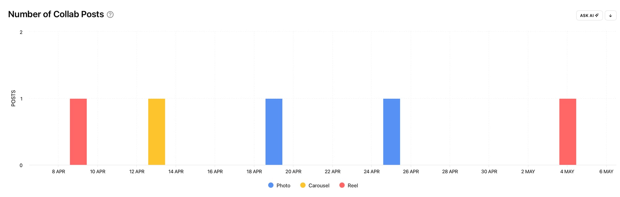
The Number of Collab Posts graph shows the number of collab posts published during the selected date range, split into content type. This can help you understand the frequency of collabs your brand has been involved in over time, alongside the type of posts included in the collabs. Use this graph to evaluate how often you were included in Instagram Collab posts and which post types were published.
Ask yourself:
- How often do you collaborate with other accounts?
- Is your involvement in collabs regular or sporadic?
- Has the amount of collabs you’ve been involved in increased or decreased over time?
- Are your collab posts all one post type or is there a mix?
Consider how your approach to Instagram Collabs is impacting your growth and performance on Instagram. When used independently, the Number of Collab Posts graph can shine a light on clear collab strategies, content gaps and post type preferences. When used in conjunction with other graphs, such as the Collab Impact on Followers graph or Engagements by Post Type graph (featured later in this article), this graph can help you build stronger strategies and align your collaborative efforts with positive change to your Instagram profile and performance.
Top Partners
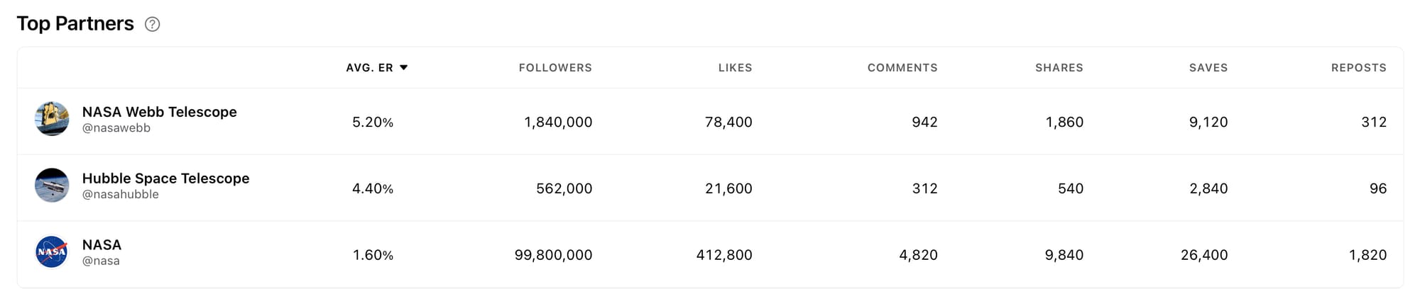
The Top Partners graph shows the top-performing profiles you've had collab posts with during the selected date range. Engagement Rate and Engagements shown are per collab post. Use this graph to identify your top collaborative partners. With the Top Partners graph you can easily see which partner brought in the highest engagement rate and total engagements through posts with your account. You can also view the follower count which shows the potential new audience size.
Ask yourself:
- Who are my top collaborative partners?
- What do my top partners have in common?
- Are my top partners brands, businesses, public figures, influencers or celebrities?
- Do the follower counts of my top partners correlate with the results?
- How can I replicate the approaches that worked well with my top partners?
Consider creating new or ongoing collaborations with your top partners and find similar collaborators that might work well with your brand. You could also delve into the content that was published during collabs with your top partners. Was there anything different about your approach to the content when you worked with your top partners? If so, this could be an area to explore for replicating similar content themes, styles and approaches with other collaborators.
Collab Impact on Followers
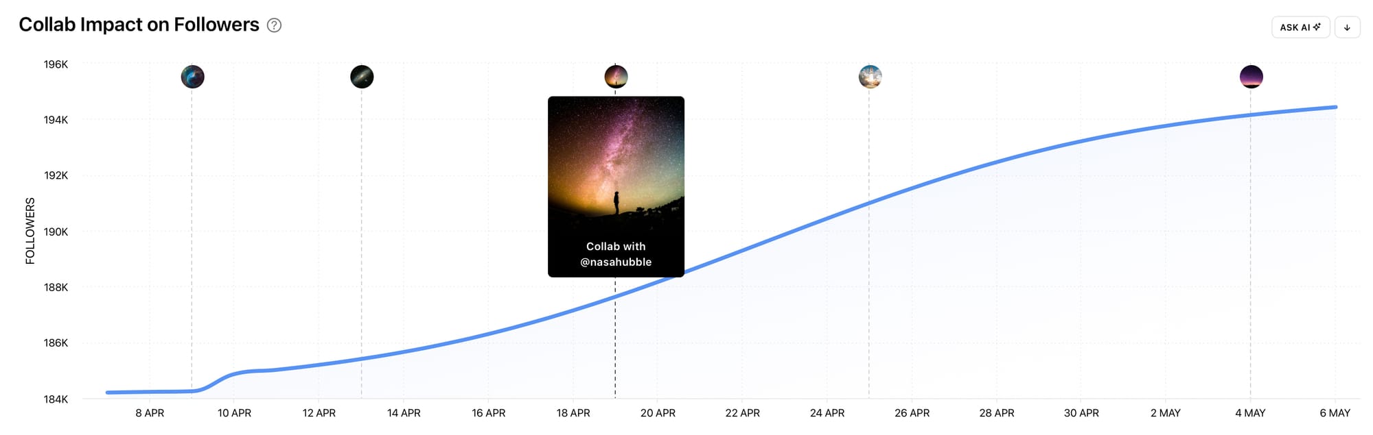
The Collab Impact on Followers graph shows the number of followers during the selected date range with collab posts indicated on the same chart. This makes it very clear to see whether changes in the number of your followers occurred on the same days as publishing collab posts. Use this graph to determine the collab posts that had a positive or negative impact on your follower amount. Look for spikes and dips in the data and delve into the specific collab posts to determine what worked well for your brand and what you can learn from.
Ask yourself:
- Did my follower amount increase or decrease steadily or dramatically?
- When did my follower count spike or dip, and did collabs happen on those days?
- Which brands and businesses did I work with when my account saw the highest increase in followers?
- How can I create new collabs that have a positive impact on the number of followers?
Take note of any days where a collab post was published and the number of followers significantly increased. By checking out the exact collab post that was published, you can design new content which replicates similar styles, themes, media types and editing styles, or collaborate with the same partner again, to increase your chances of encouraging even more follower growth.
Engagements
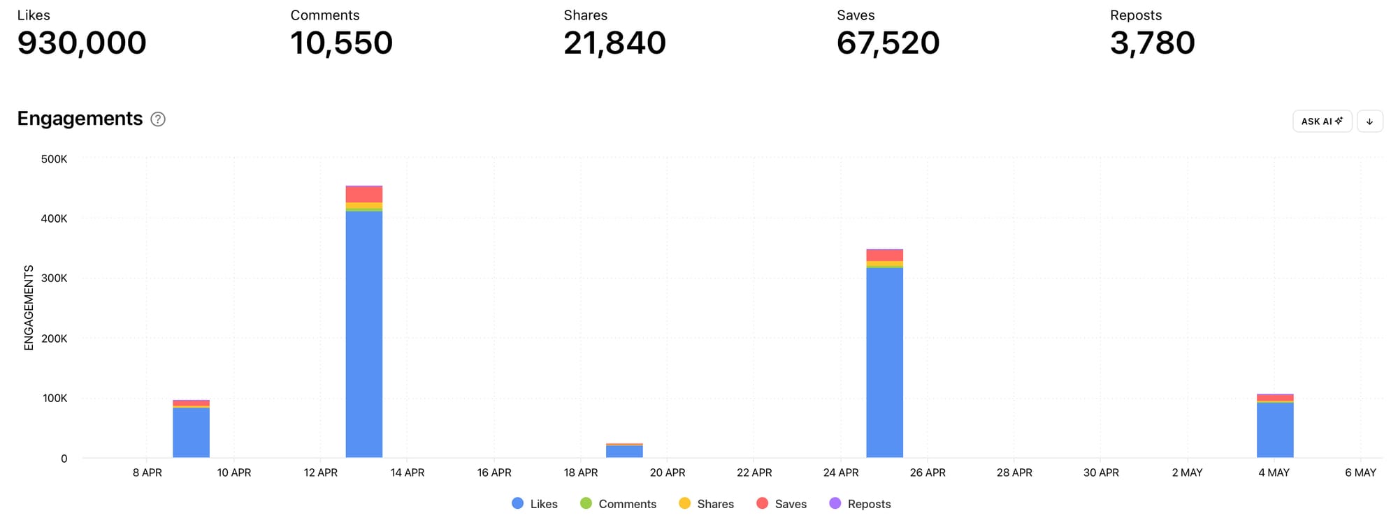
The Collab Engagements graph shows the total number of likes, comments, shares, saves and reposts on collab posts published during the selected date range. Use this graph to see the number of engagements specifically on collab posts and view a breakdown of the engagement types.
Ask yourself:
- When did collab posts get the highest number of engagements and which collab posts were published then?
- Which engagement type did my collab posts gain the most of?
- Are there any abnormalities or days that stand out?
- Which engagement type would I like more of on my collab content and how can I encourage that with my next collab?
With the Collab Engagements graph you can see whether your collabs are connecting with your audience and the audience of your collaborators, as well as when your collabs gained higher amounts of engagement. Take note of any days that were significantly different from others e.g. days with a significantly higher amount of saves. By finding the collabs that were published on days when anomalies happened, you can figure out what you did differently that led to different types of engagement and actions.
Engagements by Post Type
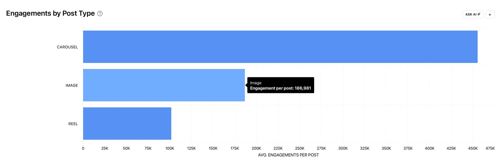
The Engagements by Post Type graph shows the average number of engagement (including likes, comments, shares, saves and reposts) per collab post published during the selected date range, broken down by post type. Use this graph to determine which post types were most effective at gaining the most engagement when participating in a collab. This information can inform the post types you decide to include in new collabs.
Ask yourself:
- What is the top post type for engagement for my collabs?
- What post types am I currently using the most in my collab posts?
- How can I create more collab posts using the top post type for engagement?
Use the Engagements by Post Type graph alongside the Number of Collab Posts graph to determine whether your collabs include the best post types for encouraging higher levels of engagement.
Engagement Rate: Non-Collab vs Collab
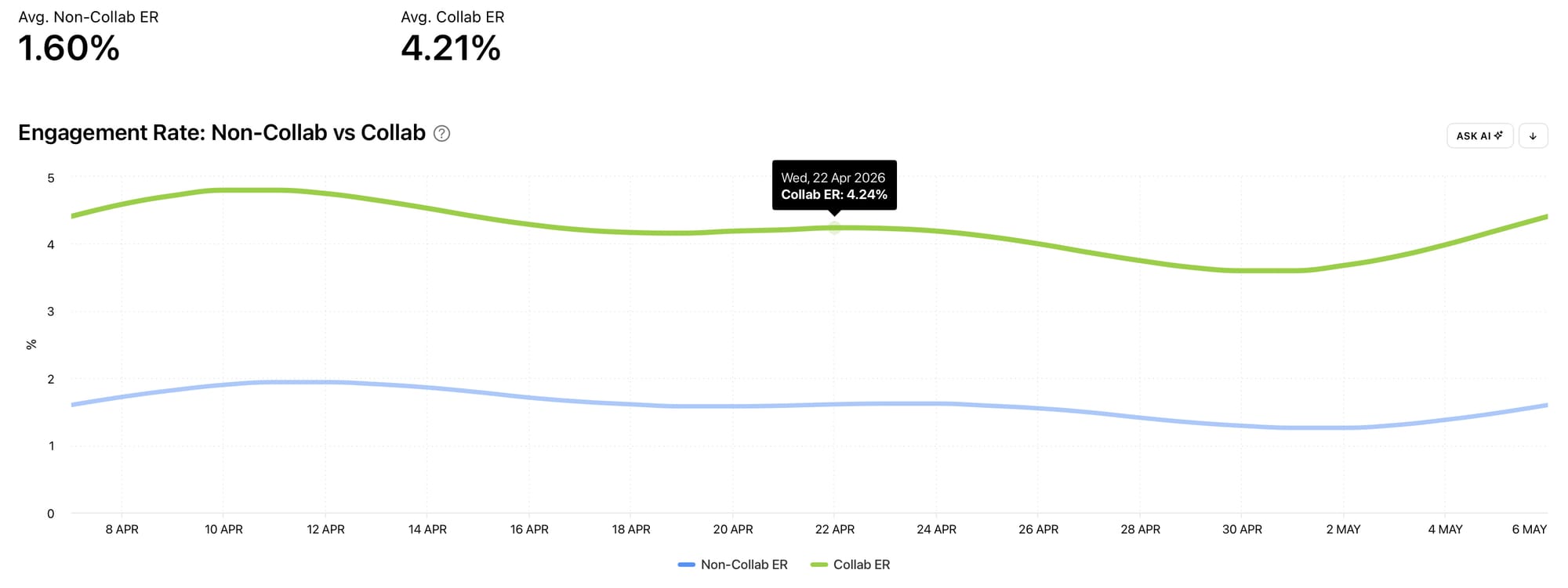
The Engagement Rate: Non-Collab vs Collab graph shows the average post engagement rate of collab posts alongside the average post engagement rate of non-collab posts published during the selected date range. Both the engagement rate for collab posts and non-collab posts are shown on the same graph, making it easy to measure and compare the performance of your collab posts with your regular feed posts.
Ask yourself:
- Is the engagement rate generally higher for my non-collab or collab posts?
- Are there spikes, dips or anomalies in the data and what could have caused them?
- Do either of the engagement rates increase or decline gradually or steeply and what can this tell me about my audience’s reaction to the content I’m publishing?
Posts
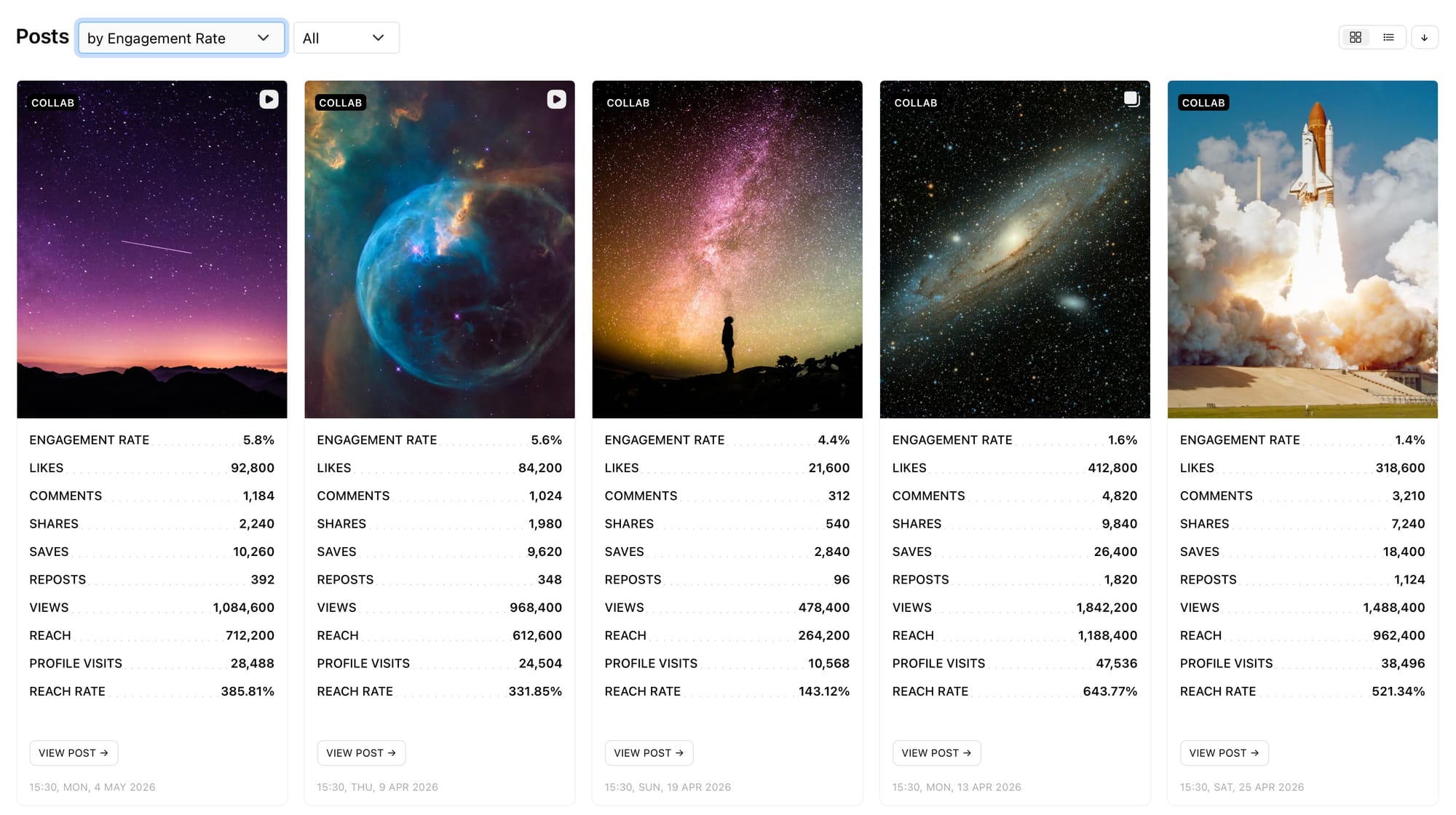
Go to the Posts section to find all your collab posts that were published during the selected range. This is the perfect place to find every collab post without any regular posts sandwiched in-between them, so you can compare all your collab posts easily. Sort your collab posts by the metric of your choice (such as engagement rate, interactions, profile visits, reach rate, comment sentiment rate, watch time, follower change etc.) to compare your collab posts and find the top-performing posts based on the metrics that matter the most to you.
Get access to your Instagram Collabs data with Minter.io - the social media analytics tool that lets you view, measure, compare and report advanced social media data. Try it today!