How to get more saves on Instagram with Minter.io

What’s better than people watching your content once? People watching it time and time again. Repeat views means more recognisability, loyalty and algorithm activation, so getting your content saved by as many people as possible is a win on so many levels.
Saves are coveted on Instagram. They are treated as keepsakes, libraries, scrapbooks and albums. Content is saved with the sole purpose of returning to it, making it the ideal metric to track if you’re after more impressions. What’s more, if people are saving your content it means they value it highly. People do not save throwaway content that doesn’t grab their attention or give them a reason to hold onto it. When you get saves on an Instagram post, you know you’re doing something right.
In this article, we’re looking at how Minter.io can assist you in getting more people pushing the save button on your content. Minter.io is a social media analytics tool that leverages your unique data to drive your brand to accelerated success. While some graphs are obvious for tracking saves, you might be surprised at how many graphs can provide dynamic insight into your audience’s behaviour when it comes to saving content.
Post Saves
Starting with an obvious one, the Saves graph in the Posts section of your Minter.io Instagram data shows the amount of times posts were saved within the selected date range. Data is split into content types, making it easy to spot whether photo posts, carousels or reels were saved most often. Historical data is available for up to two years or since the profile was converted to a professional profile, helping you spot patterns over a long period of time even before your account was connected to Minter.io.
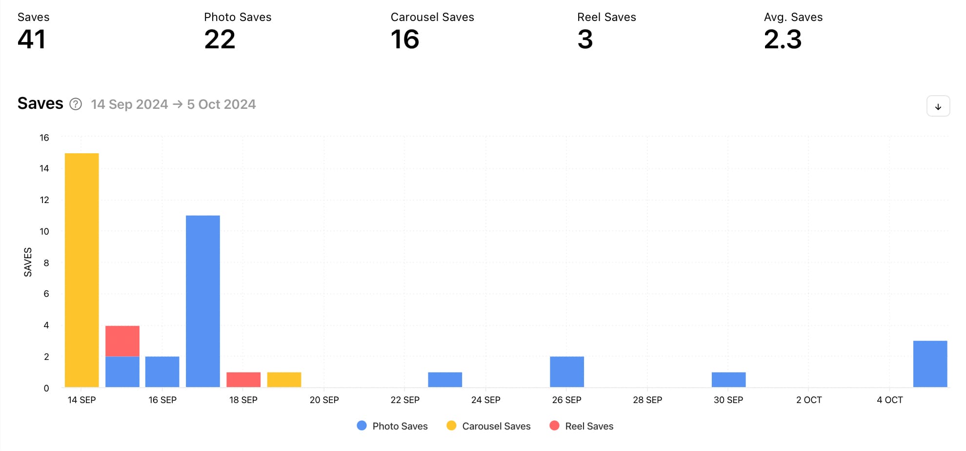
Use this graph to find out how many saves your content is currently getting and which types of content are gaining the highest amount of saves. This is the ideal graph to help you see how the saves on your content are trending over time, helping you course correct quickly if needed. It can help you spot anomalies, pinpoint peaks and take note of dips, which is key information to determine the content and contributing factors that drive saves for your content. When aiming to get more saves on content, it may be beneficial to lean heavily into the content types that are already proving to be a hit. Take note of periods of time that gain a surge in saves and consider whether the content differed or whether outside elements such as world events, seasonal changes or holidays impacted the amount of saves on your content.
Sort Posts by Saves
Minter.io has an in-built feature that enables you to view your content by the metric of your choice. By sorting your content based on the amount of saves each piece of content gained, you can cut through the noise and get straight to the point. What’s more, you can choose to view all your posts or a specific content type such as: image, video, carousel, reel, collab or archived. This is exceptionally useful to look at after you’ve viewed the previous graph and found the content type that gained the most saves.
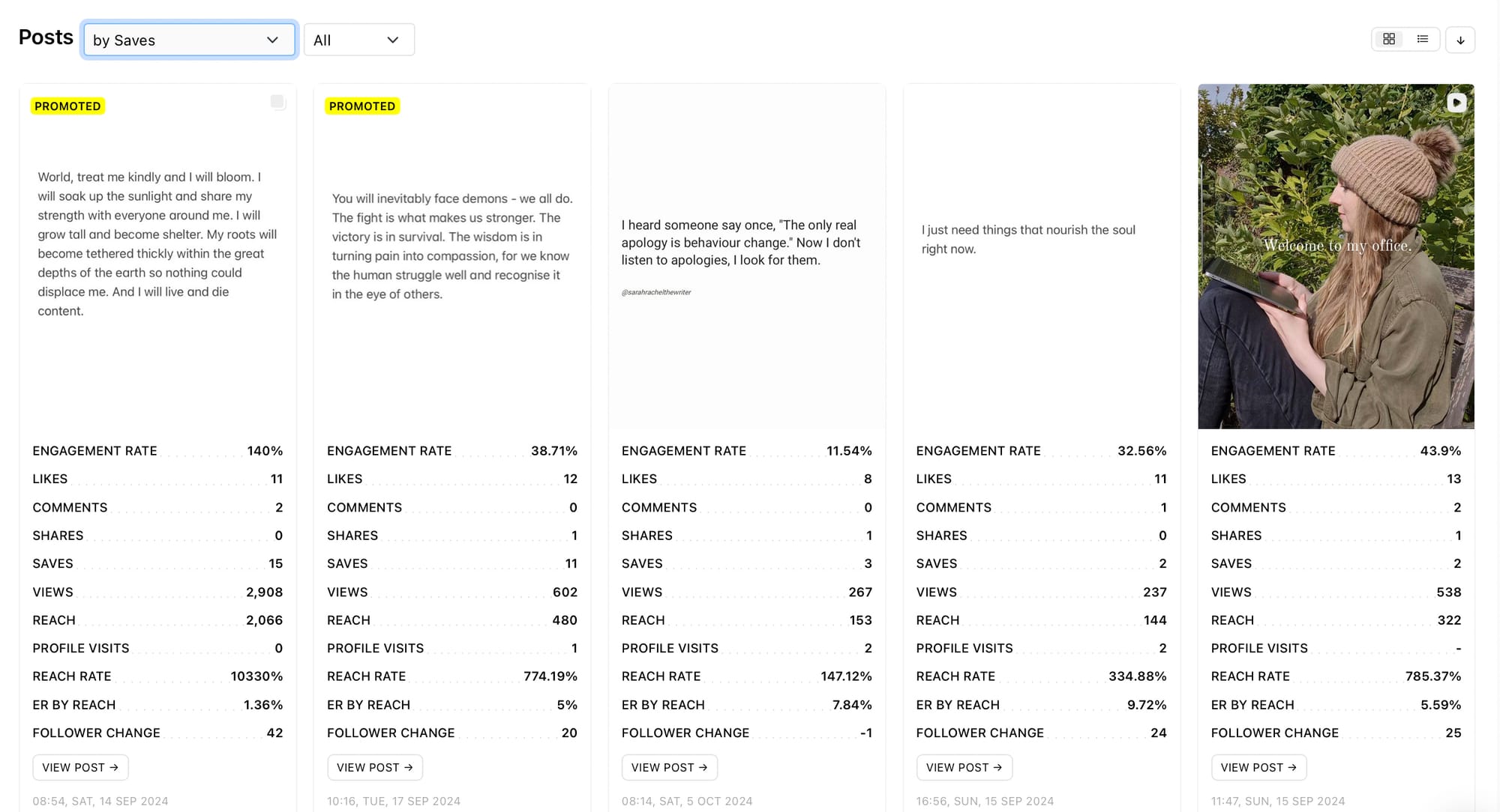
Take note of the posts taking up the top spots. What do they have in common? Look at the themes and topics. Consider visual elements such as the colours, text overlays, filters and subject(s). Look at the hook, pacing, music and captions. Did you hop on trends or launch a campaign? Were your posts promoted or organic? Every element of your most-saved posts can help you build a picture about what your audience values enough to save. Replicate these elements to replicate similar results.
Saves 72h
Select a piece of content and scroll down to find the Saves 72h graph. This graph shows the distribution of saves the post received in the first 72 hours broken down by each hour. This is key information for understanding how the first people who saw your content reacted to it. It shows how quickly the content was saved and, when used in conjunction with other 72 hour graphs such as reach, can provide insight into how the algorithm served up your content.
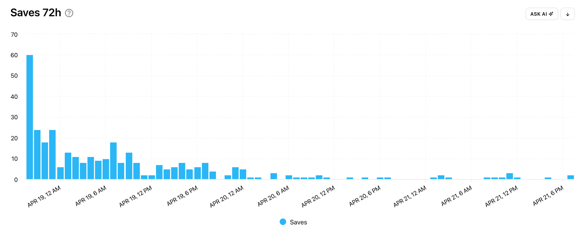
Top-performing content can provide vital clues as to whether early engagement had a ripple effect on the amount of reach and impressions. When content gains high quality engagement, such as saves, early after publication this sends signals to the algorithm that the content is valuable to its audience, which results in the algorithm serving up the content to wider audiences.
Ad Saves
Explore the amount of saves your Instagram adverts gained in the Ads section of your Minter.io Instagram data. The Ad Saves graph shows the amount of times ads were saved within the selected date range. This graph is separate from your organic posts, making it simple to sift through paid-for data without complication.
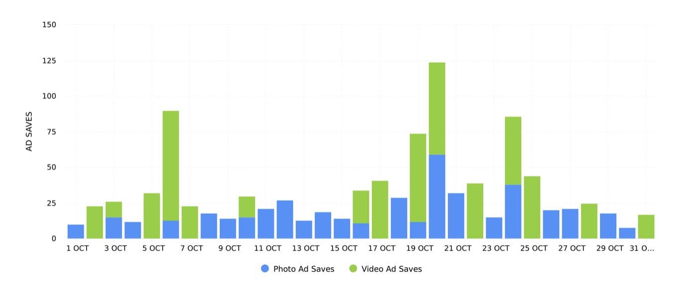
Use the date picker to hone in on specific campaigns and marketing efforts. Look for trends, peaks and dips in the data to get an overarching view of the amount of saves your ads gained. Were specific creatives, campaigns or budget allocations responsible for higher amounts of saves? Use this graph in conjunction with other graphs in the Ads section, such as the Number of Ads graph and the Ad Spend graph, to pull out links between your marketing tactics and the amount of saves those efforts produced.
Other graphs to consider
Although not specific to saves, the following graphs can provide more complex insight into a metric that includes saves. The function of saves is that it is an engagement metric; it is a way in which people can interact with a post. Therefore, there are 2 more graphs that are useful to look at when looking to increase the amount of saves on your Instagram content.
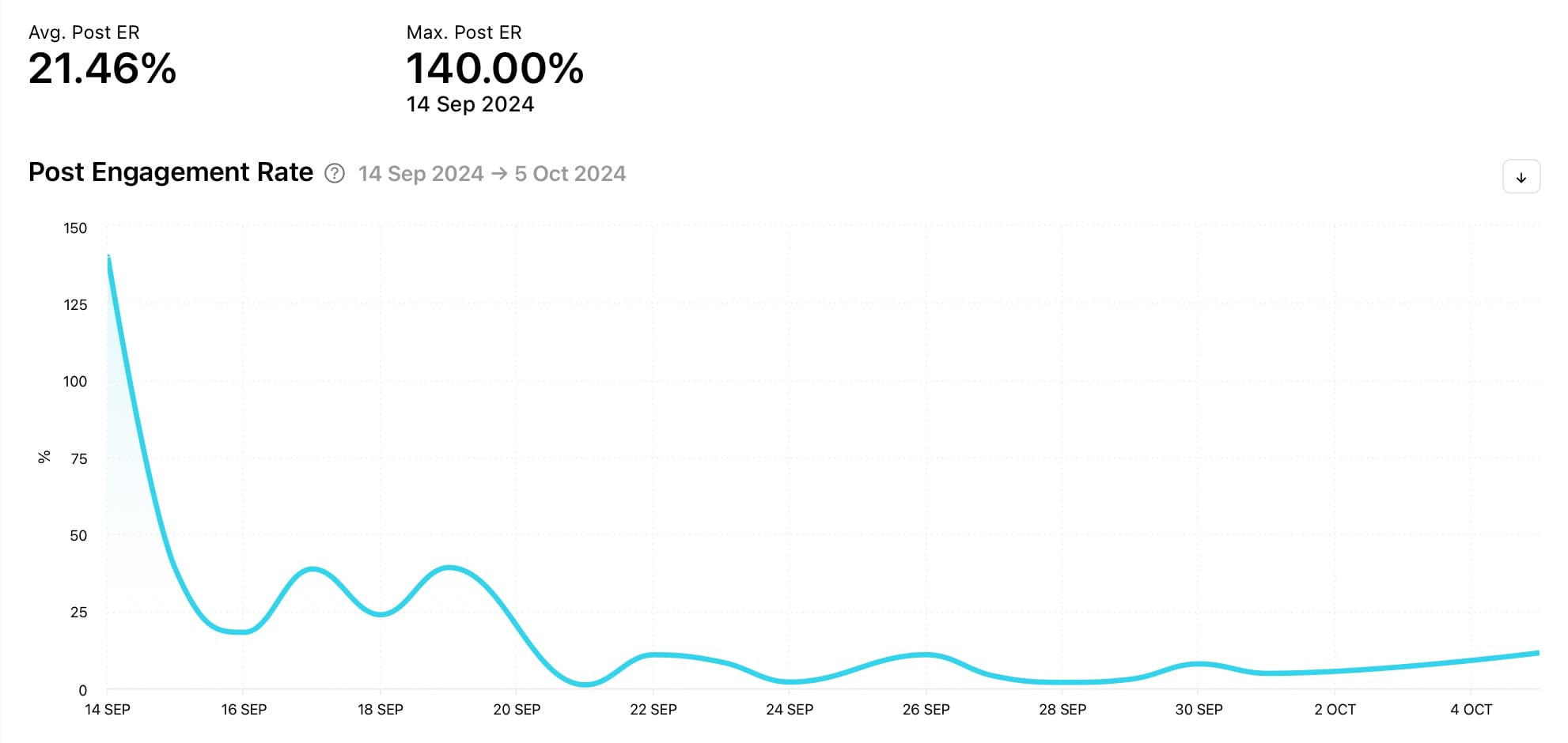
Post Engagement Rate
The Engagement Rate graph shows the sum of likes, comments, saves, shares and reposts, divided by the number of posts and the number of followers on a given day within the selected date range. You can find it in the Posts section of your Minter.io Instagram data. By exploring the Engagement Rate graph, you can have a more complete picture of how your audience interacts with your content.
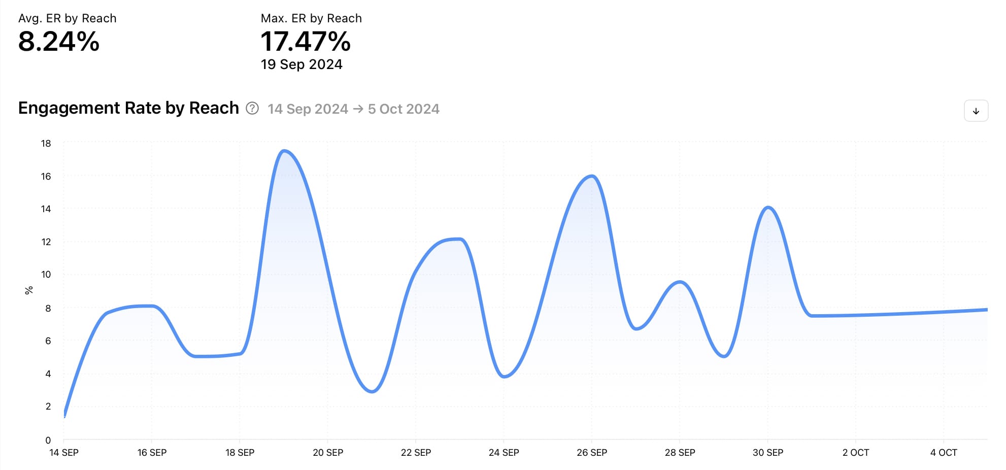
Engagement Rate by Reach
The Engagement Rate by Reach graph shows the sum of likes, comments, saves, shares and reposts, divided by reach and the number of posts on any given day within the selected date range. This provides a wider view of your overall engagement as it takes into consideration reach instead of followers. Find this graph in the Posts section of your Minter.io Instagram data.
To unlock your graphs using your unique Instagram data, head to Minter.io now.
All the metrics you need to grow your business on Instagram.