How to get more likes on Instagram using Minter.io
The like count is an iconic engagement feature synonymous with social media. No matter what platform you’re using, likes are a powerful symbol of how well your posts are performing online. Wouldn’t it be great if there was an easy way to ensure more likes for your content? In this article, we’re going to look at how you can use your own unique data to drive more likes on your Instagram content. This method ensures your efforts are driven by data and relevant to your business online. We’re going to use the social media analytics tool Minter.io so if you’re not familiar with this trusty little business toolkit, check it out now to get started.
A little bit about Minter.io
Minter.io collects and stores data on the most valuable metrics for your social media accounts. By linking your social media accounts to this effective tool, you can peruse through data stored over a significant amount of time that is simply lost if you rely solely on in-app insights. You can decide whether you want to view recent data, data from all time or data from a specific time frame - this is particularly useful if you’re looking at a specific campaign or season. Use the date picker to find information that’s interesting and relevant to you.
Gain inspiration from your best-performing content
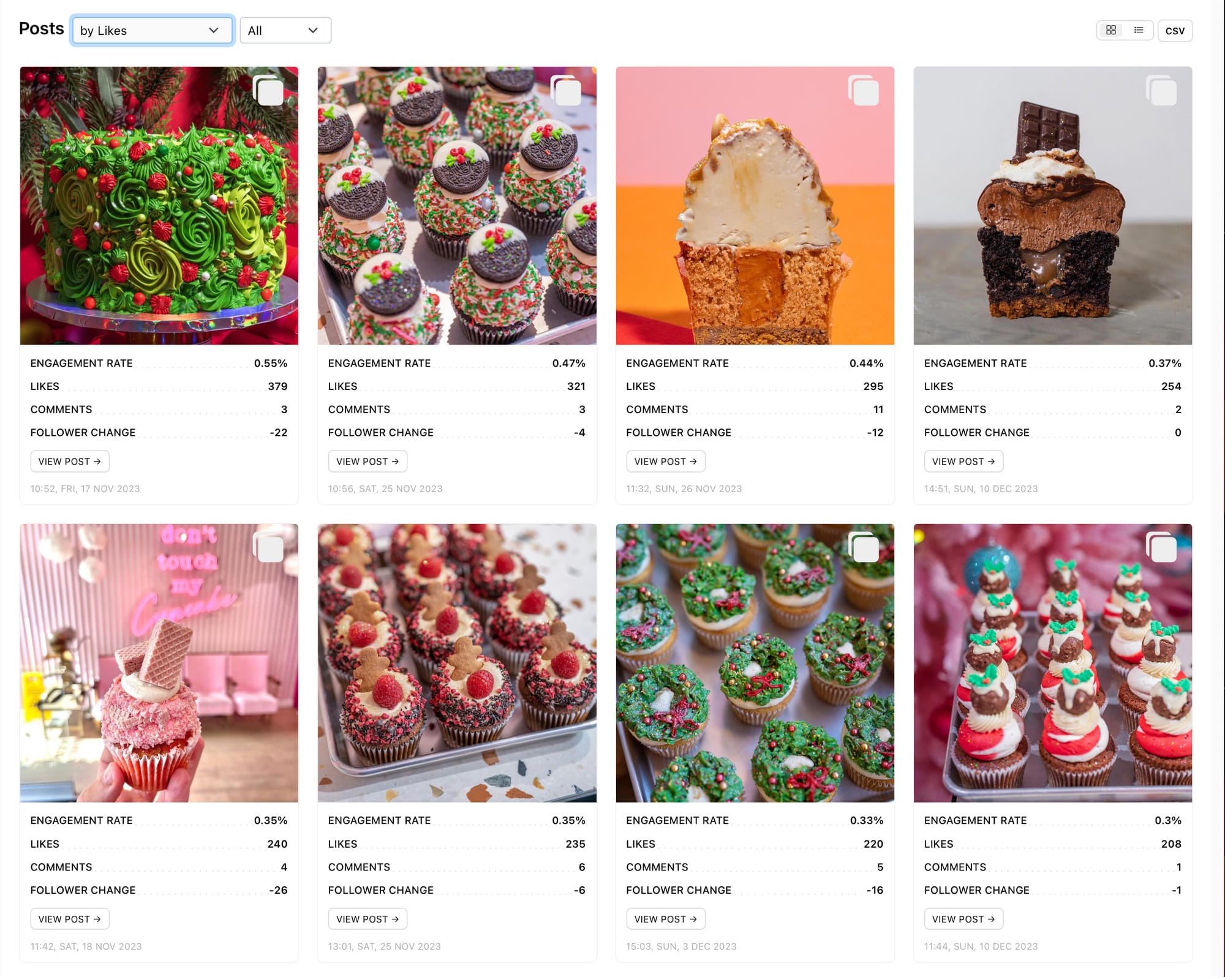
When drawing inspiration from your own content, the first thing you’ll want to do is to find the top-performing content, organised by the metric that is most important to you. In this case, we’re going to look at the best-performing content sorted by likes.
How to find your content with the highest like counts:
- Go to Minter.io and select your Instagram profile.
- Choose ‘Posts’ from the menu on the left-hand side of the screen.
- Scroll until you reach your Instagram posts sorted by a changeable metric.
- Choose ‘by Likes’ from the drop-down menu.
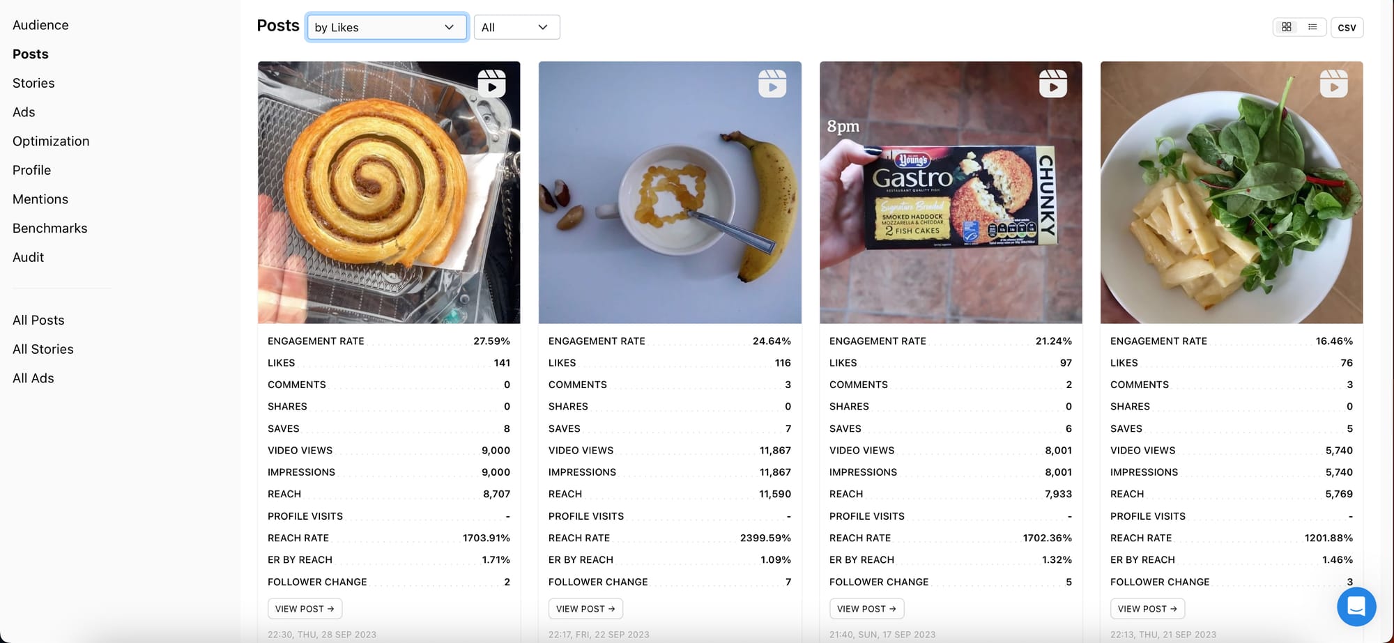
Now you are viewing your content within the selected time frame sorted from the highest amount of likes to the lowest amount of likes. You can choose to view all your content types together or view a specific media type such as image, carousel or reel. Click on a post to view the post description and additional metrics.
Pay particular attention to the top few posts. Ask yourself:
- Do they have anything in common?
- What type of posts are they?
- What are the themes?
- What is featured in the imagery?
- What colours have been used?
- Are the descriptions long or short? Do they feature emojis?
- Are there caption overlays?
- Is there a call to action?
- Have I used sounds or music in the content?
- Is there anything that makes them stand out?
By figuring out what made the top posts perform well, you can figure out what your audience responds well to and replicate key techniques to achieve similar results.
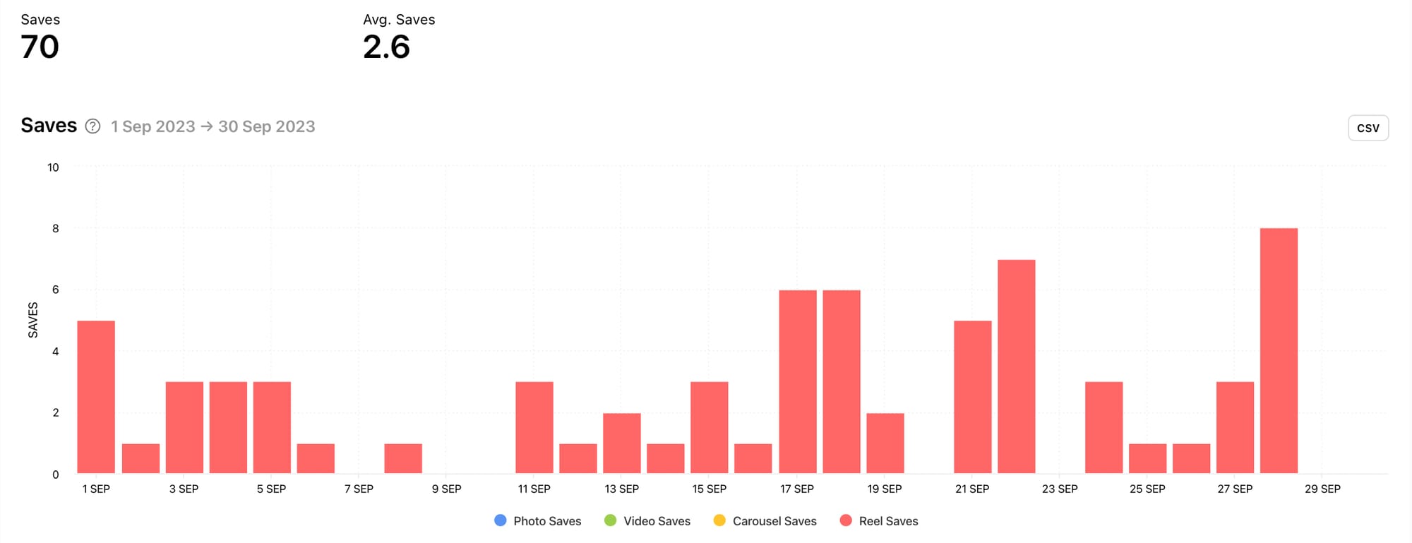
Pinpoint key content with the Likes graph
View specific metrics in graphs of their own to get an even more in-depth look at the types of content that are driving the most likes. The Likes graph is a bar graph set across your selected time frame and each bar is separated into likes gained by specific types of content. This can help you identify the types of content that gain the most likes for your brand.
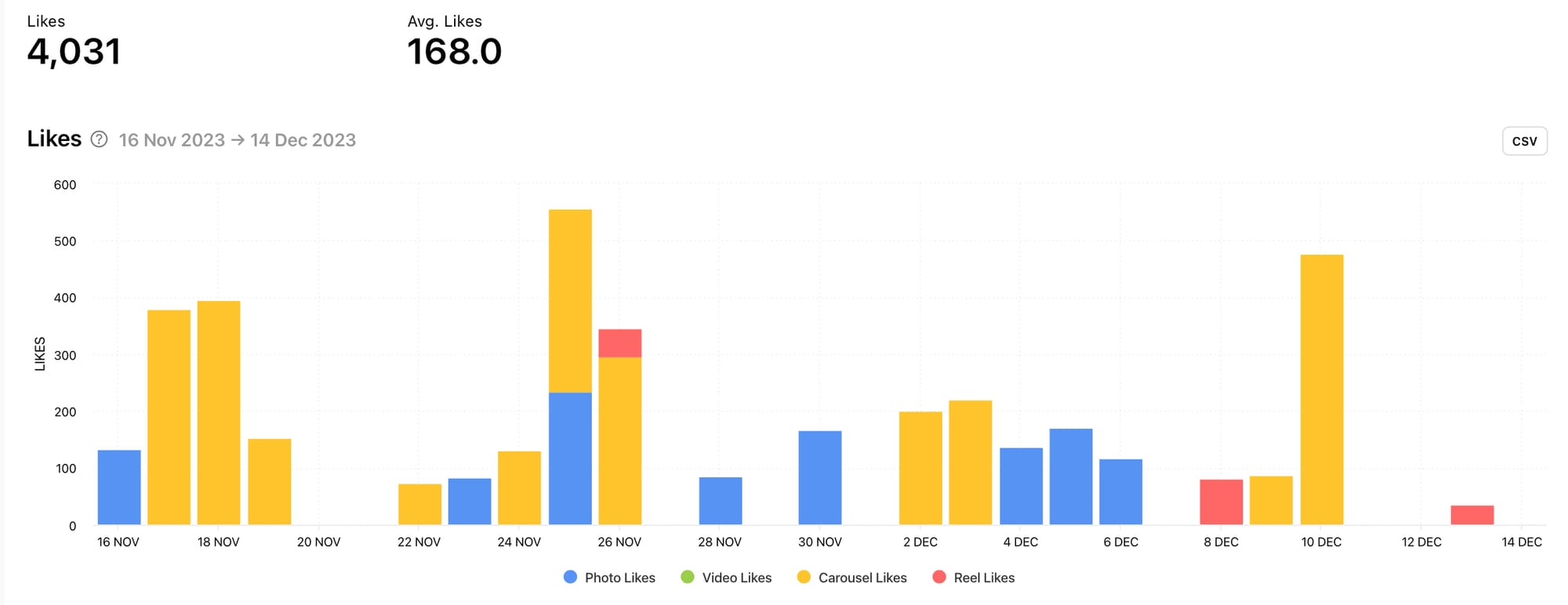
In the example above, it’s clear to see that carousel posts gained the most likes, whereas likes from reels clearly missed the mark. This could be because this profile posts more carousel posts than any other type of post, or it could be that its audience responds best to carousel posts. Either way, it’s worth diving into other graphs (such as the Number of Posts graph) to confirm the reasons and explore this type of content further.
Another thing to learn from the Likes graph is key dates when the like count spiked. From here you can figure out whether there was a specific reason for this or whether a piece of content performed really well regardless of the date. Were spikes in likes associated with a particular holiday, marketing campaign, collaboration or other event? This knowledge can help you lean into days and dates that encourage more likes and identify anomalies that exceeded your expectations.
View metrics that mirror the Likes graph
Something that is often the case is that when one engagement metric does well, it is reflected in other engagement metrics too. Look at other graphs to determine what other metrics spiked. Is there a trend of a few days with high engagement? Could this be triggered by cultural events, specific marketing agendas or a change in tactics?
It’s not always easy to determine whether the like count was influenced by other engagement metrics or vice versa. What’s interesting is that engagement metrics often work together. By figuring out which other metrics work in tandem with your Likes graph, you can learn which other metrics to consider when aiming for a higher like count.
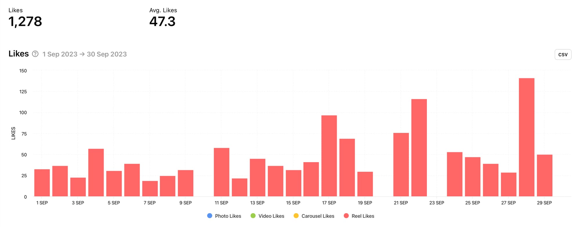
Likes graph (left) and Saves graph (right) by Minter.io
In the example above, the spikes in saves tend to mirror the spikes in likes. Are users saving the posts because they really like them or are they liking the content because they find it valuable enough to return to and therefore save? This is something that can be explored by diving into the specific pieces of content that were published on the high-performing days.
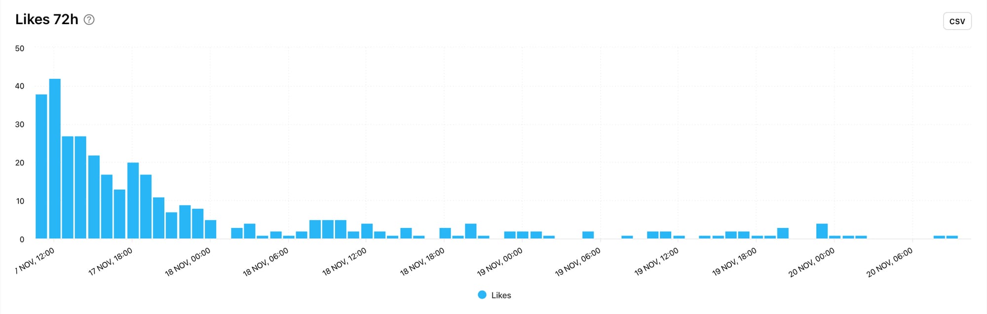
Dive into more detail with 72 hour data
If you go back to the initial way of finding your top-performing posts, you can click on a piece of content to grab more in-depth details and graphs. Minter.io now shares data collected within the first 72 hours of posting a piece of content, which includes the Likes 72h graph. This helps you to see exactly when your post gained the most amount of likes after publication, at what rate the likes petered out and if there was an uptick in likes after its initial release.
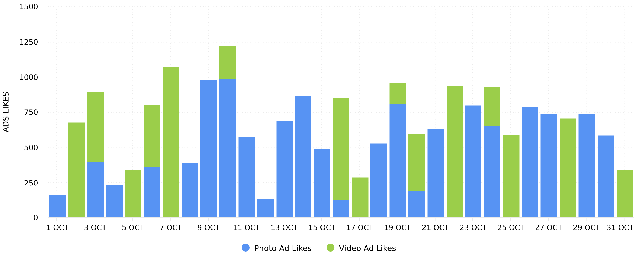
Access metrics for ads
There’s an entire section with your Minter.io Instagram data dedicated to ads. Here you can access the Ads Likes graph to view likes over a selected time frame split into photo and video ad content. At the bottom of the screen, you can sort all ads by the amount of likes, just as shown in the initial tip in this article. This gives you a clear idea of how well your adverts and boosted posts were received and which ones sparked the highest amount of likes. The amount of likes on your ads could be influenced by the ad spend, the type of post, the targeted audience and the effectiveness of the creative and copy.
Learn from your competitors
Now that you know what is working for your brand on Instagram, it’s time to get some inspiration from your competitors. By adding a competitor Instagram account on Minter.io you can access audience, post, optimisation and benchmark data for an Instagram account that you don’t own. Find the Likes graph as well as Likes 72h graphs for individual posts just like you can for your own content. You can also sort your competitor’s posts by the amount of likes. This allows you to gain inspiration from top-performing competitor content in a relevant niche.
It’s time to get the like counts your content deserves. With these tips you can make informed decisions about upcoming content to inspire higher engagement with your audience and beyond. To access your social media data, head to Minter.io now.
Try Minter.io now →