How to use Instagram stories analytics to boost business
Instagram Stories is a powerful feature that connects brands and their audiences in a deeper, more meaningful way. Brands can leverage this dynamic tool to drive traffic to websites, link to products and shops, gain customer feedback and insight, countdown to important dates, encourage engagement through several interactive stickers and so much more. There’s incentive for fans of brands to keep up to date with new stories too as they vanish to the public after 24 hours. Important stories can be made into permanent fixtures on a profile when added to a Stories highlight, which is positioned at the top of an Instagram profile.
With so much possibility in just one part of the Instagram experience, are you making the most of Instagram Stories? Using the social media analytics tool Minter.io you can get in-depth insights into your content on Instagram. This can help you make effective choices to boost your business and grow your brand online. Let’s find out how…
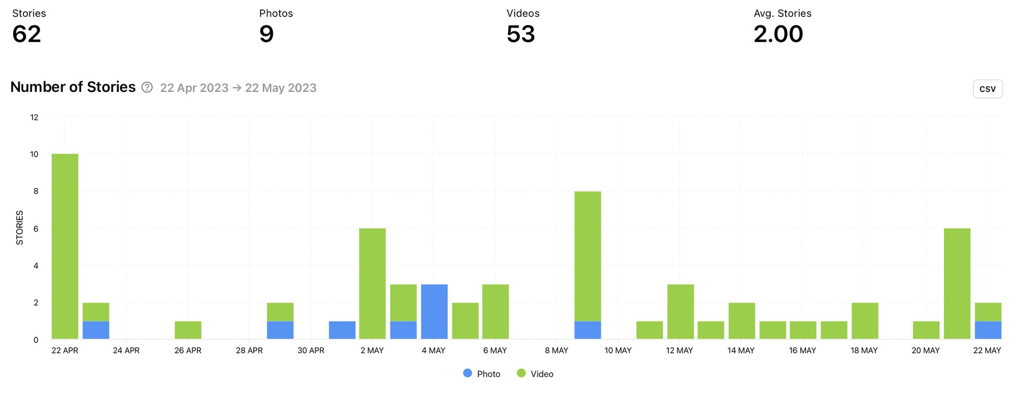
Number of Stories
A great place to start with Stories analytics is the number of stories graph. This helps you get really clear on what you are posting and when. Are you posting on a consistent schedule or is your Stories content sporadic? Use this graph in conjunction with other graphs to determine how this might be impacting the user experience.
Notice the key metrics displayed at the top of this graph. These include the total number of stories, the total number of photos, the total number of videos and the average stories per day. Use this snapshot to get a good idea of your publishing patterns at a glance.
As with several other graphs by Minter.io the number of stories graph is broken down by content type so you can clearly see how often you post photos versus videos. What types of media are you posting the most? Is there a reason for this?
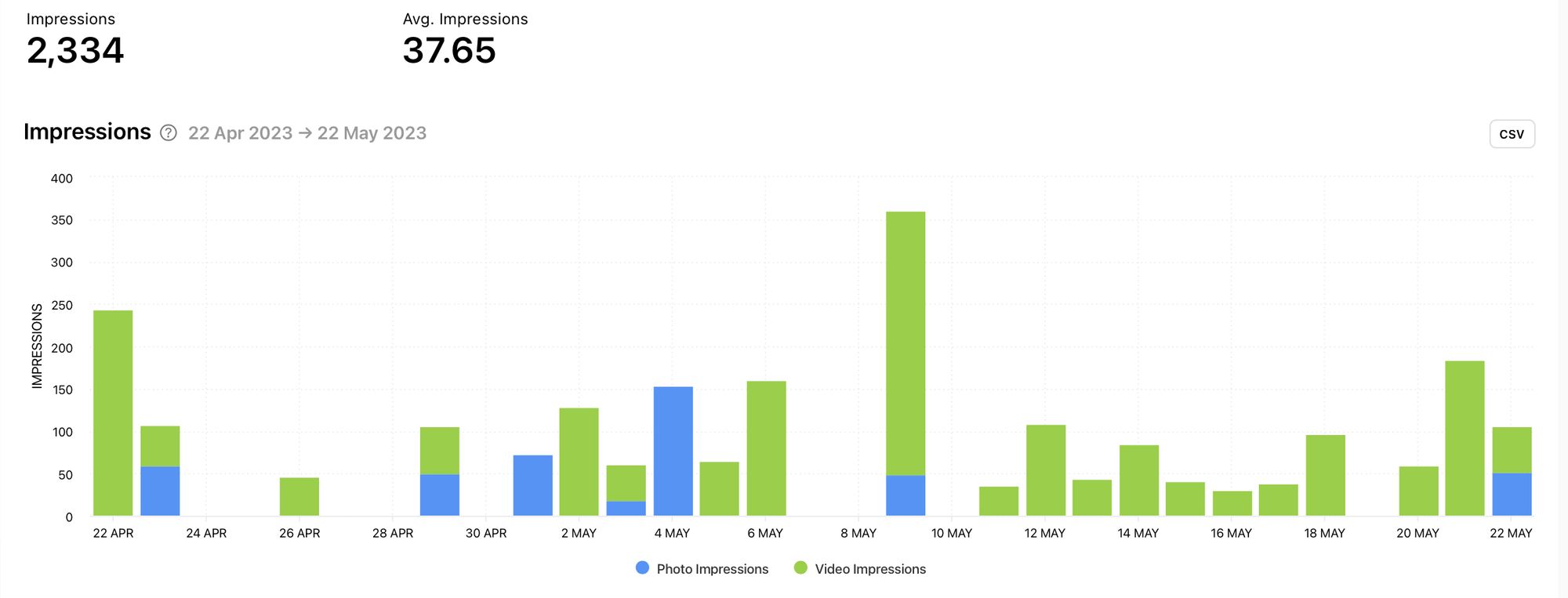
Impressions
Find out how many times your stories were viewed. The number of impressions is the amount of views your content gets regardless of whether an account has previously viewed the story. This graph is particularly useful when used in conjunction with the reach graph, as you can compare the amount of accounts that were reached on a particular day with the amount of impressions gained, helping you pinpoint content and content types that viewers returned to view more than once.
Two key metrics are displayed at the top of the impressions graph. These include the total number of impressions and the average number of impressions per day.
The impressions graph is broken into photo impressions and video impressions. Which media type gained the highest amount of impressions? Was this a result of the types of media published during the date range or did one media type dominate over the other even with this taken into consideration? View this graph in conjunction with the previous graph to determine whether there are any anomalies that should be explored further.
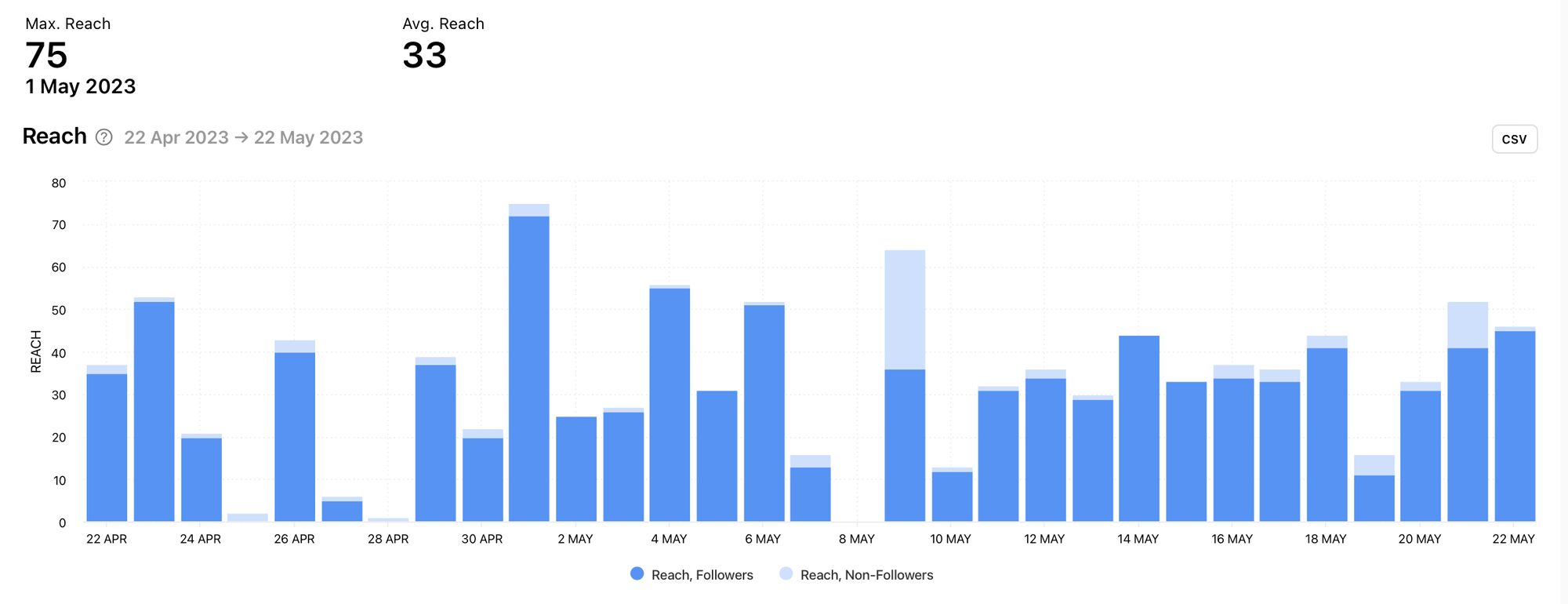
Reach
The reach graph shows the number of times stories were viewed by unique accounts. This means that if an account viewed a story multiple times, it would only be counted once. This is a key graph to use on its own as well as in conjunction with the previous two graphs. Viewing the number of stories graph alongside the reach graph may help you understand how the frequency of posting influences the amount of accounts your content reaches. Using the impressions graph alongside the reach graph can help you find valuable content that was viewed multiple times.
Two key metrics are displayed at the top of the reach graph. These include the maximum amount of reach and the average reach per day. Which days gained the highest amount of reach? How does this day compare with the average? Leverage this knowledge to replicate content that got higher amounts of reach.
The reach graph is broken down into reach by followers and reach by non-followers. When Stories content is viewed by large amounts of non-followers, we can see that the Instagram algorithm is pushing the content to new audiences. Pinpoint days where this occurred to determine what could have been the cause so you can replicate similar content. In the example below, the 9th of May is a good example of content worth exploring further.
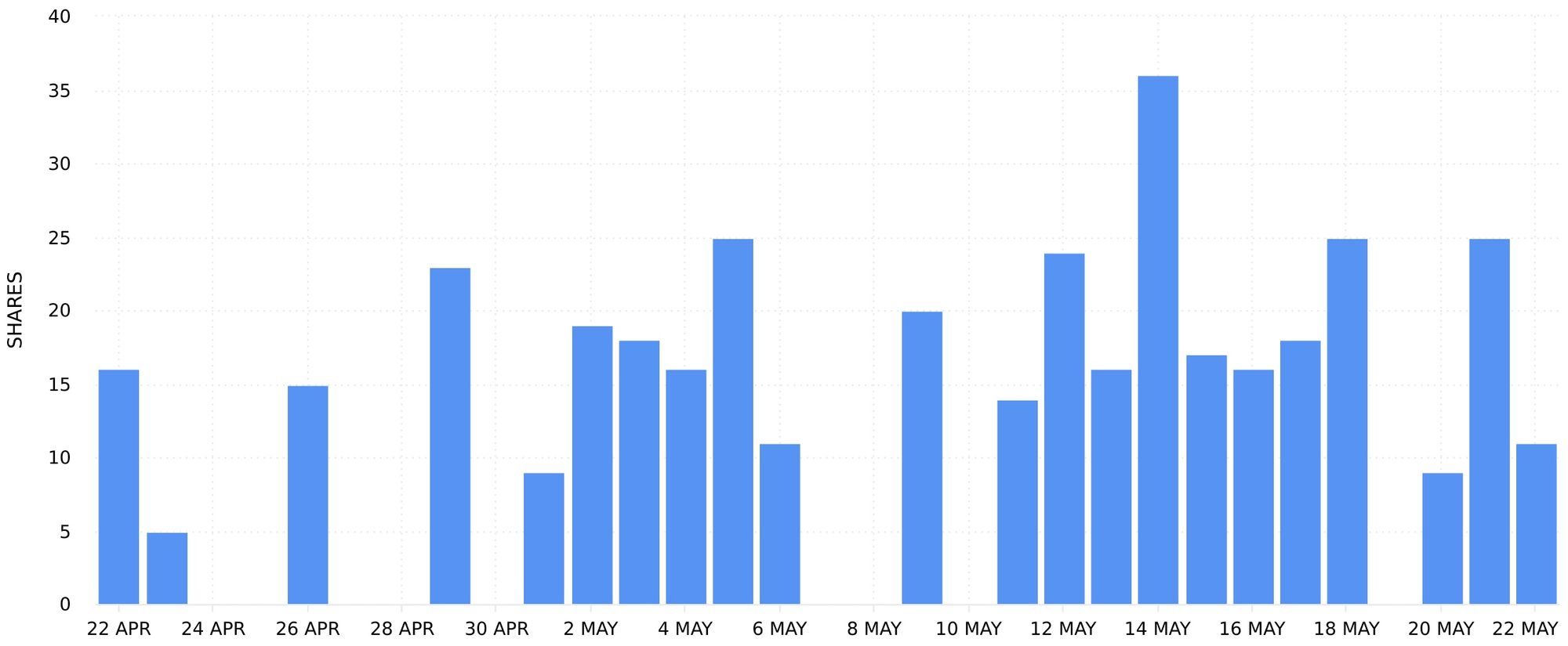
Shares
An incredibly powerful engagement metric is shares because this is a form of word-of-mouth marketing - the most effective form of marketing there is. When someone shares your content with someone they know, or their audience as a whole, it builds trust and social proof (as long as they’re sharing it for the right reasons). By using the shares graph, you can find content that was shared with others. This is definitely worth diving into, as finding content that users want to share with their friends is the gold of content marketing.
However, be aware that shares are not guaranteed to be positive. If people are sharing your content for negative reasons, this can be detrimental to a brand. Keep this in mind when using this graph as not all engagement is automatically a good sign.
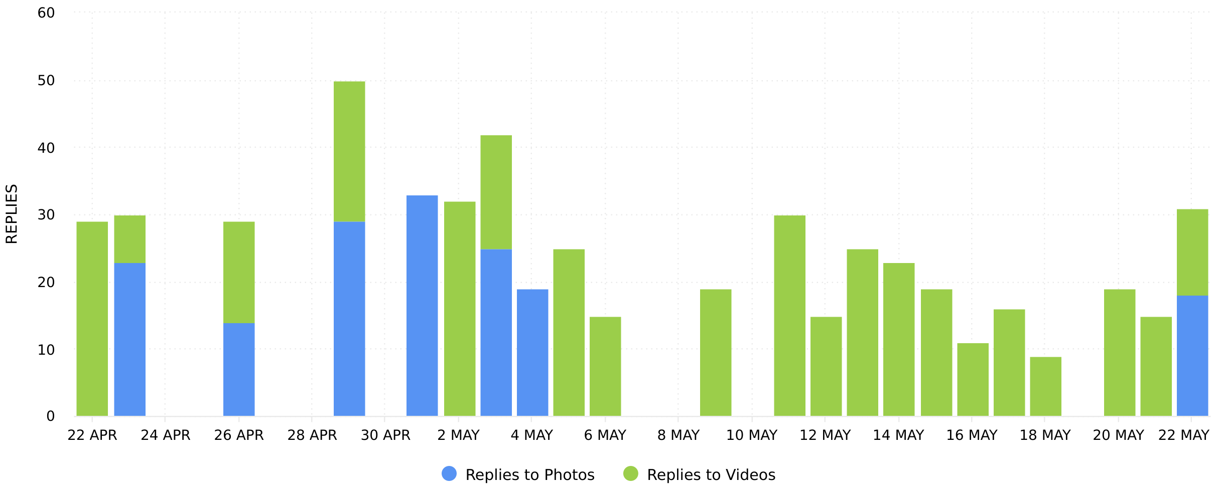
Replies
When an Instagram Stories post is published, viewers can reply to a story by sending a direct message from the story to the account that published it. This is a very direct way to interact with a story. If certain pieces of content spark replies, this is a good indication of viewers feeling a need to get in touch. Why might this be the case? There could be a need for more information, or perhaps the content sparked a strong emotional response. How could you leverage this knowledge to encourage more replies and get into direct communication with more potential customers?
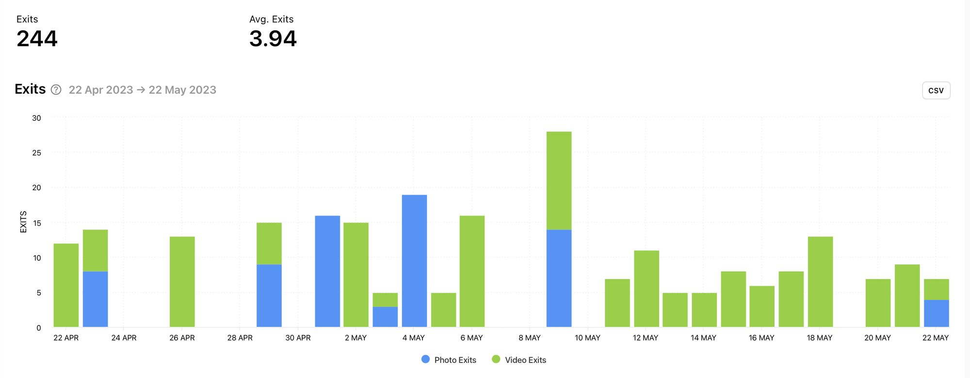
Exits
When people view Instagram Stories posts, exiting a story is just one swipe away. Viewers can easily swipe off one account’s stories and onto someone else’s. Equally, it’s simple to swipe off Stories posts entirely and onto the main Instagram feed. The exits graph tracks these actions. Find out which days sparked the highest amount of exits to find content that was less interesting to your audience. You can also use this graph in tandem with other graphs, such as impressions, to see whether the amount of exits were significant when compared with the total amount of views.
Above the graph is the total amount of exits and the average amount of exits per day. This can give you a quick overview of the amount of exits on your stories.
The exits graph is broken down into photo exits and video exits. This could give you insight into the types of content your audience is more likely to swipe away from.
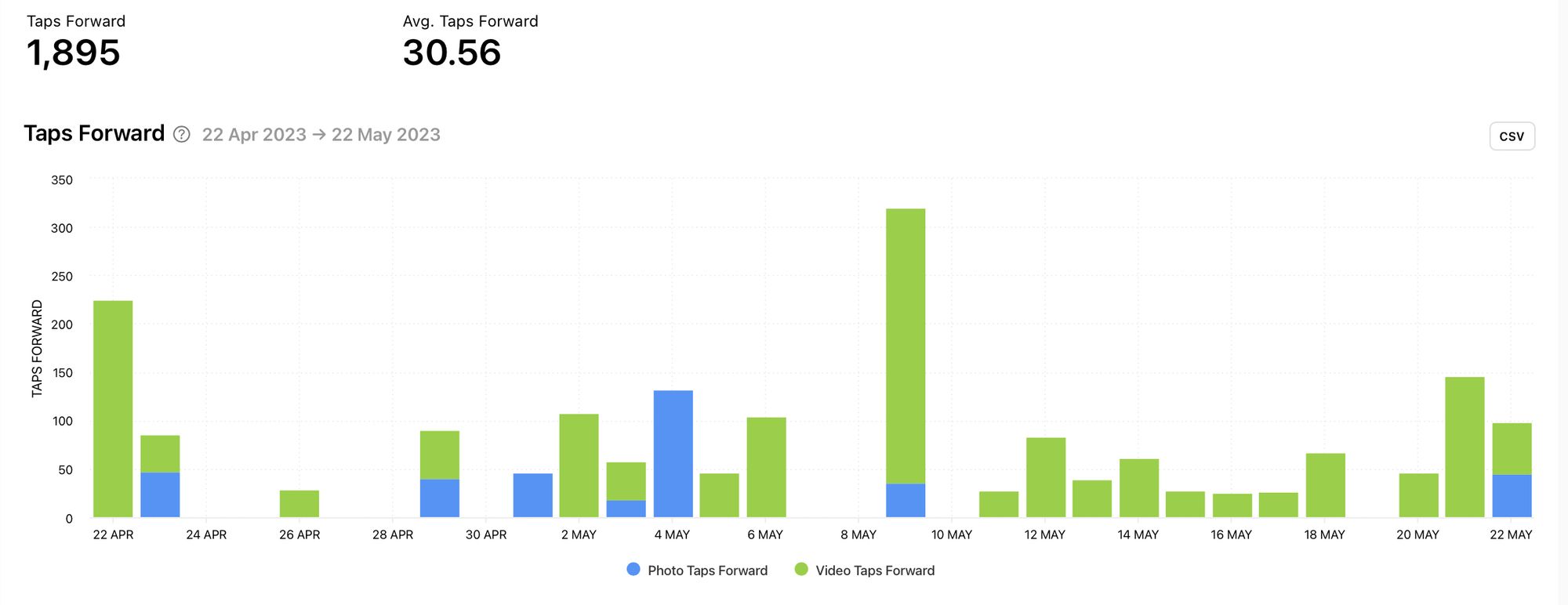
Taps Forward
Viewers can tap forward on a story to view the next available story. This could be another one of your stories or the next story in the queue. Taps forward could indicate that the content didn't hold the attention of the viewer until the end, but the viewer didn’t lose interest in viewing stories as a whole. If you had multiple stories queued up, the viewer simply tapped onto the next story.
Key metrics highlighted on top of the taps forward graph include the total number of taps forward and the average number of taps forward. You can compare these key metrics across different time periods by using the date picker. Which time periods sparked more taps forward and were there any noticeable changes in the stories shared? You can use this information to develop content that grabs and holds viewer attention for longer.
The taps forward graph is broken into photo and video content. This makes the data easy to compare with other graphs, while providing clear insight into the media types that sparked this specific action.
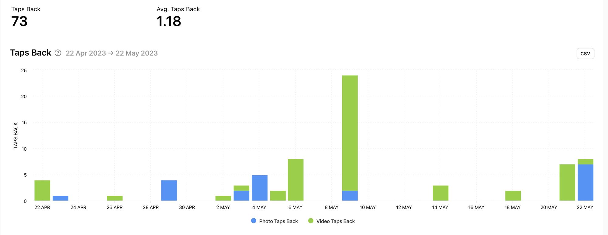
Taps Back
Similarly to taps forward, viewers can also tap back on a story. However, unlike taps forward, when a viewer taps back on a story it is likely to indicate interest in the content. It could show that the viewer had interest in the previous story or it could be an attempt to rewatch the current story a viewer is on. Pinpoint days with the highest amount of taps back to find content that triggers this action.
Key metrics highlighted on top of the taps back graph include the total number of taps back and the average number of taps back. See in an instant how often viewers rewatch content through tapping back.
The taps back graph is broken into photo and video content. Find out which type of media is more likely to gain taps back to determine the kinds of content viewers may be more interested in. This is particularly useful when looked at alongside the impressions graph.
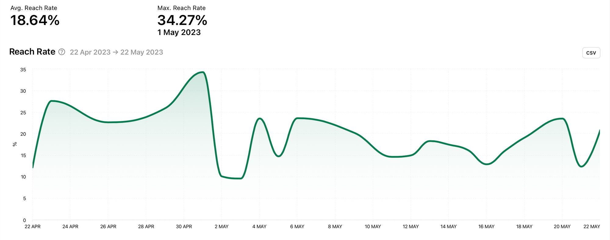
Reach Rate
Onto some different types of graphs now as we check out the reach rate graph. This is the percentage of your followers that saw your stories. You can absolutely use this graph in conjunction with the reach graph to get a better picture of who your stories are getting in front of. Easily pinpoint peaks and dips in reach over a selected time period to find content that encourages a higher amount of views from your followers.
There are two key metrics highlighted above the reach rate graph. The average reach rate and the maximum reach rate are displayed as percentages. The maximum reach rate is shown with the specific date the highest reach rate was achieved, making it simple to find content that correlates with this peak. Use this information to replicate content that may be likely to spark a higher reach rate.
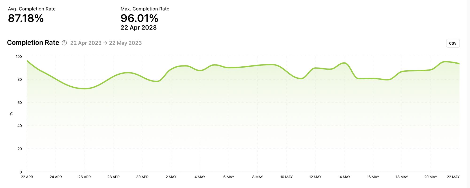
Completion Rate
The completion rate graph shows the percentage of impressions without exits. A high completion rate implies that stories published on that date were of interest to the audience. The higher the completion rate, the better.
Above the completion rate graph are two key data points, both displayed as percentages. View the average completion rate as well as the maximum completion rate. Is your audience viewing your stories without swiping off or exiting? Are there significant peaks or dips in your completion rate data? Use this knowledge to create stories your audience will stick around for.
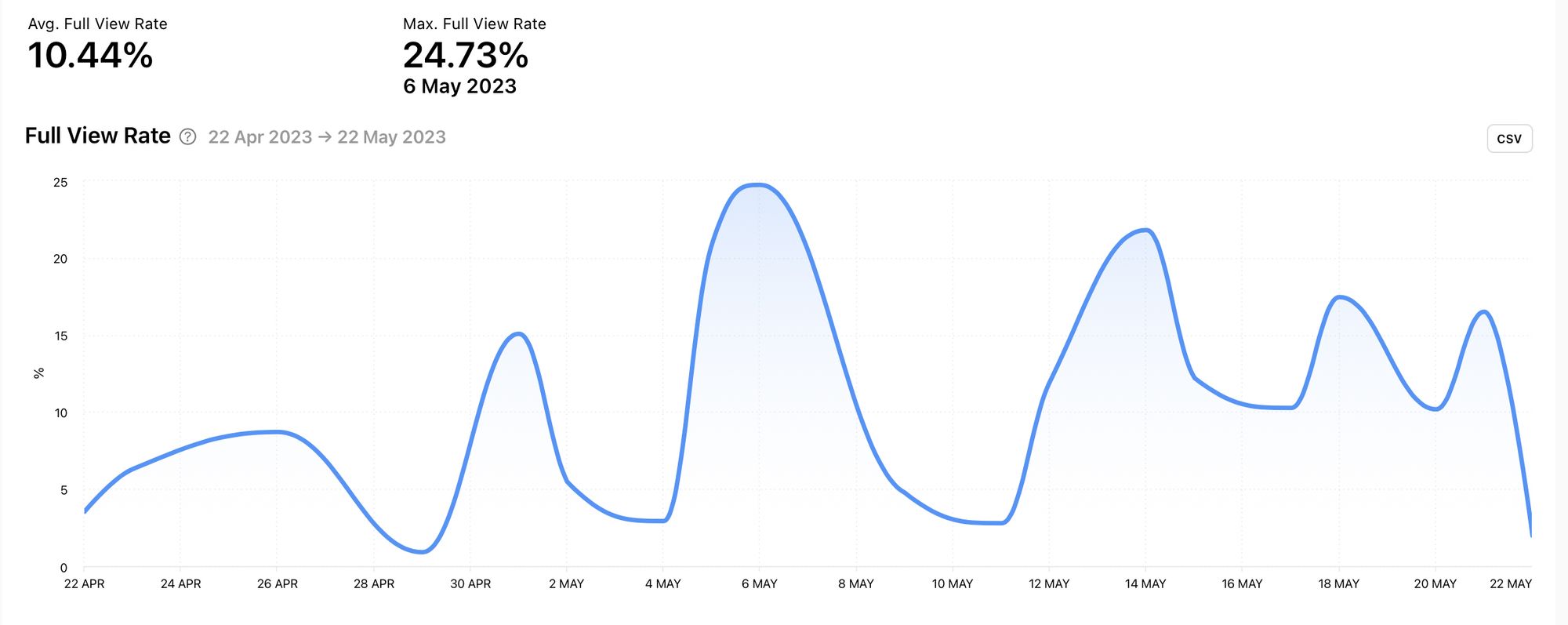
Full View Rate
The full view rate graph shows the percentage of impressions without exits or taps forward. As this graph takes into account taps forward, it can look very different to the completion rate graph. Pinpoint peaks to find content your audience watched fully. Dips in this data can help you learn from content that didn’t fully hold viewer attention.
For easy picking, the average full view rate and the maximum full view rate are displayed as percentages above the full view rate graph. The maximum full view rate shows the date of the highest peak, making it easy to find content which resulted in this outcome.
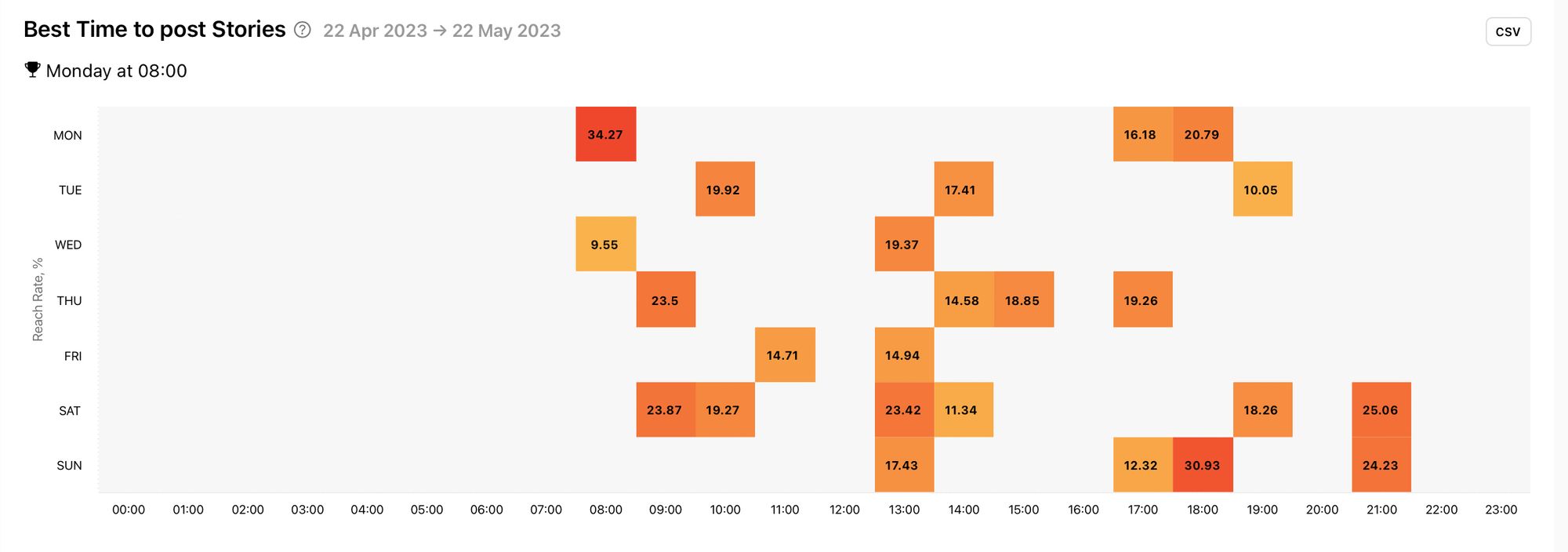
Best Time to post Stories
Knowing how to optimise your stories can help you get the most from your effort. With the best time to post stories graph you can make smart choices about the times and days you publish content. This graph measures the reach rate of stories published at different times of the day and on different days of the week. The darker the colour, the better the reach rate. Use this graph to find the best times and days to post stories for maximum reach.
Stories by metric
View and sort your stories by: impressions, replies, exits, reach, taps forward, taps back, reach rate, completion rate, full view rate, follower change and date. You can choose to view all your stories or only images or videos. This enables you to view your stories sorted by the metrics that mean the most to you.
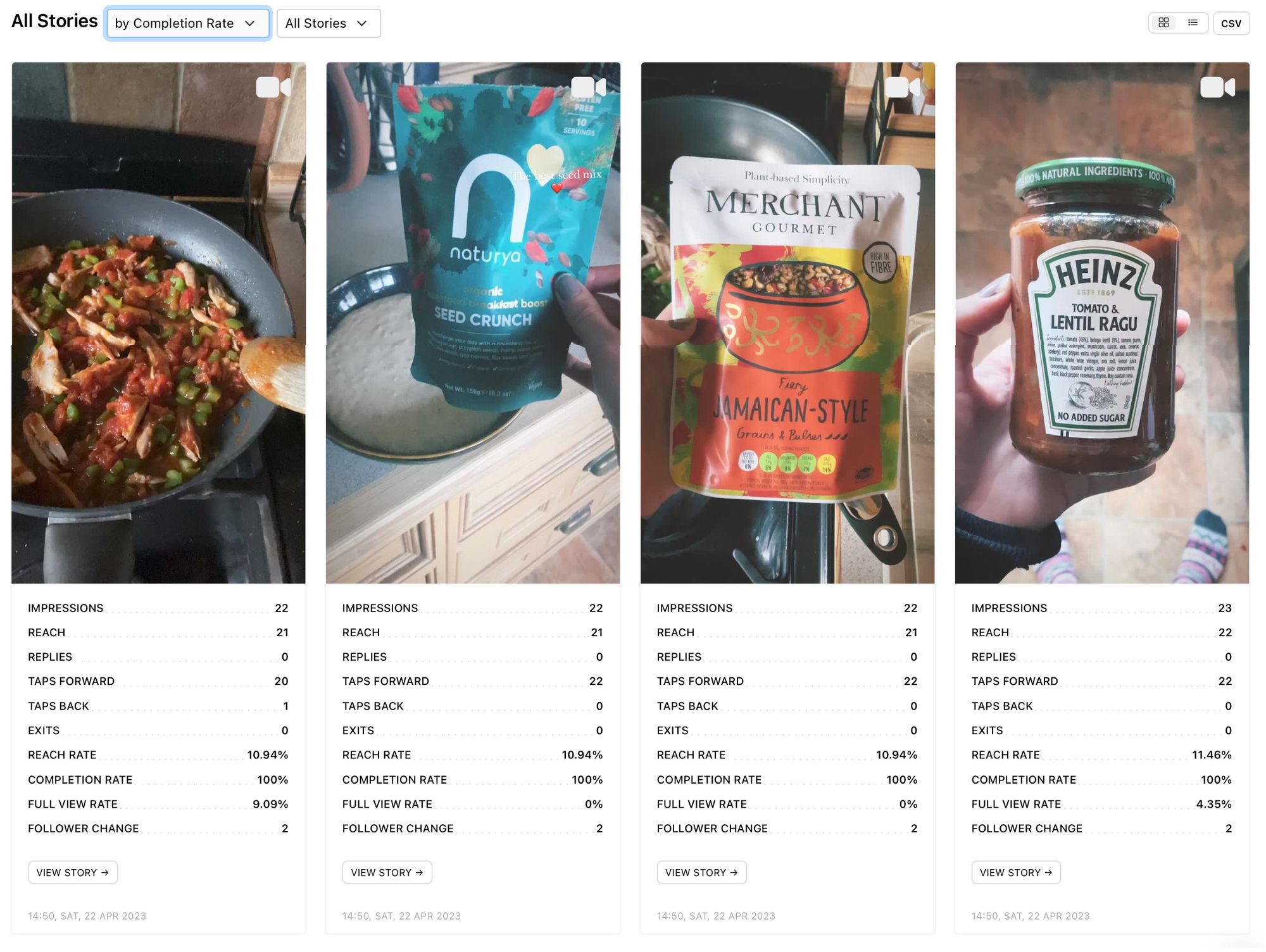
However you choose to view your stories, clearly see metrics for each story for quick comparison and more detailed analysis.
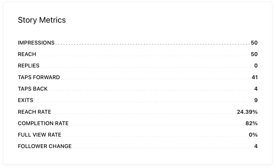
View individual posts
Select a specific story to view it in more detail alongside its metrics. These metrics include: impressions, reach, replies, taps forward, taps back, exits, reach rate, completion rate, full view rate and follower change.
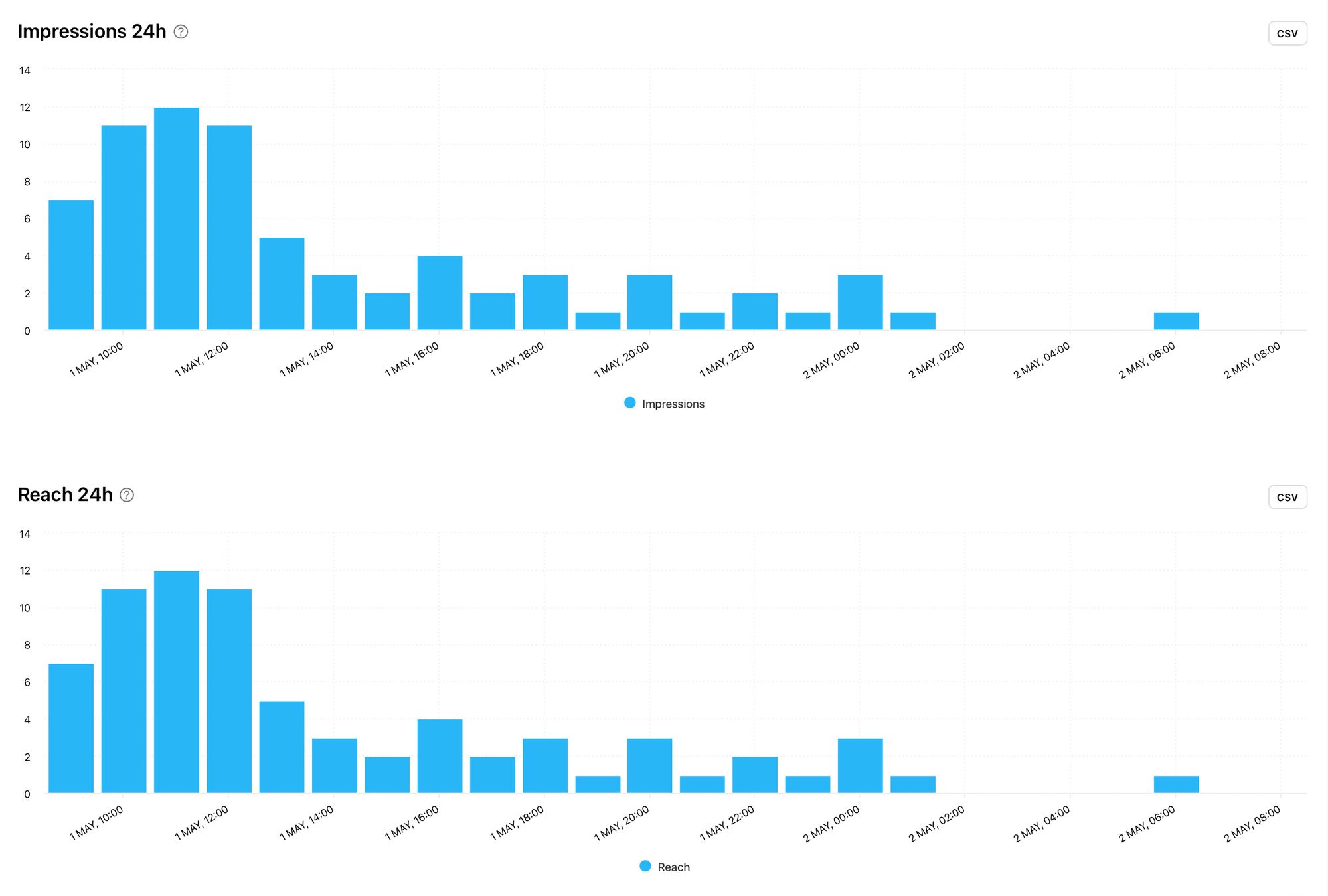
24 Hour data
Instagram Stories posts are time sensitive due to the fact that they are only public for 24 hours (unless added to a highlight by the account owner). 24 hour data provides a deeper, more in-depth look at a specific story. Broken into 1 hour time slots, 24 hour data graphs display the times people viewed the content as well as when specific actions took place. Get a more detailed look at how the content was pushed to viewers and how quickly the audience responded to the content.
When viewing data on a single story, scroll down to find graphs detailing 24 hour data. This includes: impressions, reach, exits, replies, taps forward, taps back and follower change.
With more data at your fingertips, you’ll be empowered to get the most out of Instagram Stories.
Unlock your analytics at Minter.io now!