10 Top Instagram metrics to track in 2026
Are you tracking the same metrics you always have? Holy cheese crackers, it’s time to up your game. Never before has it been more important to review the analytics you pay attention to and update your reporting to reflect Instagram’s many recent changes. Instagram is an unrecognisable platform to its origins, and with the recent navigation update, introduction of the Friends Reels tab, emphasis on Reels content, and increased importance of sharing among connected accounts, the data you track should reflect these changes.
If you’re still leaning on the same metrics as you were when you first hopped onto The Gram, there are likely to be huge gaps in your focus, tracking and reporting. Today we’re going through the top 10 Instagram metrics you must track in 2026 if you‘re to have any hope of keeping up this year. To do so, we’re turning our attention to Minter.io - the social media analytics tool that keeps businesses and brands on track.
Here are the 10 top Instagram metrics you need to track in 2026…
1. Reach
Reach is the total number of unique accounts that view your content. This is different to views which shows the total amount of times your content is viewed, regardless of whether it is viewed repeatedly by the same account. Without unique accounts seeing your Instagram posts, your Instagram presence is unlikely to have a significant impact on your business. If your posts aren’t reaching accounts, they won’t be getting noticed, viewed, engaged with and shared. Every positive Instagram interaction is downwind of your content being seen. That is why reach is a vital metric to track on Instagram in 2026.
To find your posts’ Reach graph, head to your Instagram data on Minter.io and go to the Posts tab. Then, scroll down until you get to the Reach graph.
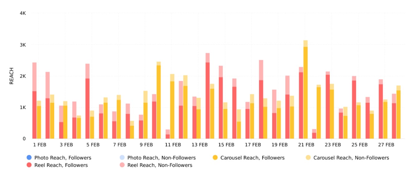
The Reach graph shows the number of times your posts were viewed by unique accounts within the selected date range. With this graph, you can see the amount of reach your posts gained, split into post types. This helps you identify which post type(s) gained the most amount of reach for your account. Try publishing more of the post types that gained the highest amount of reach for your brand to increase your reach further.
Another feature of the Reach graph on Minter.io is that you can see a clear breakdown of reach from your followers and non-followers. This helps you understand whether you should focus on nurturing your current follower base or invest your efforts in bringing more people into the fold.
2. Engagement Rate by Reach
Once you understand how many unique accounts your content is being shown to, turn your attention to the amount of engagement that is gained in relation to it. Engagement Rate by Reach is the percentage of unique accounts reached that interacted with your posts. Looking at engagement in relation to the amount of reach your content gained can give you a clear picture as to whether people who see your content are also interacting with your content.
To find your Engagement Rate by Reach graph, head to your Instagram data on Minter.io and go to the Posts tab. Then, scroll down until you get to the Engagement Rate by Reach graph.
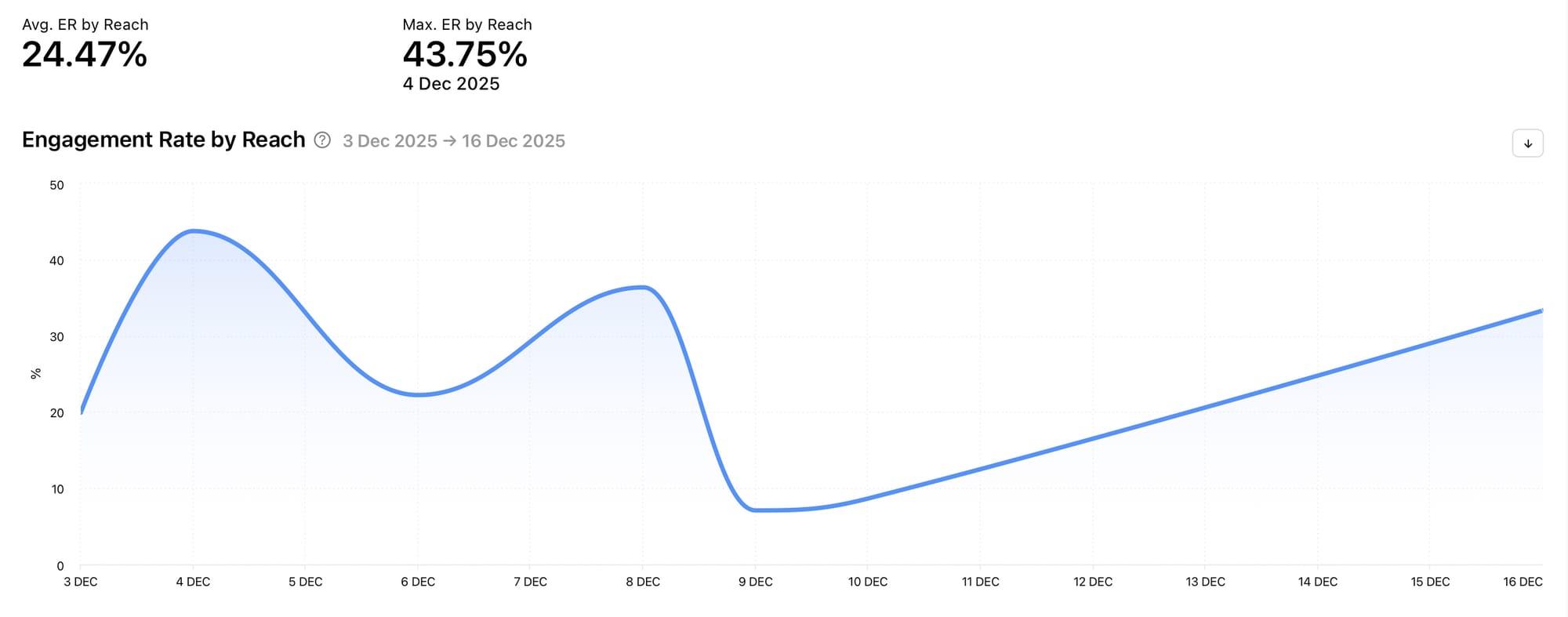
The Engagement Rate by Reach graph shows a percentage which is calculated as the sum of all likes, comments, shares, reposts and saves, divided by reach and by the number of posts on a given day during the selected date range. Spikes in data show a high amount of engagement in relation to views. This is important to track so you can understand whether the people who are seeing your posts are finding them valuable enough to interact with. Spikes in data can help you pinpoint time frames when your post engagement was high in relation to reach, which can provide you with opportunities to replicate efforts that resulted in the spikes.
3. Average Watch Time
Reels are becoming increasingly important on Instagram. With a dedicated Reels tab, the new Friends Reels tab and best practices and weekly recaps specifically targeting the creation of reels, tracking data related to reels is becoming vital to any business or brand that wants to grow on Instagram. Average watch time is a key metric to take note of.
To find your Average Watch Time graph, head to your Instagram data on Minter.io and go to the Posts tab. Then, scroll down until you get to the Average Watch Time graph.
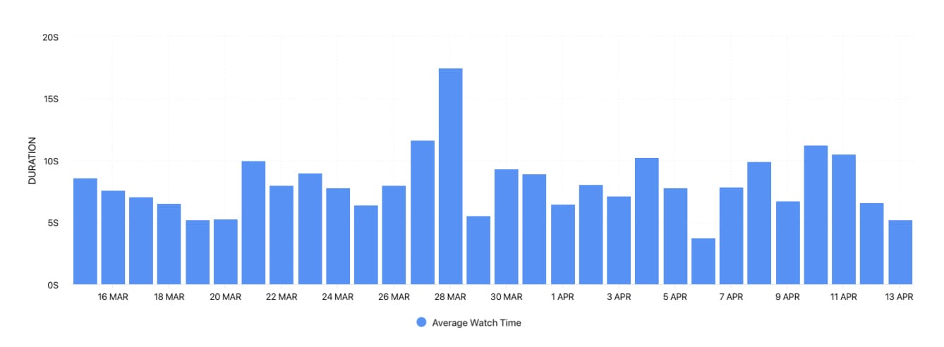
The Average Watch Time graph shows the average watch time for reels published during the selected date range. The more watch time your content gains, the more attention it is stealing from your audience, which can act as a tidal wave in getting your content pushed by the algorithm. Spikes in data can lead you to notice pieces of content that stand out in terms of average watch time. This can help you replicate strategies that result in more watch time.
4. Shares
Instagram's CEO, Adam Mosseri, has openly stated the importance of shares and their roll in the Instagram algorithm pushing content. Shares are more important than likes, so take note of the amount of shares your content gains over other engagement metrics.
To find your Shares graph, head to your Instagram data on Minter.io and go to the Posts tab. Then, scroll down until you get to the Shares graph.
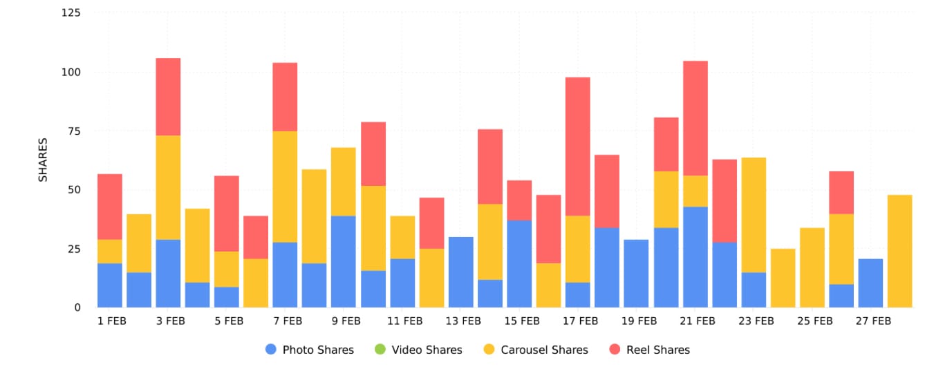
The Shares graph shows the number of times posts were shared within the selected date range. With this graph, you can see the amount of shares split into post types. This helps you identify which of the post types are gaining the highest amount of shares for your content. Try publishing more of the post types that gain the highest amount of shares for your brand to encourage more shares on future content.
5. Profile Visits
Instagram isn’t just about content; it’s also about building community and creating a space on social media that connects with likeminded individuals and potential customers. When your content is seen, interested viewers may venture onto your profile to get more context about your brand. This can lead to follower growth and increased sales. For this reason, understanding the actions and content that led to increased profile visits is highly beneficial.
To find your Profile Visits graph, head to your Instagram data on Minter.io and go to the Profile tab. Then, scroll down until you get to the Profile Visits graph.
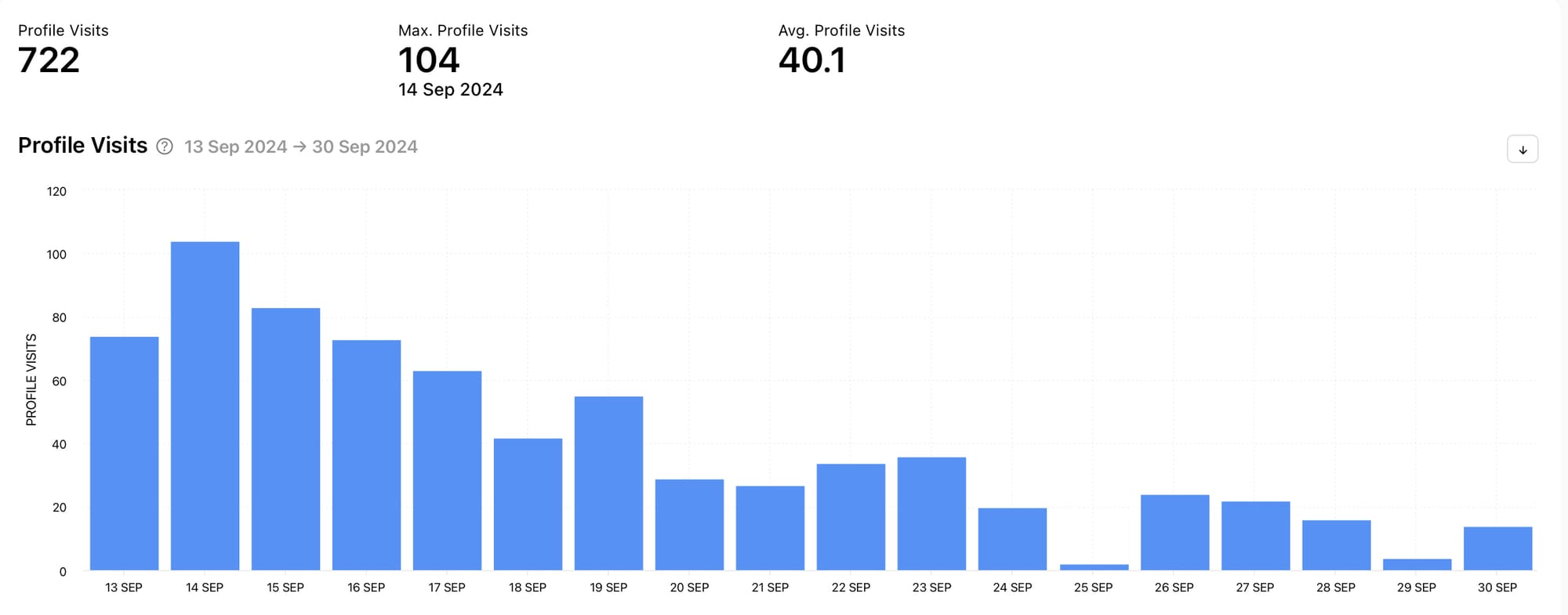
The Profile Visits graph shows the number of times the profile was visited within the selected date range. Using this data, an account can match actions they took and content they published around dates where profile visits spiked to determine the reason for the increase in profile visits. This can lead to replicating actions and techniques within successful content to encourage more profile visits. With more profile visits, there are more opportunities for relevant people to fall in love with your brand and follow your profile.
6. Reach Distribution
When content is published on Instagram, it is usually shown to a mix of your followers and people who don’t follow your account. Understanding this percentage can give you insight into who Instagram is serving up your content to, which can help you decide whether you want to focus on nurturing your current follower base or aim to reach new people.
To find your Reach Distribution graph, head to your Instagram data on Minter.io and go to the Profile tab. Then, scroll down until you get to the Reach Distribution graph.
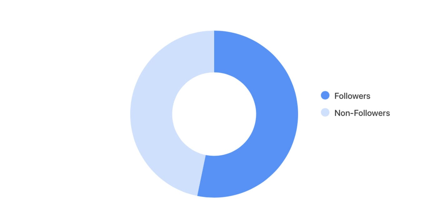
The Reach Distribution graph shows the percentage of followers and non-followers that viewed your posts, stories and ads during the selected date range. This graph shows up to 30 days of reach distribution. This recency is useful because it shows information which is currently relevant. By understanding where your reach is coming from, you can make strategic choices about the content you share. For example, if you want to reach more non-followers, you may opt to publish reels with broader topics.
7. Accounts Engaged
Engagement is a key metric every business needs to be aware of as it is the driving force behind the algorithm understanding what viewers find valuable. Every like, comment, share, save and reply sends a signal to the algorithm that a piece of content is valued enough by the audience member to interact with it, which can trigger the algorithm to show the content to more accounts that may find it interesting. There are several engagement metrics you can track, and Minter.io makes these available to you, however the Accounts Engaged graph is a particularly useful one because it shows the number of unique accounts that interacted with your content.
To find your Accounts Engaged graph, head to your Instagram data on Minter.io and go to the Profile tab. Then, scroll down until you get to the Accounts Engaged graph.
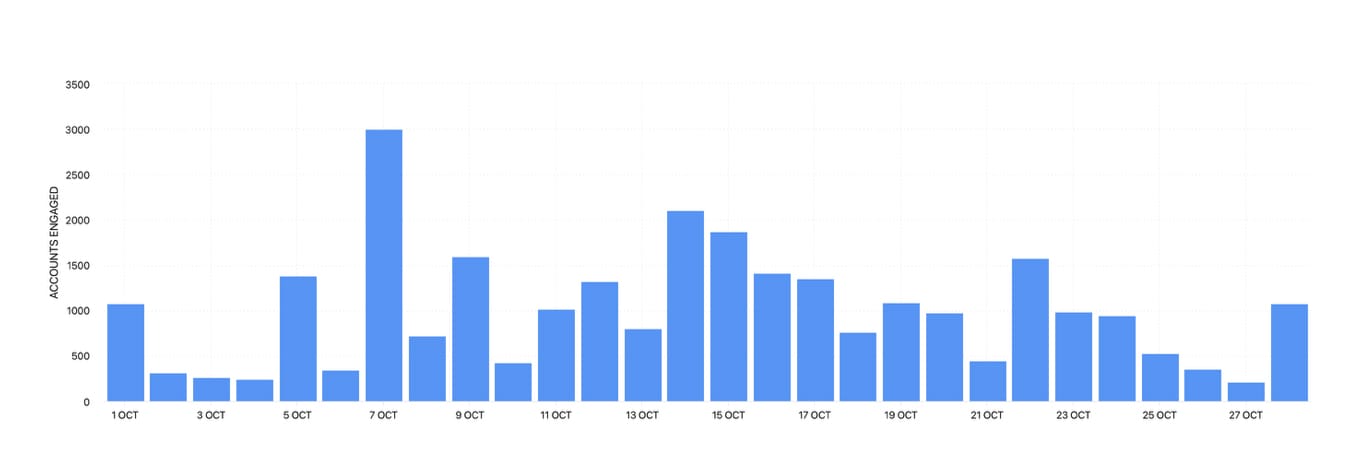
The Accounts Engaged graph shows the number of unique accounts that interacted with your posts, stories and ads during the selected date range. Interactions can include likes, comments, saves, shares and replies. Grouping together interactions provides a solid overview of engagement, while only showing engagement from unique accounts ensures you’re not simply viewing multiple interactions from the same person or people. Taking this wider view provides context as to the overall amount of people engaging with your content.
8. Reach 72h
72 hour data is available for individual posts, and it provides a breakdown of information over the first 72 hours from when the content was published. Being able to see key metrics broken down by the hour following a piece of content’s publication provides key insight into how the algorithm and audience reacted to the content in potentially the most critical part of its lifecycle. Reach is a key metric to look at as it helps with understanding how the algorithm is serving your content up.
To find your Reach 72h graph, head to your Instagram data on Minter.io and go to the All Posts tab. Select a piece of content and scroll down until you get to the Reach 72h graph.
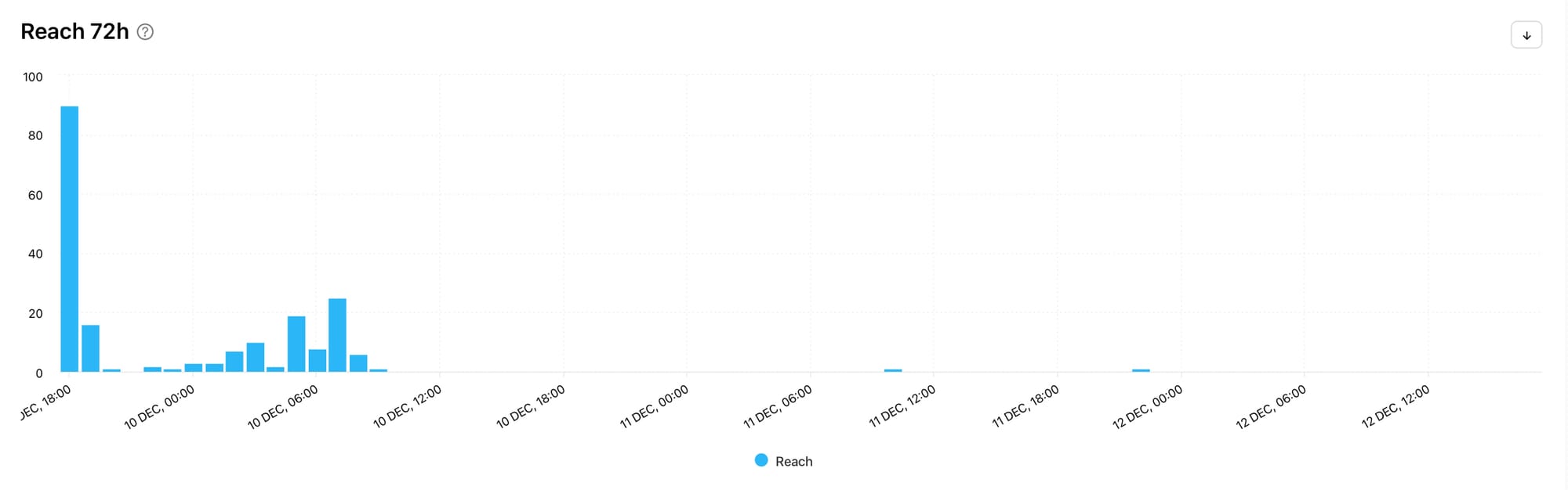
The Reach 72h graph shows the distribution of reach the post received in the first 72 hours by hour. Notice any spikes and drop-off points and see if this correlates with other 72h graphs such as likes, comments, shares and saves. This can help you pinpoint whether a specific engagement metric (or lack of engagement) is having an impact on your early reach. This can help you create more effective content by focusing on the metrics that are positively correlated with your Reach 72h graph.
9. Views 72h
When you‘ve got your head around the amount of reach, see whether reach translated into views by looking at the Views 72h graph. With reels being a key part of any savvy social media strategy in 2026, views are becoming increasingly important. If content isn’t being watched, it’s not going to get pushed by the algorithm and will result in less engagement too.
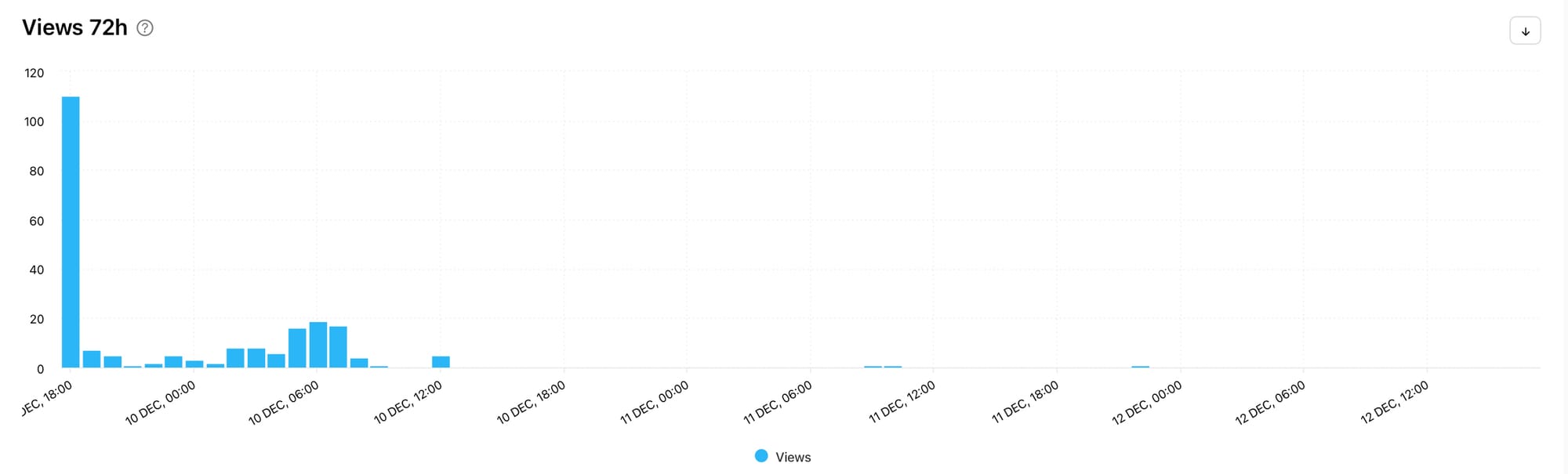
The Views 72h graph shows the distribution of views the post received in the first 72 hours by hour. Does the Views 72h graph line up well with the Reach 72h graph or are there discrepancies? Were there repeat views or did a drop in views result in lower reach in the upcoming hours? This data can help you notice patterns in your top-performing posts.
10. Followers 72h
Are your reach and views translating into a growing following? The truth is, you can get all the attention you want, but if people are viewing and sharing your content for the wrong reasons, you may find that attracting attention ultimately has a negative effect on your business. This is why shock-style content and controversy may be good for going viral but it is generally terrible for business.
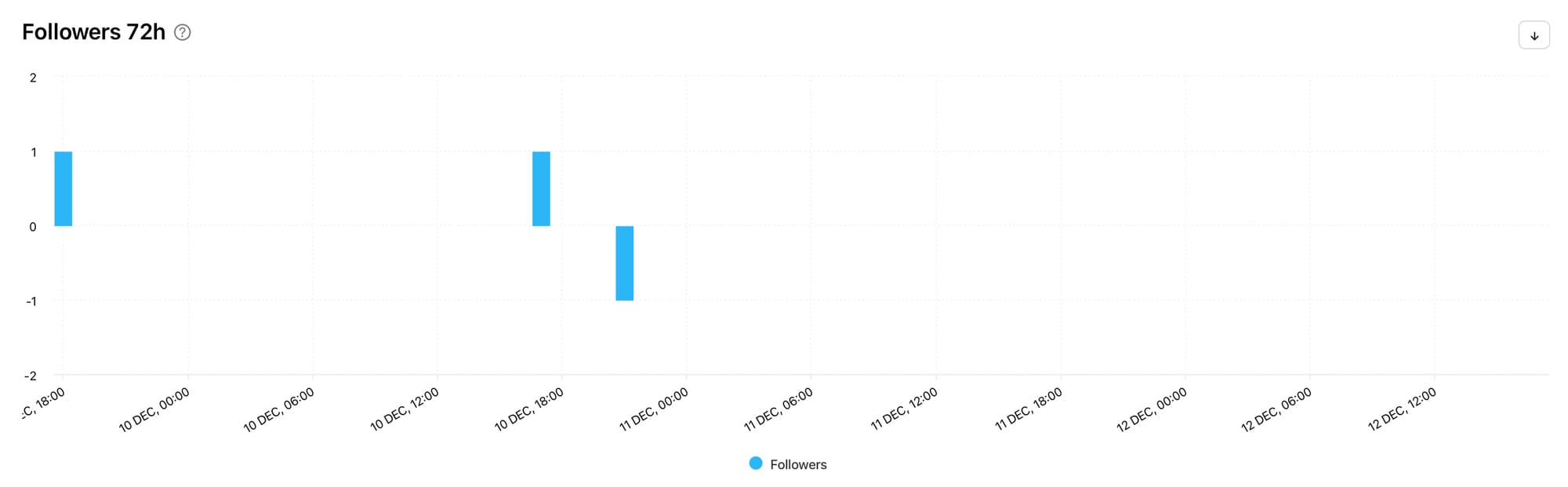
The Followers 72h graph shows the distribution of followers the post gained and lost in the first 72 hours by hour. Here you can see whether your Instagram account is gaining or losing followers soon after publishing a piece of content. This can help you understand your audience’s feelings about a certain piece of content, which can provide valuable customer feedback. If there’s a flood of new followers, people clearly resonate with the post. If there’s a steep decline, it may be time to go back to the drawing board, take the post down or maybe even publish an apology…
Discover all the graphs in this article on Minter.io and make 2026 the year your social media accounts make a real difference to your business. Whether you’re aiming to grow a bigger following, connect with your existing customers, provide opportunities for customer feedback or embed yourself in the conversation, Minter.io can help you in your efforts. Make this your year on social media. Explore your analytical graphs today!
Start your free trial today →